Treemap
Previous
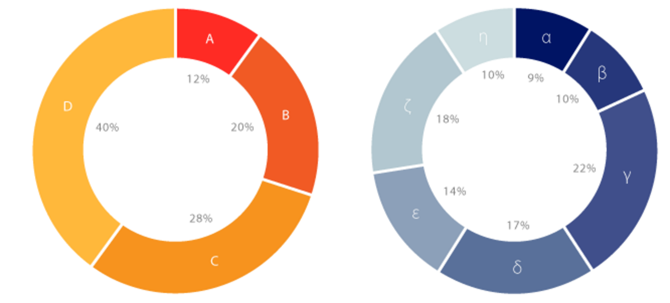
Sunburst Chart
Next
Venn Diagram
Loading...

A treemap is a visualization chart used to display hierarchical data through a series of nested rectangles representing tree-structured data. The area of each rectangle is proportional to its corresponding value, and colors are typically used to distinguish different categories or levels. Treemaps transform tree data structures into rectangular fills in planar space, providing an intuitive display of data hierarchy and value proportions.
Treemaps are particularly suitable for displaying large amounts of data with hierarchical relationships, such as file systems, organizational structures, budget allocations, and stock markets. Compared to traditional tree structure diagrams, treemaps can utilize space more effectively and have the capability to show proportions, enabling users to quickly understand data distribution and importance.
Treemaps also support interactive drill-down functionality, allowing users to click on a rectangular area to view detailed sub-items of that level, making it a powerful tool for data exploration and analysis.
English Name: Treemap
| Chart Type | Treemap |
|---|---|
| Suitable Data | Hierarchical data: nested data with tree structure, including categorical and value fields |
| Function | Display proportional relationships and distribution of hierarchical data |
| Data-Visual Mapping | Hierarchy mapped to nested rectangles Value size mapped to rectangle area Different categories distinguished by color and position |
| Suitable Scenarios | File systems, organizational structures, budget allocations, stock portfolios with clear hierarchical relationships |
Example 1: Displaying File System Structure
The following chart shows the hierarchical structure of a software project's file system. Through treemap visualization, you can clearly see the size distribution of various modules and files, helping developers understand the code structure.
import { Chart } from '@antv/g2';const chart = new Chart({container: 'container',theme: 'classic',autoFit: true,});chart.options({type: 'treemap',data: {type: 'fetch',value: 'https://assets.antv.antgroup.com/g2/flare-treemap.json',},layout: {path: (d) => d.name.replace(/\./g, '/'),tile: 'treemapBinary',paddingInner: 1,},encode: {value: 'size',color: (d) => d.parent?.data.name.split('.')[1] || 'root',},style: {labelText: (d) => {const name = d.data.name.split('.').pop().split(/(?=[A-Z][a-z])/g)[0];return name;},labelFill: '#000',labelPosition: 'top-left',labelDx: 3,labelDy: 3,fillOpacity: 0.7,},tooltip: {title: (d) => d.path?.join?.('.') || d.data.name,items: [{ field: 'value', name: 'Size' }],},});chart.render();
Explanation:
path configuration to transform flattened data into hierarchical structurelayout.tile to treemapBinary to use binary layout algorithmpaddingInner for inner padding between rectangles to enhance visual separationExample 2: Displaying Budget Allocation
Treemaps are excellent for showing budget allocation across different projects and sub-projects, helping managers quickly understand resource allocation.
import { Chart } from '@antv/g2';const chart = new Chart({container: 'container',theme: 'classic',autoFit: true,});const budgetData = {name: 'Annual Budget',children: [{name: 'R&D Department',children: [{ name: 'Frontend Development', value: 1200 },{ name: 'Backend Development', value: 1500 },{ name: 'Testing', value: 800 },{ name: 'Design', value: 600 },],},{name: 'Marketing Department',children: [{ name: 'Advertising', value: 2000 },{ name: 'Event Planning', value: 800 },{ name: 'Content Marketing', value: 500 },],},{name: 'Operations Department',children: [{ name: 'Customer Service', value: 700 },{ name: 'Data Analysis', value: 400 },{ name: 'Operations Support', value: 300 },],},{ name: 'Other Expenses', value: 1200 },],};chart.options({type: 'treemap',data: { value: budgetData },layout: {tile: 'treemapSquarify',paddingInner: 2,},encode: {value: 'value',color: (d) => d.path[1] || d.data.name,},style: {labelText: (d) => d.data.name,labelFill: '#fff',labelStroke: '#000',labelLineWidth: 0.5,labelFontSize: 12,},tooltip: {title: (d) => d.data.name,items: [{ field: 'value', name: 'Budget', valueFormatter: (v) => `${v}k USD` },],},});chart.render();
Explanation:
pathtile: 'treemapSquarify' uses golden ratio algorithm, producing rectangles closer to squareslabelPosition: 'center'Example 3: Displaying Sales Data Hierarchy
Treemaps can effectively show multi-level sales data structure, from regions to product categories to specific products.
import { Chart } from '@antv/g2';const chart = new Chart({container: 'container',theme: 'classic',autoFit: true,});const salesData = {name: 'National Sales',children: [{name: 'East Region',children: [{name: 'Digital Products',children: [{ name: 'Smartphones', value: 3200 },{ name: 'Computers', value: 2800 },{ name: 'Tablets', value: 1500 },],},{name: 'Home Appliances',children: [{ name: 'Refrigerators', value: 2100 },{ name: 'Washing Machines', value: 1800 },{ name: 'Air Conditioners', value: 2500 },],},],},{name: 'North Region',children: [{name: 'Digital Products',children: [{ name: 'Smartphones', value: 2800 },{ name: 'Computers', value: 2400 },{ name: 'Tablets', value: 1200 },],},{name: 'Home Appliances',children: [{ name: 'Refrigerators', value: 1900 },{ name: 'Washing Machines', value: 1600 },{ name: 'Air Conditioners', value: 2200 },],},],},{name: 'South Region',children: [{ name: 'Digital Products', value: 2200 },{ name: 'Home Appliances', value: 1800 },],},],};chart.options({type: 'treemap',data: { value: salesData },layout: {tile: 'treemapSliceDice',paddingInner: 3,layer: 2, // Show only first two layers},encode: {value: 'value',color: (d) => d.path[1] || 'default',},style: {labelText: (d) => {const name = d.data.name;const value = d.value;return d.depth <= 1 ? `${name}\n${Math.round(value)}k` : name;},labelFill: '#000',labelFontSize: (d) =>Math.max(10, Math.min(16, Math.sqrt(d.x1 - d.x0) * 2)),stroke: '#fff',lineWidth: 2,},interaction: {treemapDrillDown: {breadCrumbY: 12,activeFill: '#873bf4',breadCrumbFill: 'rgba(0, 0, 0, 0.85)',breadCrumbFontSize: 12,},},legend: false,});chart.render();
Example 1: Data Comparison with Minimal Value Differences
When data values have very small differences, the area differences in treemaps are not noticeable, making it difficult for users to perceive subtle value variations.
import { Chart } from '@antv/g2';const chart = new Chart({container: 'container',theme: 'classic',autoFit: true,});// Data with very small differencesconst similarData = {name: 'Regional Sales (Similar Values)',children: [{ name: 'Beijing', value: 9995 },{ name: 'Shanghai', value: 10001 },{ name: 'Guangzhou', value: 9999 },{ name: 'Shenzhen', value: 10003 },{ name: 'Hangzhou', value: 9997 },{ name: 'Nanjing', value: 10002 },],};chart.options({type: 'treemap',data: { value: similarData },encode: { value: 'value' },style: {labelText: (d) => `${d.data.name}\n${d.value}`,labelFill: '#000',},});chart.render();
Bar Chart (Recommended)
import { Chart } from '@antv/g2';const chart = new Chart({container: 'container',theme: 'classic',autoFit: true,});const similarDataFlat = [{ name: 'Beijing', value: 9995 },{ name: 'Shanghai', value: 10001 },{ name: 'Guangzhou', value: 9999 },{ name: 'Shenzhen', value: 10003 },{ name: 'Hangzhou', value: 9997 },{ name: 'Nanjing', value: 10002 },];chart.options({type: 'interval',data: similarDataFlat,encode: { x: 'name', y: 'value', color: 'name' },axis: {y: { nice: false, domain: [9990, 10010] }, // Narrow Y-axis range to highlight differences},});chart.render();
Explanation: When data value differences are less than 5%, treemap area differences are barely perceptible. In such cases, bar charts with adjusted Y-axis ranges are recommended to highlight the differences.
Example 2: Simple Categorical Data Without Hierarchy
For simple categorical data without hierarchical relationships, treemaps appear overly complex compared to pie charts or bar charts.
import { Chart } from '@antv/g2';const chart = new Chart({container: 'container',theme: 'classic',autoFit: true,});// Simple categorical data without hierarchyconst simpleData = {name: 'Product Sales',children: [{ name: 'Product A', value: 230 },{ name: 'Product B', value: 180 },{ name: 'Product C', value: 150 },{ name: 'Product D', value: 120 },],};chart.options({type: 'treemap',data: { value: simpleData },encode: { value: 'value' },style: {labelText: (d) => d.data.name,labelFill: '#000',},});chart.render();
Pie Chart (Recommended)
import { Chart } from '@antv/g2';const chart = new Chart({container: 'container',theme: 'classic',autoFit: true,});const simpleDataFlat = [{ name: 'Product A', value: 230 },{ name: 'Product B', value: 180 },{ name: 'Product C', value: 150 },{ name: 'Product D', value: 120 },];chart.options({type: 'interval',data: simpleDataFlat,encode: { y: 'value', color: 'name' },transform: [{ type: 'stackY' }],coordinate: { type: 'theta' },legend: {color: { position: 'right' },},});chart.render();
Explanation: For simple categorical proportion data, pie charts can more intuitively show the proportion relationship of each part within the whole.
One of the most powerful features of treemaps is support for drill-down interaction, allowing users to click on an area to explore detailed information at that level:
import { Chart } from '@antv/g2';const chart = new Chart({container: 'container',theme: 'classic',autoFit: true,});const drillDownData = {name: 'Products',children: [{name: 'Stationery',children: [{name: 'Pens',children: [{ name: 'Pencils', value: 430 },{ name: 'Ballpoint Pens', value: 530 },{ name: 'Fountain Pens', value: 80 },{ name: 'Markers', value: 130 },],},{ name: 'Notebooks', value: 160 },{ name: 'Folders', value: 90 },{ name: 'Others', value: 80 },],},{name: 'Snacks',children: [{ name: 'Cookies', value: 280 },{ name: 'Spicy Strips', value: 150 },{ name: 'Candy', value: 210 },{name: 'Beverages',children: [{ name: 'Cola', value: 122 },{ name: 'Mineral Water', value: 244 },{ name: 'Juice', value: 49 },{ name: 'Milk', value: 82 },],},{ name: 'Others', value: 40 },],},{ name: 'Other Products', value: 450 },],};chart.options({type: 'treemap',data: { value: drillDownData },layout: {tile: 'treemapBinary',paddingInner: 5,},encode: { value: 'value' },style: {labelFill: '#000',labelStroke: '#fff',labelLineWidth: 1.5,labelFontSize: 14,labelPosition: 'top-left',labelDx: 5,labelDy: 5,},interaction: {treemapDrillDown: {breadCrumbY: 12,activeFill: '#873bf4',breadCrumbFill: 'rgba(0, 0, 0, 0.85)',breadCrumbFontSize: 12,},},tooltip: {title: (d) => d.data.name,items: [{ field: 'value', name: 'Quantity' }],},});chart.render();
Through rich style configurations, you can create personalized treemaps:
import { Chart } from '@antv/g2';const chart = new Chart({container: 'container',theme: 'classic',autoFit: true,});const customData = {name: 'Tech Stack',children: [{name: 'Frontend',children: [{ name: 'React', value: 45 },{ name: 'Vue', value: 35 },{ name: 'Angular', value: 20 },],},{name: 'Backend',children: [{ name: 'Node.js', value: 40 },{ name: 'Python', value: 35 },{ name: 'Java', value: 25 },],},{name: 'Database',children: [{ name: 'MySQL', value: 50 },{ name: 'MongoDB', value: 30 },{ name: 'Redis', value: 20 },],},],};chart.options({type: 'treemap',data: { value: customData },layout: {tile: 'treemapResquarify',paddingInner: 4,paddingOuter: 2,},encode: {value: 'value',color: (d) => d.path[1] || 'default',},scale: {color: {range: ['#FF6B6B', '#4ECDC4', '#45B7D1', '#96CEB4', '#FFEAA7', '#DDA0DD'],},},style: {labelText: (d) => d.data.name,labelFill: '#fff',labelStroke: '#000',labelLineWidth: 1,labelFontSize: (d) => Math.max(10, Math.min(18, (d.x1 - d.x0) * 0.1)),labelFontWeight: 'bold',stroke: '#fff',lineWidth: 3,radius: 4, // Rounded cornersfillOpacity: 0.9,shadowColor: 'rgba(0, 0, 0, 0.1)',shadowBlur: 4,shadowOffsetX: 2,shadowOffsetY: 2,},interaction: [{type: 'elementHighlight',},],});chart.render();
Gradient colors can enhance the visual effect of treemaps:
import { Chart } from '@antv/g2';const chart = new Chart({container: 'container',theme: 'classic',autoFit: true,});const gradientData = {name: 'Market Share',children: [{ name: 'Alibaba', value: 28 },{ name: 'Tencent', value: 25 },{ name: 'ByteDance', value: 18 },{ name: 'Meituan', value: 15 },{ name: 'JD.com', value: 12 },{ name: 'Baidu', value: 10 },{ name: 'NetEase', value: 8 },{ name: 'Xiaomi', value: 7 },{ name: 'DiDi', value: 6 },{ name: 'PDD', value: 5 },{ name: 'Sina', value: 4 },{ name: 'Sohu', value: 3 },{ name: '360', value: 2 },{ name: 'Others', value: 7 },],};chart.options({type: 'treemap',data: { value: gradientData },layout: {tile: 'treemapSquarify',paddingInner: 3,},encode: {value: 'value',color: 'value',},scale: {color: {type: 'sequential',range: ['#E8F4FD', '#1890FF'],},},style: {labelText: (d) => `${d.data.name}\n${d.value}%`,labelFill: (d) => (d.value > 20 ? '#fff' : '#000'),labelFontSize: 14,labelFontWeight: 'bold',stroke: '#fff',lineWidth: 2,},tooltip: {title: (d) => d.data.name,items: [{ field: 'value', name: 'Market Share', valueFormatter: (v) => `${v}%` },],},});chart.render();
Both treemaps and sunburst charts can display hierarchical data, but have different characteristics:
| Comparison Dimension | Treemap | Sunburst Chart |
|---|---|---|
| Visual Form | Rectangular layout | Circular layout |
| Space Utilization | Rectangle filling, high efficiency | Circular boundary, lower efficiency |
| Proportion Perception | Area comparison, more accurate | Angle comparison, moderate |
| Hierarchy Display | Nested rectangles, clear containment | Concentric circles, clear hierarchy |
| Suitable Scenarios | Emphasize precise proportion comparison | Emphasize hierarchy and overall structure |
Advantages of treemaps over pie charts:
Advantages of pie charts: