Area Chart
Previous
Violin Plot
Next
Box Plot
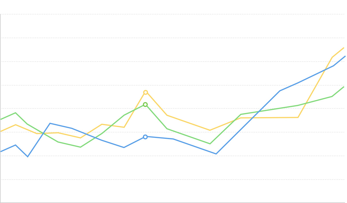
Loading...

Area charts build upon line charts by filling the area between the line and the coordinate axis, emphasizing the magnitude of change in trends. Area charts can better showcase the peaks and valleys in trend changes, using the visual effect of filled regions to emphasize how quantities change over time.
Area charts are particularly suitable for displaying continuous time series data, intuitively expressing the trends of data changes while emphasizing changes in total volume within certain intervals through the visual effect of the filled area.
When you need to display data from multiple series simultaneously, you can use stacked area charts or percentage stacked area charts to compare the proportion of each category in the total and how these proportions change over time.
Other Names: Area Chart, Area Graph

| Chart Type | Basic Area Chart |
|---|---|
| Suitable Data | Time series data: one ordered/continuous data field (usually time), one continuous data field |
| Function | Display data trends over time or ordered dimensions |
| Data-to-Visual Mapping | Time field mapped to horizontal axis position Value field mapped to vertical axis height Area fill emphasizes the degree of data change |
| Suitable Scenarios | Trend changes of a single data series over time |

| Chart Type | Stacked Area Chart |
|---|---|
| Suitable Data | Multi-series time data: one ordered/continuous data field (usually time), one continuous data field, one categorical data field |
| Function | Display trends of multiple data series over time and their stacked total |
| Data-to-Visual Mapping | Time field mapped to horizontal axis position Value field mapped to vertical axis height Category field mapped to different colors and stacked areas |
| Suitable Scenarios | Comparison of multiple data series and their total over time |
Example 1: Suitable for displaying trends in continuous time series
The chart below is an area chart of stock price trends, showing how a company's stock price changes over time.
| date | close |
|---|---|
| 2015/1/5 | 121.73 |
| 2015/1/6 | 115.07 |
| 2015/1/7 | 116.75 |
| ... | ... |
import { Chart } from '@antv/g2';const chart = new Chart({container: 'container',theme: 'classic',});chart.options({type: 'view',autoFit: true,data: {type: 'fetch',value: 'https://assets.antv.antgroup.com/g2/aapl.json',transform: [{type: 'map',callback: (d) => ({...d,date: new Date(d.date),}),},],},encode: { x: 'date', y: 'close' },axis: {x: {title: null,},y: {title: null,},},children: [{type: 'area',style: {fill: 'l(270) 0:#ffffff 0.5:#7ec2f3 1:#1890ff',fillOpacity: 0.6,},},{type: 'line',style: {lineWidth: 2,},},],});chart.render();
Notes:
date field is mapped to the horizontal axis position, indicating the chronological orderclose field is mapped to the vertical axis height and filled area, showing price trends over timeExample 2: Suitable for displaying stacked trends of multiple data series
Stacked area charts can show changes in multiple data series over time, as well as their sum trend. The chart below shows trends in unemployment numbers across different industries.
import { Chart } from '@antv/g2';const chart = new Chart({container: 'container',theme: 'classic',});chart.options({type: 'area',autoFit: true,data: {type: 'fetch',value: 'https://assets.antv.antgroup.com/g2/unemployment-by-industry.json',},encode: {x: (d) => new Date(d.date),y: 'unemployed',color: 'industry',},transform: [{type: 'stackY',},],axis: {x: {title: null,},y: {title: null,},},});chart.render();
Notes:
date field is mapped to the horizontal axis, representing the time dimensionunemployed field is mapped to the vertical axis, representing the number of unemployed peopleindustry field is mapped to color, distinguishing different industriesstackY transformation is used to display the data series in a stacked mannerExample 3: Percentage stacked area chart for displaying proportion changes
When you need to display how each category's proportion of the total changes over time, percentage stacked area charts are a very suitable choice.
import { Chart } from '@antv/g2';const chart = new Chart({container: 'container',theme: 'classic',});chart.options({type: 'area',autoFit: true,data: [{ country: 'Asia', year: '1750', value: 502 },{ country: 'Asia', year: '1800', value: 635 },{ country: 'Asia', year: '1850', value: 809 },{ country: 'Asia', year: '1900', value: 947 },{ country: 'Asia', year: '1950', value: 1402 },{ country: 'Asia', year: '1999', value: 3634 },{ country: 'Asia', year: '2050', value: 5268 },{ country: 'Africa', year: '1750', value: 106 },{ country: 'Africa', year: '1800', value: 107 },{ country: 'Africa', year: '1850', value: 111 },{ country: 'Africa', year: '1900', value: 133 },{ country: 'Africa', year: '1950', value: 221 },{ country: 'Africa', year: '1999', value: 767 },{ country: 'Africa', year: '2050', value: 1766 },{ country: 'Europe', year: '1750', value: 163 },{ country: 'Europe', year: '1800', value: 203 },{ country: 'Europe', year: '1850', value: 276 },{ country: 'Europe', year: '1900', value: 408 },{ country: 'Europe', year: '1950', value: 547 },{ country: 'Europe', year: '1999', value: 729 },{ country: 'Europe', year: '2050', value: 628 },],encode: { x: 'year', y: 'value', color: 'country' },transform: [{ type: 'stackY' }, { type: 'normalizeY' }],axis: {x: {title: null,},y: {title: null,labelFormatter: '.0%',},},});chart.render();
Notes:
stackY and normalizeY transformations to standardize stacked data as percentagesExample 1: Not suitable for comparing precise individual values
Area charts display data changes through filled regions and are not suitable for scenarios requiring precise comparisons of individual values. If the main purpose is to compare specific values across different categories, bar or column charts would be better choices.
Example 2: May cause visual confusion when data fluctuates dramatically
When multiple data series fluctuate dramatically and intersect frequently, using stacked area charts may lead to visual confusion, making it difficult to distinguish specific trend changes in each series. In such cases, consider using multiple line charts or small multiples instead.
Range area charts can represent upper and lower limits of data, commonly used to show data uncertainty or fluctuation ranges.
/*** A recreation of this demo: https://www.anychart.com/zh/products/anychart/gallery/Combined_Charts/Range_Spline-Area,_Spline_and_Marker_Chart.php*/import { Chart } from '@antv/g2';const chart = new Chart({container: 'container',autoFit: true,});chart.options({type: 'view',autoFit: true,data: {type: 'fetch',value: 'https://assets.antv.antgroup.com/g2/range-spline-area.json',transform: [{type: 'map',callback: ([x, low, high, v2, v3]) => ({x,low,high,v2,v3,}),},],},scale: { x: { type: 'linear', tickCount: 10 } },axis: { y: { title: false } },children: [{type: 'area',encode: { x: 'x', y: ['low', 'high'], shape: 'smooth' },style: { fillOpacity: 0.65, fill: '#64b5f6', lineWidth: 1 },},{type: 'point',encode: { x: 'x', y: 'v2', size: 2, shape: 'point' },tooltip: { items: ['v2'] },},{type: 'line',encode: { x: 'x', y: 'v3', color: '#FF6B3B', shape: 'smooth' },},],});chart.render();
Notes:
y: ['low', 'high'] to specify the upper and lower bounds of the rangeDifference area charts are used to compare two data series, highlighting the difference areas between them.
import { Chart } from '@antv/g2';const chart = new Chart({container: 'container',theme: 'classic',});chart.options({type: 'area',autoFit: true,data: {type: 'fetch',value: 'https://assets.antv.antgroup.com/g2/temperature-compare.json',transform: [{type: 'fold',fields: ['New York', 'San Francisco'],key: 'city',value: 'temperature',},],},transform: [{ type: 'diffY' }],encode: {x: (d) => new Date(d.date),y: 'temperature',color: 'city',},scale: {color: {range: ['#67a9cf', '#ef8a62'],},},axis: {y: { title: null },x: { title: null },},});chart.render();
Notes:
transform: [{ type: 'diffY' }] to achieve the difference effect