Pie Chart
Previous
Multi-set Bar Chart
Next
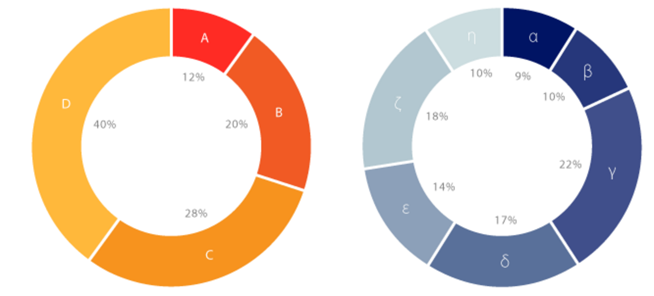
Donut Chart
Loading...

A pie chart is a circular statistical chart that represents data as sectors of a circle, used to display the proportional relationship of different categories within a total. Each sector's angle is proportional to the value it represents, and the entire pie represents the sum of the data.
Pie charts are particularly suitable for displaying the proportional relationships of categorical data, intuitively showing the relative importance of each part within the whole. By using different colored sectors to distinguish categories, comparing the proportions of different categories becomes simple and intuitive.
When there are fewer categories (typically no more than 5-7) and emphasis on the relationship between parts and the whole is needed, pie charts are an excellent choice. For cases with many categories, consider merging smaller proportions into an "Others" category.
Other Names: Pie Chart
| Chart Type | Basic Pie Chart |
|---|---|
| Suitable Data | Categorical data: one categorical data field, one continuous data field |
| Function | Display the proportional relationship of each category within the total |
| Data-to-Graphics Mapping | Category field maps to sector color and labels Value field maps to sector angle size The entire circle represents the data total |
| Suitable Scenarios | Proportion display with fewer categories (within 5-7) |
Example 1: Display market share distribution
The following chart shows the market share proportions of different browsers, clearly displaying the relative position of each browser in the market.
| browser | value (market share) |
|---|---|
| Chrome | 61.04 |
| Safari | 15.12 |
| Edge | 10.52 |
| Firefox | 7.19 |
| Samsung Internet | 2.98 |
| Opera | 3.15 |
import { Chart } from '@antv/g2';const chart = new Chart({container: 'container',theme: 'classic',});chart.options({type: 'interval',autoFit: true,data: [{ browser: 'Chrome', value: 61.04 },{ browser: 'Safari', value: 15.12 },{ browser: 'Edge', value: 10.52 },{ browser: 'Firefox', value: 7.19 },{ browser: 'Samsung Internet', value: 2.98 },{ browser: 'Opera', value: 3.15 },],encode: {y: 'value',color: 'browser',},transform: [{ type: 'stackY' }],coordinate: { type: 'theta' },legend: {color: {position: 'right',rowPadding: 5,},},});chart.render();
Explanation:
browser field maps to color, distinguishing different browsersvalue field maps to angle size, representing market sharecoordinate: { type: 'theta' } to convert bar chart to pie charttransform: [{ type: 'stackY' }] to stack dataExample 2: Display budget allocation
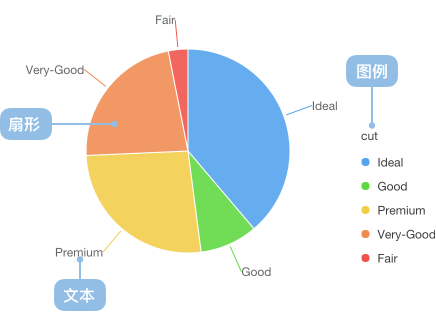
Pie charts are very suitable for displaying budget, expenditure, and other resource allocation situations, allowing people to see the resource proportion of each project at a glance.
import { Chart } from '@antv/g2';const chart = new Chart({container: 'container',theme: 'classic',});chart.options({type: 'interval',autoFit: true,data: [{ category: 'R&D', value: 35 },{ category: 'Marketing', value: 25 },{ category: 'Sales', value: 20 },{ category: 'Operations', value: 15 },{ category: 'Others', value: 5 },],encode: {y: 'value',color: 'category',},transform: [{ type: 'stackY' }],coordinate: { type: 'theta', outerRadius: 0.8 },scale: {color: {palette: 'category10',},},legend: {color: {position: 'right',rowPadding: 5,},},labels: [{text: (d) => `${d.category}: ${d.value}%`,position: 'outside',connector: true,},],});chart.render();
Explanation:
connector: true adds label connection linesouterRadius: 0.8 adjusts pie chart size to leave space for labelsExample 1: Not suitable when there are too many categories
When the number of categories exceeds 7, pie charts become difficult to read and compare. The chart below shows the population proportion of various provinces. Due to the excessive number of categories, it's difficult to clearly compare the population data proportions of each province.
import { Chart } from '@antv/g2';const chart = new Chart({container: 'container',theme: 'classic',});chart.options({type: 'interval',autoFit: true,data: [{ province: 'Beijing', population: 19612368 },{ province: 'Tianjin', population: 12938693 },{ province: 'Hebei', population: 71854210 },{ province: 'Shanxi', population: 27500000 },{ province: 'Inner Mongolia', population: 24706291 },{ province: 'Liaoning', population: 43746323 },{ province: 'Jilin', population: 27452815 },{ province: 'Heilongjiang', population: 38313991 },{ province: 'Shanghai', population: 23019196 },{ province: 'Jiangsu', population: 78660941 },{ province: 'Zhejiang', population: 54426891 },{ province: 'Anhui', population: 59500468 },{ province: 'Fujian', population: 36894217 },{ province: 'Jiangxi', population: 44567797 },{ province: 'Shandong', population: 95792719 },{ province: 'Henan', population: 94029939 },{ province: 'Hubei', population: 57237727 },{ province: 'Hunan', population: 65700762 },{ province: 'Guangdong', population: 104320459 },{ province: 'Guangxi', population: 46023761 },{ province: 'Hainan', population: 8671485 },{ province: 'Chongqing', population: 28846170 },{ province: 'Sichuan', population: 80417528 },{ province: 'Guizhou', population: 34748556 },{ province: 'Yunnan', population: 45966766 },{ province: 'Tibet', population: 3002165 },{ province: 'Shaanxi', population: 37327379 },{ province: 'Gansu', population: 25575263 },{ province: 'Qinghai', population: 5626723 },],encode: {y: 'population',color: 'province',},transform: [{ type: 'stackY' }],coordinate: { type: 'theta' },});chart.render();
Explanation: In such cases, we recommend using bar charts.
Example 2: Not suitable when category proportions are similar
In the chart below, different game genres have similar sales volumes with very small angular differences, making it difficult to visually distinguish size relationships quickly.
import { Chart } from '@antv/g2';const chart = new Chart({container: 'container',theme: 'classic',});chart.options({type: 'interval',autoFit: true,data: [{ genre: 'Sports', sold: 15000 },{ genre: 'Strategy', sold: 14900 },{ genre: 'Action', sold: 15050 },{ genre: 'Shooter', sold: 13000 },{ genre: 'Other', sold: 13900 },],encode: {y: 'sold',color: 'genre',},transform: [{ type: 'stackY' }],coordinate: { type: 'theta', outerRadius: 0.8 },legend: {color: {position: 'bottom',layout: { justifyContent: 'center' },},},labels: [{text: (d, i, data) => {const total = data.reduce((acc, curr) => acc + curr.sold, 0);const percent = ((d.sold / total) * 100).toFixed(2);return `${percent}%`;},style: {fontSize: 10,},},],});chart.render();
Explanation: In the chart above, each category accounts for around 20% with very small differences, making it unsuitable for pie charts. In this case, bar charts would be more appropriate.
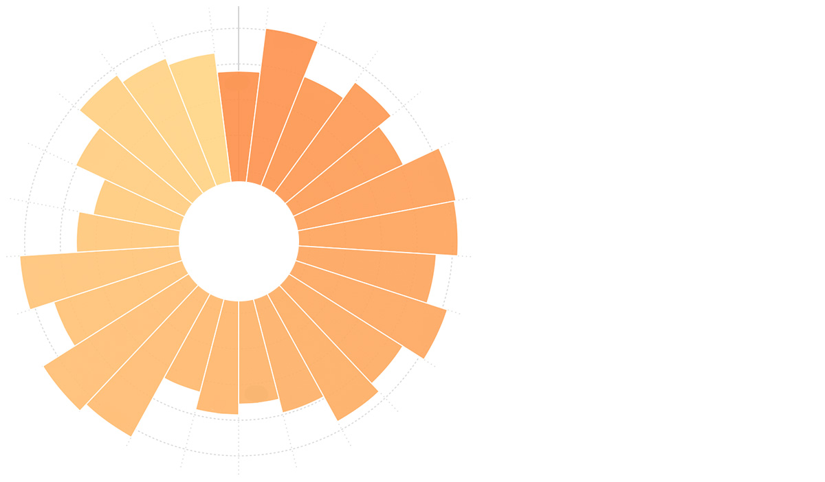
Rose charts use the radius rather than the angle of sectors to represent values, suitable for displaying categorical data with large value differences.
import { Chart } from '@antv/g2';const chart = new Chart({container: 'container',theme: 'classic',});chart.options({type: 'interval',autoFit: true,data: [{ month: 'Jan', value: 120 },{ month: 'Feb', value: 200 },{ month: 'Mar', value: 150 },{ month: 'Apr', value: 80 },{ month: 'May', value: 70 },{ month: 'Jun', value: 110 },{ month: 'Jul', value: 130 },{ month: 'Aug', value: 80 },{ month: 'Sep', value: 140 },{ month: 'Oct', value: 160 },{ month: 'Nov', value: 180 },{ month: 'Dec', value: 190 },],encode: {x: 'month',y: 'value',color: 'month',},coordinate: { type: 'polar' },scale: {x: { padding: 0 },color: {palette: 'rainbow',},},axis: {x: { grid: true },y: { tickCount: 5, grid: true },},legend: false,});chart.render();
Explanation:
coordinate: { type: 'polar' } to create polar coordinate systemRadial jitter scatter plots map traditional pie chart data to points in a polar coordinate system, adding radial jitter to avoid overlapping, suitable for displaying the distribution of categorical data.
import { Chart } from "@antv/g2";const chart = new Chart({ container: "container" });chart.options({type: "point",autoFit: true,data: {type: "fetch",value: "https://gw.alipayobjects.com/os/antvdemo/assets/data/diamond.json",},encode: { x: "clarity", color: "clarity" },transform: [{ type: "jitter" }],coordinate: { type: "polar" },legend: false,});chart.render();
Explanation: