Sunburst Chart
Previous
Stem-and-Leaf Plot
Next
Treemap
Loading...

A sunburst chart is a hierarchical data visualization that displays multi-level data structures using concentric circles. Each level is represented by a ring, where the inner and outer radii indicate the depth of the level, and the angular size represents the data values. Sunburst charts combine the advantages of pie charts and tree diagrams, using circular segmentation to display multi-level nested information structures.
Sunburst charts are particularly suitable for displaying hierarchical data with clear parent-child relationships, providing an intuitive view of proportional relationships and hierarchical structures between different levels. Through their circular layout, sunburst charts effectively showcase hierarchical relationships and proportional distributions in data, offering advantages over tree diagrams such as space efficiency and more intuitive overall visualization.
Sunburst charts also support drill-down interactions, allowing users to click on sectors to view detailed information at specific levels, making them an indispensable tool in business analysis, geographic research, and other fields.
Alternative Names: Radial Tree Chart, Multi-level Pie Chart

| Chart Type | Sunburst Chart |
|---|---|
| Suitable Data | Hierarchical data: nested data structures with multi-level parent-child relationships |
| Function | Display proportional relationships and hierarchical structures in hierarchical data |
| Data to Visual Mapping | Hierarchical relationships mapped to concentric rings Value sizes mapped to sector angles Different categories distinguished by colors |
| Suitable Scenarios | Organizational structures, file systems, budget allocations, and other data with clear hierarchical relationships |
Example 1: Displaying File System Hierarchy
The following chart shows a file system's hierarchical structure, where the sunburst chart clearly displays the size distribution of various folders and files.
import { plotlib } from '@antv/g2-extension-plot';import { Runtime, corelib, extend } from '@antv/g2';const Chart = extend(Runtime, { ...corelib(), ...plotlib() });const chart = new Chart({container: 'container',theme: 'classic',autoFit: true,});chart.options({type: 'sunburst',data: {type: 'fetch',value: 'https://gw.alipayobjects.com/os/antvdemo/assets/data/sunburst.json',},encode: {value: 'sum',},animate: { enter: { type: 'waveIn' } },});chart.render();
Example 2: Displaying Budget Allocation Structure
Sunburst charts can clearly show budget allocation between different projects and sub-projects, helping managers understand resource distribution.
import { plotlib } from '@antv/g2-extension-plot';import { Runtime, corelib, extend } from '@antv/g2';const Chart = extend(Runtime, { ...corelib(), ...plotlib() });const chart = new Chart({container: 'container',theme: 'classic',autoFit: true,});chart.options({type: 'sunburst',data: {type: 'fetch',value: 'https://gw.alipayobjects.com/os/antvdemo/assets/data/sunburst.json',},encode: {value: 'sum',},labels: [{text: 'name',transform: [{type: 'overflowHide',},],},],});chart.render();
Example 1: Readability Issues with Excessive Hierarchy Depth
When hierarchy exceeds 4 levels, the outer sectors of sunburst charts become extremely small and difficult to identify. The following shows a 6-level deep sunburst chart where the outer layers are completely unrecognizable.
Sunburst Chart (Not Recommended)
import { plotlib } from '@antv/g2-extension-plot';import { Runtime, corelib, extend } from '@antv/g2';const Chart = extend(Runtime, { ...corelib(), ...plotlib() });const chart = new Chart({container: 'container',theme: 'classic',autoFit: true,});// Create deep hierarchy data (6 levels) - generated programmaticallyfunction generateDeepData() {const createNode = (prefix, depth, maxDepth) => {if (depth >= maxDepth) {return {label: `${prefix}-Leaf Node`,count: Math.floor(Math.random() * 20) + 5,};}const children = [];const childCount = depth < 3 ? 3 : 2; // First 3 levels have 3 children each, subsequent levels have 2for (let i = 1; i <= childCount; i++) {children.push(createNode(`${prefix}-${i}`, depth + 1, maxDepth));}return {label: `${prefix}`,children: children,};};return createNode('ROOT', 0, 6);}const deepData = generateDeepData();chart.options({type: 'sunburst',data: { value: deepData },encode: {value: 'count',text: 'label',},style: { radius: 4 }, // Small border radiuslegend: false,});chart.render();
Treemap (Recommended)
import { Chart } from '@antv/g2';const chart = new Chart({container: 'container',theme: 'classic',autoFit: true,});// Create deep hierarchy data (6 levels) - generated programmaticallyfunction generateDeepData() {const createNode = (prefix, depth, maxDepth) => {if (depth >= maxDepth) {return {name: `${prefix}-Leaf Node`,value: Math.floor(Math.random() * 20) + 5,};}const children = [];const childCount = depth < 3 ? 3 : 2; // First 3 levels have 3 children each, subsequent levels have 2for (let i = 1; i <= childCount; i++) {children.push(createNode(`${prefix}-${i}`, depth + 1, maxDepth));}return {name: `${prefix}`,children: children,};};return createNode('ROOT', 0, 6);}const deepData = generateDeepData();chart.options({type: 'treemap',data: { value: deepData },layout: {path: (d) => d.name.replace(/\./g, '/'),tile: 'treemapBinary',paddingInner: 1,},encode: {value: 'value',},style: {labelFill: '#000',labelStroke: '#fff',labelLineWidth: 1,labelFontSize: 10,labelPosition: 'top-left',labelDx: 2,labelDy: 2,},legend: false,});chart.render();
Explanation: When data hierarchy is too deep, the outer sectors of sunburst charts become extremely small, labels overlap severely, and users struggle to extract meaningful information. In such cases, treemaps are recommended.
Example 2: Issues with Too Many Categories
When the second level contains more than 20 categories, both color distinction and angle perception in sunburst charts become difficult, with crowded and hard-to-read labels.
Sunburst Chart (Not Recommended)
import { plotlib } from '@antv/g2-extension-plot';import { Runtime, corelib, extend } from '@antv/g2';const Chart = extend(Runtime, { ...corelib(), ...plotlib() });const chart = new Chart({container: 'container',theme: 'classic',autoFit: true,});// Create hierarchical data with too many categories (25 subcategories in second level)const manyData = {label: 'Retail Chain Enterprise',children: [{label: 'North China Region',children: [{ label: 'Beijing Chaoyang Store', count: 142 },{ label: 'Beijing Haidian Store', count: 135 },{ label: 'Beijing Xicheng Store', count: 128 },{ label: 'Tianjin Binhai Store', count: 156 },{ label: 'Shijiazhuang Yuhua Store', count: 98 },{ label: 'Taiyuan Yingze Store', count: 89 },{ label: 'Hohhot Xincheng Store', count: 67 },],},{label: 'East China Region',children: [{ label: 'Shanghai Pudong Store', count: 189 },{ label: 'Shanghai Jingan Store', count: 167 },{ label: 'Hangzhou Xihu Store', count: 145 },{ label: 'Nanjing Gulou Store', count: 134 },{ label: 'Suzhou Park Store', count: 123 },{ label: 'Wuxi New District Store', count: 112 },{ label: 'Ningbo Haishu Store', count: 101 },{ label: 'Hefei Shushan Store', count: 95 },{ label: 'Fuzhou Gulou Store', count: 87 },{ label: 'Xiamen Siming Store', count: 79 },{ label: 'Nanchang Donghu Store', count: 72 },{ label: 'Jinan Lixia Store', count: 88 },{ label: 'Qingdao Shinan Store', count: 94 },{ label: 'Yantai Zhifu Store', count: 76 },{ label: 'Weifang Kuiwen Store', count: 68 },{ label: 'Linyi Lanshan Store', count: 63 },{ label: 'Zibo Zhangdian Store', count: 58 },{ label: 'Weihai Huancui Store', count: 54 },],},],};chart.options({type: 'sunburst',data: { value: manyData },encode: {value: 'count',text: 'label',},labels: [{text: 'name',},],legend: false,});chart.render();
Bar Chart (Recommended)
import { Chart } from '@antv/g2';const chart = new Chart({container: 'container',theme: 'classic',autoFit: true,});const manyCategories = [{ category: 'Beijing Chaoyang Store', value: 142, group: 'North China' },{ category: 'Beijing Haidian Store', value: 135, group: 'North China' },{ category: 'Beijing Xicheng Store', value: 128, group: 'North China' },{ category: 'Tianjin Binhai Store', value: 156, group: 'North China' },{ category: 'Shijiazhuang Yuhua Store', value: 98, group: 'North China' },{ category: 'Taiyuan Yingze Store', value: 89, group: 'North China' },{ category: 'Hohhot Xincheng Store', value: 67, group: 'North China' },{ category: 'Shanghai Pudong Store', value: 189, group: 'East China' },{ category: 'Shanghai Jingan Store', value: 167, group: 'East China' },{ category: 'Hangzhou Xihu Store', value: 145, group: 'East China' },{ category: 'Nanjing Gulou Store', value: 134, group: 'East China' },{ category: 'Suzhou Park Store', value: 123, group: 'East China' },{ category: 'Wuxi New District Store', value: 112, group: 'East China' },{ category: 'Ningbo Haishu Store', value: 101, group: 'East China' },{ category: 'Hefei Shushan Store', value: 95, group: 'East China' },{ category: 'Fuzhou Gulou Store', value: 87, group: 'East China' },{ category: 'Xiamen Siming Store', value: 79, group: 'East China' },{ category: 'Nanchang Donghu Store', value: 72, group: 'East China' },{ category: 'Jinan Lixia Store', value: 88, group: 'East China' },{ category: 'Qingdao Shinan Store', value: 94, group: 'East China' },{ category: 'Yantai Zhifu Store', value: 76, group: 'East China' },{ category: 'Weifang Kuiwen Store', value: 68, group: 'East China' },{ category: 'Linyi Lanshan Store', value: 63, group: 'East China' },{ category: 'Zibo Zhangdian Store', value: 58, group: 'East China' },{ category: 'Weihai Huancui Store', value: 54, group: 'East China' },];chart.options({type: 'interval',data: manyCategories,encode: { x: 'category', y: 'value', color: 'group' },transform: [{ type: 'dodgeX' }],coordinate: { transform: [{ type: 'transpose' }] },legend: { color: { position: 'top' } },});chart.render();
Explanation: When sunburst charts contain too many categories (like the 25 stores shown above), the second-level sectors become too small in angle, labels overlap severely, colors are difficult to distinguish, and the visual effect becomes chaotic. In such cases, grouped bar charts are recommended for clear comparison.
Example 3: Issues with Small Value Differences
When the value differences between second-level categories are very small, the angular differences in sunburst charts are not obvious, making effective comparison difficult.
Sunburst Chart (Not Recommended)
import { plotlib } from '@antv/g2-extension-plot';import { Runtime, corelib, extend } from '@antv/g2';const Chart = extend(Runtime, { ...corelib(), ...plotlib() });const chart = new Chart({container: 'container',theme: 'classic',autoFit: true,});// Create two-level data with very small value differences (second-level city sales differences within 1%)const similarData = {label: 'National Sales Network',children: [{label: 'East China Region',children: [{ label: 'Shanghai', count: 2997 },{ label: 'Hangzhou', count: 3001 },{ label: 'Nanjing', count: 2999 },{ label: 'Suzhou', count: 3003 },],},{label: 'North China Region',children: [{ label: 'Beijing', count: 2998 },{ label: 'Tianjin', count: 3002 },{ label: 'Shijiazhuang', count: 2996 },{ label: 'Jinan', count: 3004 },],},],};chart.options({type: 'sunburst',data: { value: similarData },encode: {value: 'count',text: 'label',},legend: { color: { position: 'bottom' } },});chart.render();
Bar Chart (Recommended)
import { Chart } from '@antv/g2';const chart = new Chart({container: 'container',theme: 'classic',autoFit: true,});// Corresponding bar chart data (8 cities)const smallDiffData = [{ category: 'Shanghai', value: 2997, group: 'East China' },{ category: 'Hangzhou', value: 3001, group: 'East China' },{ category: 'Nanjing', value: 2999, group: 'East China' },{ category: 'Suzhou', value: 3003, group: 'East China' },{ category: 'Beijing', value: 2998, group: 'North China' },{ category: 'Tianjin', value: 3002, group: 'North China' },{ category: 'Shijiazhuang', value: 2996, group: 'North China' },{ category: 'Jinan', value: 3004, group: 'North China' },];chart.options({type: 'interval',data: smallDiffData,encode: { x: 'category', y: 'value', color: 'group' },transform: [{ type: 'dodgeX' }],axis: {y: { nice: false, domain: [2990, 3010] }, // Narrow Y-axis range to highlight differences},legend: { color: { position: 'top' } },});chart.render();
Explanation: When value differences between categories are very small (like the city sales figures above ranging from 2996-3004, with differences less than 0.3%), the angular differences in sunburst charts are extremely minimal, making it impossible for users to visually perceive subtle value differences. In such cases, grouped bar charts with adjusted Y-axis ranges are recommended to highlight the differences.
Adding labels to sunburst charts makes the data clearer and more readable:
import { plotlib } from '@antv/g2-extension-plot';import { Runtime, corelib, extend } from '@antv/g2';const Chart = extend(Runtime, { ...corelib(), ...plotlib() });const chart = new Chart({container: 'container',autoFit: true,});chart.options({type: 'sunburst',data: {type: 'fetch',value: 'https://gw.alipayobjects.com/os/antvdemo/assets/data/sunburst.json',},encode: {value: 'sum',},labels: [{text: 'name',transform: [{type: 'overflowHide',},],},],});chart.render();
By setting color channels, you can better distinguish different categories:
import { plotlib } from '@antv/g2-extension-plot';import { Runtime, corelib, extend } from '@antv/g2';const Chart = extend(Runtime, { ...corelib(), ...plotlib() });const chart = new Chart({container: 'container',autoFit: true,});chart.options({type: 'sunburst',data: {type: 'fetch',value: 'https://gw.alipayobjects.com/os/antvdemo/assets/data/sunburst.json',},encode: {value: 'sum',color: 'label',},});chart.render();
You can customize the appearance of sunburst charts through style configuration:
import { plotlib } from '@antv/g2-extension-plot';import { Runtime, corelib, extend } from '@antv/g2';const Chart = extend(Runtime, { ...corelib(), ...plotlib() });const chart = new Chart({container: 'container',autoFit: true,});chart.options({type: 'sunburst',data: {type: 'fetch',value: 'https://gw.alipayobjects.com/os/antvdemo/assets/data/sunburst.json',},encode: {value: 'sum',},style: {radius: 8,// Built-in opacity fillOpacity, calculated as 0.85 ** depth based on levelfillOpacity: (v) => v['fillOpacity'],fill: (v) => {if (v['path'] === 'Category 3') return 'red';if (v['name'] === 'Category 2.1.1') return 'red';},},});chart.render();
Sunburst charts support drill-down interactions, allowing users to click on sectors for hierarchical navigation:
import { plotlib } from '@antv/g2-extension-plot';import { Runtime, corelib, extend } from '@antv/g2';const Chart = extend(Runtime, { ...corelib(), ...plotlib() });const chart = new Chart({container: 'container',autoFit: true,});chart.options({type: 'sunburst',data: {type: 'fetch',value: 'https://gw.alipayobjects.com/os/antvdemo/assets/data/sunburst.json',},encode: {value: 'sum',},labels: [{text: 'name',transform: [{type: 'overflowHide',},],},],interaction: {drillDown: {breadCrumb: {rootText: 'Start',style: {fontSize: '18px',fill: '#333',},active: {fill: 'red',},},// FixedColor default: true, true -> drillDown update scale, false -> scale keep.isFixedColor: false,},},state: {active: { zIndex: 2, stroke: 'red' },inactive: { zIndex: 1, stroke: '#fff' },},});chart.render();
Sunburst charts can be viewed as multi-level pie charts, offering the following advantages over regular pie charts:
Both sunburst charts and treemaps can display hierarchical data, but with different characteristics:
| Comparison Dimension | Sunburst Chart | Treemap |
|---|---|---|
| Visual Form | Circular layout | Rectangular layout |
| Space Utilization | Circular boundaries, lower space efficiency | Rectangular filling, higher space efficiency |
| Hierarchy Display | Concentric circles, clear hierarchical relationships | Nested rectangles, clear containment relationships |
| Proportion Perception | Angular comparison, moderate accuracy | Area comparison, more accurate |
| Use Cases | Emphasize hierarchical relationships and overall structure | Emphasize precise proportional comparisons |
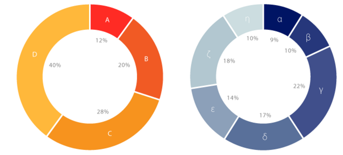
Donut charts can be viewed as two-level sunburst charts:
Advantages of Sunburst Charts over Donut Charts:
Advantages of Donut Charts: