Heatmap
Previous
Donut Chart
Next
Choropleth Map
Loading...

A heatmap is a visualization technique that uses color intensity to map the density or magnitude of two-dimensional data, excelling at revealing distribution patterns, clusters, and anomalies. Heatmaps map two categorical or continuous fields (such as x, y) to coordinate axis and a third numerical field (such as value) to a color gradient, forming a grid-like matrix of colored cells. Typically, cool colors (like blue) represent low values and warm colors (like red) represent high values.
Heatmaps are particularly suitable for displaying the distribution characteristics of large amounts of data points. Through color variations, they intuitively reflect density or intensity changes in a dataset, helping to identify patterns and relationships. When displaying multi-dimensional data, heatmaps are more intuitive than bar charts or scatter plots, clearly showing areas of data concentration and sparsity at a glance.
Heatmaps are widely used in geographic spatial analysis, website user behavior research, correlation analysis in scientific research, and many other scenarios.
Other Names: Heat Map, Thermal Map
| Chart Type | Heatmap with Unsmoothed Boundaries |
|---|---|
| Suitable Data | Three continuous fields |
| Function | Observe data distribution patterns |
| Data-to-Visual Mapping | Two continuous fields mapped to x-axis and y-axis respectively. One continuous metadata mapped to color |
| Suitable Data Volume | More than 30 data points |
| Chart Type | Heatmap with Smoothed Boundaries |
|---|---|
| Suitable Data | Three continuous fields |
| Function | Display data distribution patterns, with statistical algorithms to predict data in unknown areas |
| Data-to-Visual Mapping | Two continuous fields mapped to x-axis and y-axis respectively. One continuous metadata mapped to color |
| Suitable Data Volume | More than 30 data points |
Example 1: Suitable for displaying two-dimensional data distribution density
The heatmap below shows the temperature distribution in a two-dimensional space. Through color variations, you can intuitively see temperature differences across different areas.
import { Chart } from '@antv/g2';const chart = new Chart({container: 'container',autoFit: true,padding: 0,});chart.options({type: 'view',axis: false,children: [{type: 'image',style: {src: 'https://gw.alipayobjects.com/zos/rmsportal/NeUTMwKtPcPxIFNTWZOZ.png',x: '50%',y: '50%',width: '100%',height: '100%',},tooltip: false,},{type: 'heatmap',data: {type: 'fetch',value: 'https://assets.antv.antgroup.com/g2/heatmap.json',},encode: {x: 'g',y: 'l',color: 'tmp',},style: {opacity: 0,},tooltip: false,},],});chart.render();
Notes:
g field is mapped to the x-axis and the l field to the y-axis, representing positions in two-dimensional spacetmp field is mapped to color, representing the temperature value at each positionExample 2: Suitable for displaying density distribution of scatter data
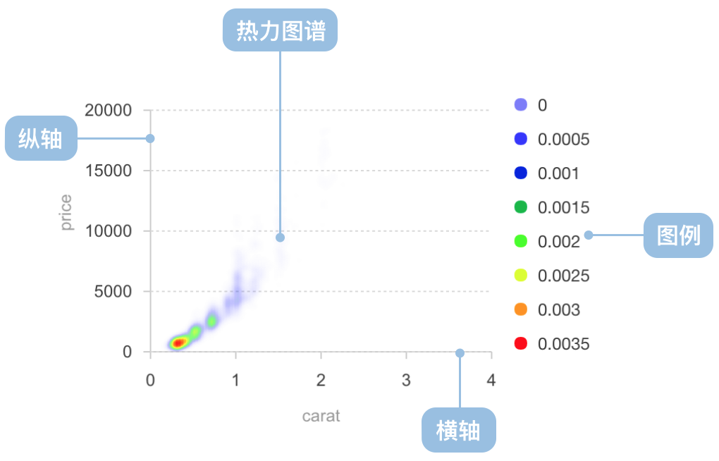
Density heatmaps can show concentration areas of scatter data. The example below shows the relationship between carat and price in a diamond dataset.
import { Chart } from '@antv/g2';import DataSet from '@antv/data-set';const chart = new Chart({container: 'container',autoFit: true,});chart.options({type: 'view',data: {type: 'fetch',value: 'https://assets.antv.antgroup.com/g2/diamond.json',},scale: {x: { nice: true, domainMin: -0.5 },y: { nice: true, domainMin: -2000 },color: { nice: true },},children: [{type: 'heatmap',data: {transform: [{type: 'custom',callback: (data) => {const dv = new DataSet.View().source(data);dv.transform({type: 'kernel-smooth.density',fields: ['carat', 'price'],as: ['carat', 'price', 'density'],});return dv.rows;},},],},encode: {x: 'carat',y: 'price',color: 'density',},style: {opacity: 0.3,gradient: [[0, 'white'],[0.2, 'blue'],[0.4, 'cyan'],[0.6, 'lime'],[0.8, 'yellow'],[0.9, 'red'],],},},{type: 'point',encode: {x: 'carat',y: 'price',},},],});chart.render();
Notes:
carat field and price field are mapped to the x-axis and y-axis respectivelyNotes:
x and y databinX and binY transforms to group and count continuous position dataExample 1: Not suitable for precise comparison of specific values
Heatmaps express value magnitude through color intensity, but human eyes perceive color less precisely than length. If accurate comparison of specific values is needed, bar charts or line charts are better choices.
Example 2: Not suitable for displaying a small number of discrete data points
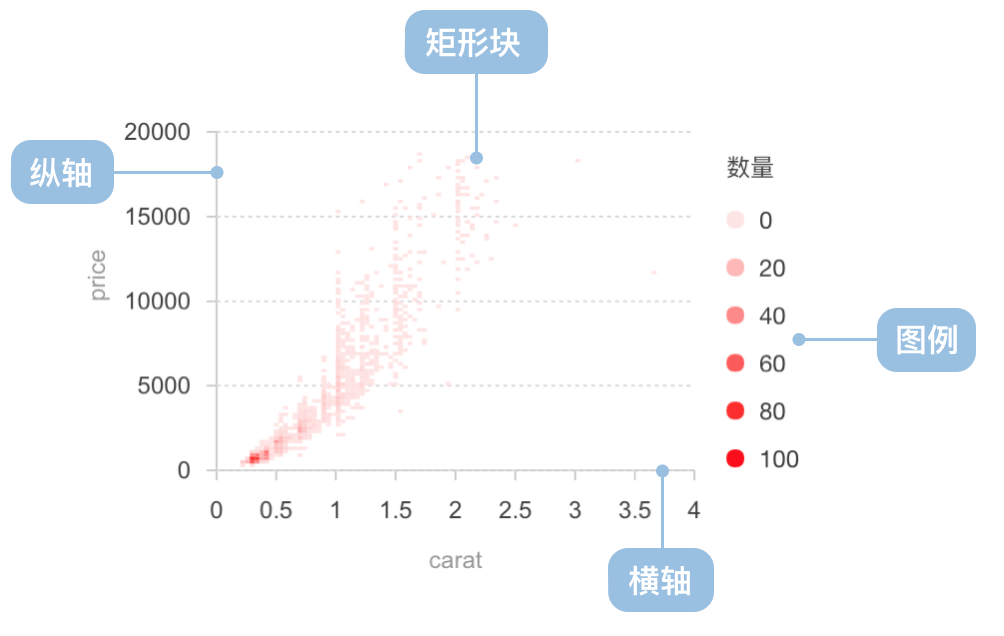
When there are few data points, the density distribution advantage of heatmaps is not obvious. Using scatter plots directly may be clearer and more intuitive.
Threshold heatmaps divide continuous data into discrete color intervals based on preset threshold ranges, suitable for emphasizing data within specific ranges.
import { Chart } from '@antv/g2';const chart = new Chart({container: 'container',autoFit: true,});chart.options({type: 'cell',data: {type: 'fetch',value: 'https://assets.antv.antgroup.com/g2/salary.json',},encode: {x: 'name',y: 'department',color: 'salary',},scale: {color: {type: 'threshold',domain: [7000, 10000, 20000],range: ['#C6E48B', '#7BC96F', '#239A3B', '#196127'],},},});chart.render();
Notes: