Dot Map
Previous
Distribution Curve
Next
Histogram Chart
Loading...

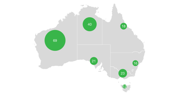
A dot map is a geographic visualization method that represents data distribution density and patterns through densely distributed dots on a geographic map. Each dot typically represents a certain quantity of statistical units (such as population, economic activity, agricultural output, etc.), and the distribution density of dots intuitively reflects the concentration and distribution characteristics of data in geographic space.
The greatest advantage of dot maps is their ability to intuitively display spatial distribution patterns of data. Through the density of dots, you can quickly identify data concentration areas and sparse regions. Compared to choropleth maps, dot maps can more precisely show the continuous distribution characteristics of data within geographic space, avoiding the impact of administrative boundary divisions on data presentation.
Dot maps are widely used in population distribution analysis, economic activity density display, natural resource distribution, disease transmission analysis, and many other geographic data visualization scenarios.
English Name: Dot Map, Dot Density Map
| Chart Type | Basic Dot Map |
|---|---|
| Suitable Data | Data containing geographic coordinates (longitude and latitude) and numerical fields |
| Function | Display data distribution density and patterns in geographic space |
| Data-to-Graphics Mapping | Longitude and latitude fields map to map positions Numerical fields affect the number or density of dots Categorical fields can map to colors Other attributes can map to shapes |
| Suitable Data Volume | Suitable for medium to large amounts of data points (typically 100-10,000 dots) |
The main components of a basic dot map include:
Example 1: US Airport Distribution Dot Map
Based on real US map data and airport location data, showing the geographic distribution of airports across the United States.
/*** Airport Distribution Dot Map Based on Real US Map Data*/import { Chart } from '@antv/g2';import { feature } from 'topojson-client';Promise.all([fetch('https://assets.antv.antgroup.com/g2/us-10m.json').then((res) =>res.json(),),fetch('https://assets.antv.antgroup.com/g2/airports.json').then((res) =>res.json(),),]).then((values) => {const [us, airports] = values;const states = feature(us, us.objects.states).features;const chart = new Chart({container: 'container',autoFit: true,});chart.options({type: 'geoView',coordinate: { type: 'albersUsa' },children: [{type: 'geoPath',data: states,style: {fill: '#f5f5f5',stroke: '#d0d0d0',lineWidth: 1,},},{type: 'point',data: airports,encode: {x: 'longitude',y: 'latitude',color: '#1890ff',shape: 'point',size: 2,},style: {opacity: 0.8,},tooltip: {title: 'name',items: [{ name: 'Airport Code', field: 'iata' },{ name: 'Longitude', field: 'longitude' },{ name: 'Latitude', field: 'latitude' },],},},],});chart.render();});
Description:
albersUsa projection is suitable for displaying geographic data of the continental United StatesExample 2: US Ethnic Distribution Dot Map
Note: The following example uses fictional ethnic distribution data for demonstration purposes
/*** Fictional Data: US Ethnic Distribution Dot Map* Note: This example uses fictional ethnic distribution data for demonstration*/import { Chart } from '@antv/g2';import { feature } from 'topojson-client';Promise.all([fetch('https://assets.antv.antgroup.com/g2/us-10m.json').then((res) =>res.json(),),]).then((values) => {const [us] = values;const states = feature(us, us.objects.states).features;// Fictional ethnic distribution data for major US cities (for demonstration only)const ethnicGroups = [{ type: 'White', ratio: 0.6, color: '#1890ff' },{ type: 'Hispanic', ratio: 0.18, color: '#52c41a' },{ type: 'African American', ratio: 0.13, color: '#faad14' },{ type: 'Asian', ratio: 0.06, color: '#f5222d' },{ type: 'Others', ratio: 0.03, color: '#722ed1' },];// Coordinates of major US cities (with fictional population data)const cities = [{ name: 'New York', lng: -74.0059, lat: 40.7128, population: 850 },{ name: 'Los Angeles', lng: -118.2437, lat: 34.0522, population: 400 },{ name: 'Chicago', lng: -87.6298, lat: 41.8781, population: 270 },{ name: 'Houston', lng: -95.3698, lat: 29.7604, population: 230 },{ name: 'Philadelphia', lng: -75.1652, lat: 39.9526, population: 160 },{ name: 'Phoenix', lng: -112.074, lat: 33.4484, population: 170 },{ name: 'San Antonio', lng: -98.4936, lat: 29.4241, population: 150 },{ name: 'San Diego', lng: -117.1611, lat: 32.7157, population: 140 },{ name: 'Dallas', lng: -96.797, lat: 32.7767, population: 130 },{ name: 'San Jose', lng: -121.8863, lat: 37.3382, population: 100 },{ name: 'Austin', lng: -97.7431, lat: 30.2672, population: 95 },{ name: 'Detroit', lng: -83.0458, lat: 42.3314, population: 67 },{ name: 'Miami', lng: -80.1918, lat: 25.7617, population: 47 },{ name: 'Seattle', lng: -122.3321, lat: 47.6062, population: 75 },{ name: 'Denver', lng: -104.9903, lat: 39.7392, population: 72 },];// Generate fictional ethnic distribution dot dataconst ethnicData = [];cities.forEach((city) => {ethnicGroups.forEach((group) => {// Calculate number of dots based on ethnic ratio and city populationconst pointCount = Math.floor((city.population * group.ratio) / 10); // One dot per 100,000 peoplefor (let i = 0; i < pointCount; i++) {// Randomly distribute dots around the city, different ethnicities have different clustering patternslet angle = Math.random() * 2 * Math.PI;let distance = Math.random() * 1.5; // Distributed within 1.5 degrees// Simulate different ethnic clustering characteristicsif (group.type === 'Asian') {// Asians tend to cluster in specific areasdistance = Math.random() * 0.8;} else if (group.type === 'Hispanic') {// Hispanics are more concentrated in southern citiesif (city.lat < 35) distance = Math.random() * 0.6;}ethnicData.push({city: city.name,lng: city.lng + Math.cos(angle) * distance,lat: city.lat + Math.sin(angle) * distance,ethnicity: group.type,value: 10, // Each dot represents 100,000 people});}});});const chart = new Chart({container: 'container',autoFit: true,});chart.options({type: 'geoView',coordinate: { type: 'albersUsa' },children: [{type: 'geoPath',data: states,style: {fill: '#f5f5f5',stroke: '#d0d0d0',lineWidth: 1,},},{type: 'point',data: ethnicData,encode: {x: 'lng',y: 'lat',color: 'ethnicity',shape: 'ethnicity',size: 2,},style: {opacity: 0.7,stroke: 'white',lineWidth: 0.5,},scale: {color: {domain: ['White', 'Hispanic', 'African American', 'Asian', 'Others'],range: ['#1890ff', '#52c41a', '#faad14', '#f5222d', '#722ed1'],},shape: {domain: ['White', 'Hispanic', 'African American', 'Asian', 'Others'],range: ['point', 'square', 'triangle', 'diamond', 'cross'],},},tooltip: {title: 'city',items: [{ name: 'Ethnicity', field: 'ethnicity' },{ name: 'Population', field: 'value', valueFormatter: (v) => `${v}0k people` },],},},],});chart.render();});
Description:
Example 1: Not Suitable for Precise Numerical Comparison
Dot maps focus on displaying distribution patterns and density, and are not suitable for scenarios requiring precise comparison of specific numerical values. If you need to accurately compare numerical sizes across different regions, you should use choropleth maps or bubble maps.
Example 2: Not Suitable for Displaying Continuous Surface Data
For continuously changing surface data such as temperature and precipitation, the discrete nature of dot maps cannot well represent the continuity of data. In such cases, consider using heatmaps or contour maps.