
Color Map
Previous
Bubble Chart
Next
Distribution Curve
Loading...
A typical color map is a visualization chart that uses color to encode numerical data. It divides a rectangular area into a grid, with each grid cell representing an intersection point of categorical data, using color depth to indicate the magnitude of values. Unlike heat maps, color maps are typically used to display relationships between discrete categorical data rather than continuous data distributions.
Color maps are particularly suitable for showing relationships and patterns between multiple categorical variables, such as sales of different products across different time periods, or temperature changes across different regions over different years. Through color encoding, users can quickly identify high and low value areas and overall distribution patterns in the dataset.
It's important to note that when there are too many categories in a color map, it may lead to label overlap and readability issues, which we'll illustrate with examples below.
Other Names: Color Block Chart
| Chart Type | Basic Color Map |
|---|---|
| Suitable Data | Datasets with two categorical dimensions and one numerical dimension |
| Function | Display relationships between two categorical dimensions and one numerical variable |
| Data-to-Visual Mapping | Two categorical data dimensions mapped to grid rows and columns Numerical data mapped to color depth Text labels can be added to display specific values |
| Suitable Data Count | Usually no more than 20 categories per dimension, with total cells recommended not to exceed 400 |
import { Chart } from '@antv/g2';const chart = new Chart({container: 'container',theme: 'classic',});chart.options({type: 'view',autoFit: true,data: [{ month: 'January', product: 'Product A', sales: 123 },{ month: 'January', product: 'Product B', sales: 231 },{ month: 'January', product: 'Product C', sales: 145 },{ month: 'February', product: 'Product A', sales: 132 },{ month: 'February', product: 'Product B', sales: 112 },{ month: 'February', product: 'Product C', sales: 178 },{ month: 'March', product: 'Product A', sales: 99 },{ month: 'March', product: 'Product B', sales: 288 },{ month: 'March', product: 'Product C', sales: 133 },{ month: 'April', product: 'Product A', sales: 181 },{ month: 'April', product: 'Product B', sales: 223 },{ month: 'April', product: 'Product C', sales: 141 },{ month: 'May', product: 'Product A', sales: 152 },{ month: 'May', product: 'Product B', sales: 219 },{ month: 'May', product: 'Product C', sales: 109 },{ month: 'June', product: 'Product A', sales: 167 },{ month: 'June', product: 'Product B', sales: 187 },{ month: 'June', product: 'Product C', sales: 255 },],coordinate: {type: 'cartesian',},children: [{type: 'cell',encode: {x: 'month',y: 'product',color: 'sales',link: 'sales',},style: {inset: 1,},labels: [{text: 'sales',style: {fill: (d) => (d.sales > 200 ? '#fff' : '#000'),},},],},],legend: {color: {position: 'right',flipPage: false,},},scale: {color: {palette: 'rdBu',offset: (t) => 1 - t,},},});chart.render();

| Chart Type | Color Map with Conditional Formatting |
|---|---|
| Suitable Data | Datasets that need to highlight specific thresholds or ranges |
| Function | Apply different color encodings based on different value ranges, highlighting key data points |
| Data-to-Visual Mapping | In addition to basic color map mappings, custom color intervals and boundary markers can be added |
| Usage Suggestions | Add clear legend explanations for different color intervals Use contrasting colors to represent different data states Avoid using too many color intervals which can cause confusion |
import { Chart } from '@antv/g2';const chart = new Chart({container: 'container',theme: 'classic',});const data = [{ month: 'January', product: 'Product A', sales: 123, target: 150 },{ month: 'January', product: 'Product B', sales: 231, target: 200 },{ month: 'January', product: 'Product C', sales: 145, target: 150 },{ month: 'February', product: 'Product A', sales: 132, target: 150 },{ month: 'February', product: 'Product B', sales: 112, target: 200 },{ month: 'February', product: 'Product C', sales: 178, target: 150 },{ month: 'March', product: 'Product A', sales: 99, target: 150 },{ month: 'March', product: 'Product B', sales: 288, target: 200 },{ month: 'March', product: 'Product C', sales: 133, target: 150 },{ month: 'April', product: 'Product A', sales: 181, target: 150 },{ month: 'April', product: 'Product B', sales: 223, target: 200 },{ month: 'April', product: 'Product C', sales: 141, target: 150 },{ month: 'May', product: 'Product A', sales: 152, target: 150 },{ month: 'May', product: 'Product B', sales: 219, target: 200 },{ month: 'May', product: 'Product C', sales: 109, target: 150 },{ month: 'June', product: 'Product A', sales: 167, target: 150 },{ month: 'June', product: 'Product B', sales: 187, target: 200 },{ month: 'June', product: 'Product C', sales: 255, target: 150 },];// Calculate performance status for each cellconst processedData = data.map((d) => ({...d,// Calculate ratio to targetperformance: d.sales / d.target,// Add status labelstatus:d.sales < d.target * 0.8? 'Below Target': d.sales < d.target? 'Near Target': d.sales < d.target * 1.2? 'Met Target': 'Exceeded Target',}));chart.options({type: 'view',autoFit: true,data: processedData,coordinate: {type: 'cartesian',},children: [{type: 'cell',encode: {x: 'month',y: 'product',color: 'performance',},style: {inset: 1,},labels: [{text: (d) => `${d.sales}/${d.target}`,style: {fill: (d) => (d.performance > 0.95 ? '#fff' : '#000'),textAlign: 'center',fontSize: 11,},},],},],legend: {color: {position: 'right',flipPage: false,},},scale: {color: {type: 'threshold',domain: [0.8, 1, 1.2],range: ['#F4664A', '#FAAD14', '#30BF78', '#0891B2'],},},});chart.render();
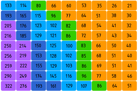
Example 1: Hangzhou Metro Fare Chart
The chart below is a simulation of Hangzhou Metro fare chart. This color map shows the fare relationship between different metro stations, with color depth representing different fare levels. You can quickly identify fare zones and the cost of traveling between any two stations.
| from | to | price |
|---|---|---|
| Xianghu | Binhe Road | 2 |
| Xianghu | Xixing | 3 |
| ... | ... | ... |
import { Chart } from '@antv/g2';const chart = new Chart({container: 'container',theme: 'classic',height: 500,});// Metro stations on Line 1const sites = ['Xianghu','Binkang Road','Xixing','Binhe Road','Jiangling Road','Jinjiang','Wujiang Road','Chengzhan',"Ding'an Road",'Longxiang Bridge','Fengqi Road','Wulin Square','West Lake Cultural Square','Datieguan','East Railway Station','Zhalongkou','Pengbu','Qibao','Jiuhe Road','Jiubao','Passenger Transport Center','Xiaxi West','Jinsha Lake','Gaosha Road','Wenze Road',];// Generate metro fare dataconst data = [];for (let i = 0; i < sites.length; i++) {for (let j = sites.length - 1; j >= i; j--) {let price = 0;const step = Math.abs(j - i);if (step <= 2) {price = 2;} else if (step <= 4) {price = 3;} else if (step <= 7) {price = 4;} else if (step <= 13) {price = 5;} else if (step <= 16) {price = 6;} else if (step <= 21) {price = 7;} else {price = 8;}data.push({ from: sites[i], to: sites[j], price: price });}}chart.options({type: 'view',autoFit: true,data,coordinate: {type: 'cartesian',},children: [{type: 'cell',encode: {x: 'from',y: 'to',color: 'price',},style: {inset: 1,stroke: '#fff',strokeWidth: 1,},labels: [{text: 'price',style: {fill: (d) => (d.price > 5 ? '#fff' : '#000'),textAlign: 'center',fontSize: 10,},},],},],legend: {color: {position: 'right',title: 'Fare (CNY)',flipPage: false,},},scale: {color: {domain: [2, 3, 4, 5, 6, 7, 8],range: ['#ffffcc','#c7e9b4','#7fcdbb','#41b6c4','#2c7fb8','#253494','#081d58',],},from: {values: sites,},to: {values: sites.slice().reverse(),},},axis: {x: {title: false,grid: false,tickLine: false,labelRotate: -Math.PI / 4,labelOffset: 5,},y: {title: false,grid: false,tickLine: false,},},});chart.render();
Analysis:
x and y axis to determine positionExample 2: Exam Score Analysis
import { Chart } from '@antv/g2';const chart = new Chart({container: 'container',theme: 'classic',});const students = ['Alex','Ben','Charlie','David','Emma','Frank','Grace','Helen',];const subjects = ['Math','English','Physics','Chemistry','Biology','History',];// Generate score dataconst data = [];students.forEach((student) => {subjects.forEach((subject) => {// Random score between 50-100const score = Math.floor(Math.random() * 51) + 50;data.push({student,subject,score,});});});chart.options({type: 'view',autoFit: true,data,coordinate: {type: 'cartesian',},children: [{type: 'cell',encode: {x: 'subject',y: 'student',color: 'score',},style: {inset: 1,},labels: [{text: 'score',style: {fill: (d) => (d.score > 85 ? '#fff' : '#000'),textAlign: 'center',},},],},],legend: {color: {position: 'right',flipPage: false,title: 'Score',},},scale: {color: {domain: [60, 70, 80, 90],range: ['#F4664A', '#FAAD14', '#30BF78', '#0891B2', '#5B8FF9'],},},});chart.render();
Example 1: Too Few Data Points
When a dataset has only a few category intersections, a color map may not be the best choice. In such cases, a simple table or bar chart might be more intuitive.
import { Chart } from '@antv/g2';const chart = new Chart({container: 'container',theme: 'classic',});// Very few data pointsconst data = [{ region: 'East', year: '2022', value: 125 },{ region: 'West', year: '2022', value: 87 },];chart.options({type: 'view',autoFit: true,data,children: [{type: 'cell',encode: {x: 'year',y: 'region',color: 'value',},style: {inset: 1,},labels: [{text: 'value',},],},],});chart.render();
In this case, using a bar chart would be more intuitive:
import { Chart } from '@antv/g2';const chart = new Chart({container: 'container',theme: 'classic',});chart.options({type: 'interval',autoFit: true,data: [{ region: 'East', year: '2022', value: 125 },{ region: 'West', year: '2022', value: 87 },],encode: {x: 'region',y: 'value',color: 'region',},labels: [{text: 'value',position: 'top',},],});chart.render();
Example 2: Need to Show Precise Trend Changes
When you need to show precise changes in trends over time, a color map is not as intuitive as a line chart. Below is an example of using a color map to show monthly data changes, but this situation is better suited for a line chart.
import { Chart } from '@antv/g2';const chart = new Chart({container: 'container',theme: 'classic',});const months = ['Jan','Feb','Mar','Apr','May','Jun','Jul','Aug','Sep','Oct','Nov','Dec',];const data = months.map((month, index) => ({month,metric: 'Sales',value: 100 + Math.sin(index / 2) * 50 + Math.random() * 10,}));chart.options({type: 'view',autoFit: true,data,children: [{type: 'cell',encode: {x: 'month',y: 'metric',color: 'value',},style: {inset: 1,},labels: [{text: (d) => d.value.toFixed(0),},],},],});chart.render();
Using a line chart is more suitable for showing trends:
import { Chart } from '@antv/g2';const chart = new Chart({container: 'container',theme: 'classic',});const months = ['Jan','Feb','Mar','Apr','May','Jun','Jul','Aug','Sep','Oct','Nov','Dec',];const data = months.map((month, index) => ({month,value: 100 + Math.sin(index / 2) * 50 + Math.random() * 10,}));chart.options({type: 'line',autoFit: true,data,encode: {x: 'month',y: 'value',},style: {lineWidth: 2,point: {fill: '#1890ff',r: 4,},},labels: [{text: (d) => d.value.toFixed(0),position: 'top',},],});chart.render();
| Chart Type | Main Features | Suitable Scenarios | Data Requirements |
|---|---|---|---|
| Color Map | Uses a regular grid to show intersections of two categorical dimensions | Comparing relationships between categorical data | Two categorical dimensions and one numerical dimension |
| Heat Map | Can use continuous scales, showing spatial distribution of data | Displaying spatial density or intensity distribution | Usually requires continuous or near-continuous data |
| Treemap | Displays hierarchical data through nested rectangles | Representing proportional relationships in hierarchical data | Requires a clear hierarchical structure |
Color Selection
Grid Design
Labels and Interaction
import { Chart } from '@antv/g2';const chart = new Chart({container: 'container',theme: 'classic',});// 生成示例数据const rows = ['A', 'B', 'C', 'D', 'E'];const cols = ['P1', 'P2', 'P3', 'P4', 'P5', 'P6'];const data = [];rows.forEach((row) => {cols.forEach((col) => {const value = Math.floor(Math.random() * 100);const baseline = 50;data.push({row,col,value,diff: value - baseline,performance: value >= baseline ? '达标' : '不达标',});});});console.log('data', data);chart.options({type: 'view',autoFit: true,data,children: [{type: 'cell',encode: {x: 'col',y: 'row',color: 'diff',},style: {inset: 2,},labels: [{text: 'value',style: {fill: (d) => (Math.abs(d.diff) > 25 ? '#fff' : '#000'),textAlign: 'center',fontWeight: 'bold',},},],},],scale: {color: {type: 'threshold',domain: [0],range: ['#2B83BA', '#D7191C'],},},tooltip: {title: (d) => `${d.row}-${d.col}`,items: [{ field: 'value', name: '数值' },{ field: 'diff', name: '与基准差异' },{ field: 'performance', name: '达标状态' },],},legend: false,interaction: [{ type: 'tooltip' }, { type: 'elementHighlight' }],});chart.render();

