Parallel Coordinates
Previous
Pack Chart
Next
Radial Bar Chart
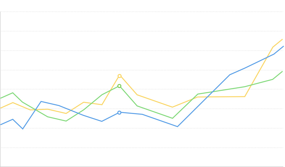
Loading...

Parallel coordinates is a statistical chart with multiple vertical parallel axis. Each vertical axis represents a field, and each field is marked with scales to indicate ranges. Thus, multi-dimensional data can easily find "points" on each axis and connect them to form a polyline. As data increases and lines stack up, analysts may discover characteristics and patterns, such as clustering relationships between data.
Although it may appear similar to a line chart on the surface, parallel coordinates do not represent trends, and there is no causal relationship between the axis. Therefore, when using parallel coordinates, how to determine the order of axis can be artificially decided. Generally speaking, the order affects perception and judgment when reading. The closer two axis are, the stronger people perceive the comparison between them. Therefore, to achieve the most appropriate and aesthetically pleasing ordering, it often requires multiple trials and comparisons. Conversely, trying different arrangements may also help to draw more conclusions.
Additionally, each axis in parallel coordinates may have different data ranges, which can easily cause misunderstanding for readers. When creating charts, it's best to clearly mark the minimum and maximum values on each axis.
English Name: Parallel Coordinates

| Chart Type | Vertical Parallel Coordinates |
|---|---|
| Suitable Data | Table: Multiple continuous data fields, optionally one categorical data field for color encoding |
| Function | Analyze relationships between multiple variables, identify data patterns and clusters |
| Data-Graphics Mapping | Each data dimension maps to a vertical axis Data records map to lines connecting axis Optional categorical field maps to line colors |
| Suitable Data Size | Moderate data volume (recommended not to exceed 1000 records, use transparency or filtering for large datasets) |

| Chart Type | Horizontal Parallel Coordinates |
|---|---|
| Suitable Data | Table: Multiple continuous data fields, optionally one categorical data field for color encoding |
| Function | Analyze relationships between multiple variables, suitable for longer dimension names |
| Data-Graphics Mapping | Each data dimension maps to a horizontal axis Data records map to lines connecting axis |
| Suitable Data Size | Moderate data volume, can accommodate more dimension labels than vertical layout |
Example 1: Multi-dimensional Data Relationship Analysis
The following chart shows the relationships between multiple performance indicators in an automotive dataset, including fuel economy, cylinders, displacement, horsepower, weight, etc.
import { Chart } from '@antv/g2';const axis = {zIndex: 1,titlePosition: 'right',line: true,labelStroke: '#fff',labelLineWidth: 5,labelFontSize: 10,labelStrokeLineJoin: 'round',titleStroke: '#fff',titleFontSize: 10,titleLineWidth: 5,titleStrokeLineJoin: 'round',titleTransform: 'translate(-50%, 0) rotate(-90)',lineStroke: 'black',tickStroke: 'black',lineLineWidth: 1,};const chart = new Chart({container: 'container',theme: 'classic',});chart.options({type: 'line',autoFit: true,data: {type: 'fetch',value: 'https://assets.antv.antgroup.com/g2/cars3.json',},coordinate: { type: 'parallel' },encode: {position: ['economy (mpg)','cylinders','displacement (cc)','power (hp)','weight (lb)','0-60 mph (s)','year',],color: 'weight (lb)',},style: {lineWidth: 1.5,strokeOpacity: 0.4,},scale: {color: {palette: 'brBG',offset: (t) => 1 - t,},},legend: {color: { length: 400, layout: { justifyContent: 'center' } },},axis: {position: axis,position1: axis,position2: axis,position3: axis,position4: axis,position5: axis,position6: axis,position7: axis,},interaction: {tooltip: { series: false },},});chart.render();
Description:
Example 2: Data Clustering Identification
Parallel coordinates can be used to identify data groups with similar patterns.
import { Chart } from '@antv/g2';const chart = new Chart({container: 'container',theme: 'classic',});const axis = {zIndex: 1,titlePosition: 'right',line: true,labelStroke: '#fff',labelLineWidth: 5,labelFontSize: 10,labelStrokeLineJoin: 'round',titleStroke: '#fff',titleFontSize: 10,titleLineWidth: 5,titleStrokeLineJoin: 'round',titleTransform: 'translate(-50%, 0) rotate(-90)',lineStroke: 'black',tickStroke: 'black',lineLineWidth: 1,};chart.options({type: 'line',autoFit: true,data: [{ A: 10, B: 30, C: 20, D: 60, group: 'Group 1' },{ A: 12, B: 32, C: 22, D: 58, group: 'Group 1' },{ A: 8, B: 28, C: 18, D: 62, group: 'Group 1' },{ A: 50, B: 20, C: 80, D: 30, group: 'Group 2' },{ A: 52, B: 18, C: 82, D: 28, group: 'Group 2' },{ A: 48, B: 22, C: 78, D: 32, group: 'Group 2' },{ A: 80, B: 60, C: 40, D: 10, group: 'Group 3' },{ A: 82, B: 58, C: 42, D: 12, group: 'Group 3' },{ A: 78, B: 62, C: 38, D: 8, group: 'Group 3' },],coordinate: { type: 'parallel' },encode: {position: ['A', 'B', 'C', 'D'],color: 'group',},style: {lineWidth: 3,strokeOpacity: 0.8,},scale: {color: {palette: 'category10',},},axis: {position: axis,position1: axis,position2: axis,position3: axis,},legend: {color: { position: 'bottom' },},interaction: {tooltip: { series: false },},});chart.render();
Example 1: Too Few Dimensions
When there are only 2-3 dimensions, scatter plots or other chart types would be more intuitive.
// Not recommended: Using parallel coordinates for only two dimensionsimport { Chart } from '@antv/g2';const chart = new Chart({container: 'container',theme: 'classic',});chart.options({type: 'line',autoFit: true,data: [{ x: 10, y: 30, category: 'A' },{ x: 20, y: 20, category: 'B' },{ x: 30, y: 40, category: 'C' },{ x: 40, y: 35, category: 'D' },{ x: 50, y: 25, category: 'E' },],coordinate: { type: 'parallel' },encode: {position: ['x', 'y'],color: 'category',},style: {lineWidth: 2,strokeOpacity: 0.8,},axis: {position: { zIndex: 1 },position1: { zIndex: 1 },},});chart.render();
For two-dimensional data, scatter plots are more suitable:
// Recommended: Using scatter plot for two-dimensional dataimport { Chart } from '@antv/g2';const chart = new Chart({container: 'container',theme: 'classic',inset: 20,});chart.options({type: 'point',autoFit: true,data: [{ x: 10, y: 30, category: 'A' },{ x: 20, y: 20, category: 'B' },{ x: 30, y: 40, category: 'C' },{ x: 40, y: 35, category: 'D' },{ x: 50, y: 25, category: 'E' },],encode: {x: 'x',y: 'y',color: 'category',size: 20,},scale: {color: {palette: 'category10',},},legend: {color: { position: 'bottom' },},});chart.render();
Example 2: Too Much Data Causing Visual Clutter
When there are too many data records, lines will severely overlap, affecting readability.
import { Chart } from '@antv/g2';// Generate large amounts of data to simulate excessive recordsconst generateData = (count) => {const data = [];for (let i = 0; i < count; i++) {data.push({A: Math.random() * 100,B: Math.random() * 100,C: Math.random() * 100,D: Math.random() * 100,id: i,});}return data;};const chart = new Chart({container: 'container',theme: 'classic',});chart.options({type: 'line',autoFit: true,data: generateData(500), // Large amount of datacoordinate: { type: 'parallel' },encode: {position: ['A', 'B', 'C', 'D'],},style: {lineWidth: 1,strokeOpacity: 0.1, // Still chaotic even with reduced opacitystroke: '#1890ff',},axis: {position: { zIndex: 1 },position1: { zIndex: 1 },position2: { zIndex: 1 },position3: { zIndex: 1 },},});chart.render();
import { Chart } from '@antv/g2';const axis = {zIndex: 1,line: true,labelStroke: '#fff',labelLineWidth: 5,labelFontSize: 10,labelStrokeLineJoin: 'round',titleStroke: '#fff',titleFontSize: 10,titleLineWidth: 5,titleStrokeLineJoin: 'round',lineStroke: 'black',tickStroke: 'black',lineLineWidth: 1,};const chart = new Chart({container: 'container',theme: 'classic',});chart.options({type: 'line',autoFit: true,data: {type: 'fetch',value: 'https://assets.antv.antgroup.com/g2/cars3.json',},coordinate: {type: 'parallel',transform: [{ type: 'transpose' }],},encode: {position: ['economy (mpg)','cylinders','displacement (cc)','power (hp)','weight (lb)',],color: 'weight (lb)',shape: 'smooth',},style: {lineWidth: 1.5,strokeOpacity: 0.4,},scale: {color: {palette: 'brBG',offset: (t) => 1 - t,},},legend: {color: { length: 400, layout: { justifyContent: 'center' } },},axis: {position: axis,position1: axis,position2: axis,position3: axis,position4: axis,},interaction: {tooltip: { series: false },},});chart.render();
Add axis brushing and highlighting functionality to enhance data exploration capabilities:
import { Chart } from '@antv/g2';const axis = {zIndex: 1,titlePosition: 'right',line: true,labelStroke: '#fff',labelLineWidth: 5,labelFontSize: 10,labelStrokeLineJoin: 'round',titleStroke: '#fff',titleFontSize: 10,titleLineWidth: 5,titleStrokeLineJoin: 'round',titleTransform: 'translate(-50%, 0) rotate(-90)',lineStroke: 'black',tickStroke: 'black',lineLineWidth: 1,};const chart = new Chart({container: 'container',theme: 'classic',});chart.options({type: 'line',autoFit: true,data: {type: 'fetch',value: 'https://assets.antv.antgroup.com/g2/cars3.json',},coordinate: { type: 'parallel' },encode: {position: ['economy (mpg)','cylinders','displacement (cc)','power (hp)','weight (lb)',],color: 'cylinders',},scale: {color: {palette: 'brBG',offset: (t) => 1 - t,},},style: {lineWidth: 1.5,strokeOpacity: 0.6,},legend: {color: { position: 'bottom' },},axis: {position: axis,position1: axis,position2: axis,position3: axis,position4: axis,},interaction: {tooltip: { series: false },brushAxisHighlight: {maskFill: '#d8d0c0',maskOpacity: 0.3,},},state: {active: { lineWidth: 3, strokeOpacity: 1 },inactive: { stroke: '#ccc', opacity: 0.3 },},});chart.render();
Inspired by Fathom Information Design, this example shows how to use parallel coordinates to analyze large-scale enterprise data over time. By displaying three dimensions - ranking, revenue, and profit - you can observe enterprise performance trajectories and relationships across different years.
import { Chart } from '@antv/g2';// Using real Fortune 500 dataconst realFortuneData = async () => {// Fortune 500 data for 2022 (Source: GitHub jc22dora/2022Fortune500)const fortune2022 = [{company: 'Walmart',ranking: 1,revenue: 572754,profit: 13673,industry: 'Retail',year: 2022,},{company: 'Amazon',ranking: 2,revenue: 469822,profit: 33364,industry: 'Technology',year: 2022,},{company: 'Apple',ranking: 3,revenue: 365817,profit: 94680,industry: 'Technology',year: 2022,},{company: 'CVS Health',ranking: 4,revenue: 292111,profit: 7910,industry: 'Healthcare',year: 2022,},{company: 'UnitedHealth Group',ranking: 5,revenue: 287597,profit: 17285,industry: 'Healthcare',year: 2022,},{company: 'Exxon Mobil',ranking: 6,revenue: 285640,profit: 23040,industry: 'Energy',year: 2022,},{company: 'Berkshire Hathaway',ranking: 7,revenue: 276094,profit: 89795,industry: 'Finance',year: 2022,},{company: 'Alphabet',ranking: 8,revenue: 257637,profit: 76033,industry: 'Technology',year: 2022,},{company: 'McKesson',ranking: 9,revenue: 238228,profit: 5234,industry: 'Healthcare',year: 2022,},{company: 'AmerisourceBergen',ranking: 10,revenue: 213989,profit: 1551,industry: 'Healthcare',year: 2022,},{company: 'Costco Wholesale',ranking: 11,revenue: 195929,profit: 5007,industry: 'Retail',year: 2022,},{company: 'Cigna',ranking: 12,revenue: 174087,profit: 5408,industry: 'Healthcare',year: 2022,},{company: 'AT&T',ranking: 13,revenue: 168864,profit: -11899,industry: 'Technology',year: 2022,},{company: 'Microsoft',ranking: 14,revenue: 168088,profit: 61271,industry: 'Technology',year: 2022,},{company: 'Cardinal Health',ranking: 15,revenue: 162467,profit: 987,industry: 'Healthcare',year: 2022,},{company: 'Chevron',ranking: 16,revenue: 155607,profit: 15625,industry: 'Energy',year: 2022,},{company: 'Home Depot',ranking: 17,revenue: 151157,profit: 17105,industry: 'Retail',year: 2022,},{company: 'Walgreens Boots Alliance',ranking: 18,revenue: 132703,profit: -3003,industry: 'Healthcare',year: 2022,},{company: 'Marathon Petroleum',ranking: 19,revenue: 128050,profit: 11267,industry: 'Energy',year: 2022,},{company: 'Anthem',ranking: 20,revenue: 118414,profit: 6104,industry: 'Healthcare',year: 2022,},{company: 'Tesla',ranking: 65,revenue: 53823,profit: 5519,industry: 'Technology',year: 2022,},{company: 'Meta Platforms',ranking: 27,revenue: 117929,profit: 39370,industry: 'Technology',year: 2022,},{company: 'Netflix',ranking: 115,revenue: 29698,profit: 4492,industry: 'Technology',year: 2022,},{company: 'NVIDIA',ranking: 134,revenue: 26974,profit: 9752,industry: 'Technology',year: 2022,},{company: 'Adobe',ranking: 235,revenue: 15785,profit: 5788,industry: 'Technology',year: 2022,},];// Simulate 2019-2021 data (reasonable variations based on 2022 data)const generateHistoricalData = (baseData, year) => {return baseData.map((item) => {const yearFactor =year === 2020 ? 0.85 : year === 2021 ? 0.95 : year === 2019 ? 0.9 : 1;const growthVariation = (Math.random() - 0.5) * 0.2; // ±10% random variationreturn {...item,year,revenue: Math.round(item.revenue * yearFactor * (1 + growthVariation)),profit: Math.round(item.profit * yearFactor * (1 + growthVariation * 1.5),), // Profit has larger fluctuationsranking: Math.max(1,Math.min(500, item.ranking + Math.floor((Math.random() - 0.5) * 6)),), // Small ranking fluctuations};});};// Generate multi-year dataconst allYearsData = [...generateHistoricalData(fortune2022, 2019),...generateHistoricalData(fortune2022, 2020),...generateHistoricalData(fortune2022, 2021),...fortune2022,...generateHistoricalData(fortune2022, 2023), // Predicted 2023];return allYearsData;};// Get data and render chartrealFortuneData().then((fortuneData) => {const chart = new Chart({container: 'container',theme: 'classic',marginTop: 200,marginLeft: 50,marginRight: 50,height: 600,width: 800,});const axisConfig = {zIndex: 1,titlePosition: 'right',line: true,lineStroke: '#2c3e50',lineLineWidth: 2,labelStroke: '#fff',labelLineWidth: 4,labelFontSize: 11,labelStrokeLineJoin: 'round',titleStroke: '#fff',titleFontSize: 13,titleLineWidth: 5,titleStrokeLineJoin: 'round',titleTransform: 'translate(-50%, 0) rotate(-90)',tickStroke: '#7f8c8d',tickLineWidth: 1,grid: true,gridStroke: '#ecf0f1',gridStrokeOpacity: 0.5,};chart.options({type: 'line',data: fortuneData.filter((d) => d.year === 2022), // Default to 2022 datacoordinate: { type: 'parallel' },encode: {position: ['ranking', 'revenue', 'profit'],color: 'industry',key: 'company',},style: {lineWidth: 2.5,strokeOpacity: 0.8,cursor: 'pointer',},scale: {position: {range: [0, 1],nice: true,},position1: {nice: true,},position2: {nice: true,},color: {type: 'ordinal',domain: ['Technology', 'Retail', 'Healthcare', 'Finance', 'Energy'],range: ['#3498db', '#e74c3c', '#2ecc71', '#f39c12', '#9b59b6'],},},legend: {color: {position: 'top',title: 'Industry Classification',titleFontSize: 14,},},axis: {position: {...axisConfig,title: 'Fortune 500 Ranking',labelFormatter: (d) => `#${Math.round(d)}`,},position1: {...axisConfig,title: 'Revenue (Million USD)',labelFormatter: (d) => `$${(d / 1000).toFixed(0)}B`,},position2: {...axisConfig,title: 'Net Profit (Million USD)',labelFormatter: (d) =>d >= 0? `$${(d / 1000).toFixed(1)}B`: `-$${Math.abs(d / 1000).toFixed(1)}B`,},},tooltip: {title: (d) => `${d.company} (${d.year})`,items: [{field: 'ranking',name: 'Fortune 500 Ranking',valueFormatter: (d) => `#${d}`,},{field: 'revenue',name: 'Revenue',valueFormatter: (d) => `$${(d / 1000).toFixed(1)} Billion USD`,},{field: 'profit',name: 'Net Profit',valueFormatter: (d) =>d >= 0? `$${(d / 1000).toFixed(1)} Billion USD`: `-$${Math.abs(d / 1000).toFixed(1)} Billion USD`,},{ field: 'industry', name: 'Industry' },],},interaction: {tooltip: {series: false,},brushAxisHighlight: {maskFill: 'rgba(52, 152, 219, 0.15)',maskOpacity: 0.6,},},state: {active: {lineWidth: 4,strokeOpacity: 1,shadowColor: '#2c3e50',shadowBlur: 8,},inactive: {stroke: '#bdc3c7',strokeOpacity: 0.2,},},});chart.render();// Add year switching controlssetTimeout(() => {const container = document.getElementById('container');const controlPanel = document.createElement('div');controlPanel.style.cssText = `position: absolute;top: 10px;left: 10px;background: rgba(255, 255, 255, 0.95);padding: 15px;border-radius: 8px;box-shadow: 0 2px 8px rgba(0,0,0,0.1);z-index: 100;font-family: -apple-system, BlinkMacSystemFont, 'Segoe UI', sans-serif;`;controlPanel.innerHTML = `<div style="margin-bottom: 10px; font-weight: 600; color: #2c3e50;">Fortune 500 Time Series Analysis</div><div style="margin-bottom: 8px;"><label style="font-size: 12px; color: #7f8c8d;">Year:</label><span id="current-year" style="font-weight: 600; color: #2c3e50;">2022</span></div><div style="display: flex; gap: 5px; margin-bottom: 8px;"><button id="prev-year" style="padding: 6px 12px; border: 1px solid #bdc3c7; background: #fff; border-radius: 4px; cursor: pointer; font-size: 12px;">◀ Previous</button><button id="next-year" style="padding: 6px 12px; border: 1px solid #bdc3c7; background: #fff; border-radius: 4px; cursor: pointer; font-size: 12px;">Next ▶</button></div><div style="font-size: 11px; color: #95a5a6; line-height: 1.3;">💡 Data Source:<a href="https://github.com/jc22dora/2022Fortune500" target="_blank" style="color: #3498db;">GitHub</a><br>⌨️ Tip:Use ← → keys to switch years</div>`;container.style.position = 'relative';container.appendChild(controlPanel);const years = [2019, 2020, 2021, 2022, 2023];let currentYearIndex = 3; // Start from 2022 (real data year)const updateChart = (yearIndex) => {const year = years[yearIndex];const yearData = fortuneData.filter((d) => d.year === year);document.getElementById('current-year').textContent = year;chart.changeData(yearData);// Update button statedocument.getElementById('prev-year').disabled = yearIndex === 0;document.getElementById('next-year').disabled =yearIndex === years.length - 1;// Update button styleconst prevBtn = document.getElementById('prev-year');const nextBtn = document.getElementById('next-year');prevBtn.style.opacity = yearIndex === 0 ? '0.5' : '1';nextBtn.style.opacity = yearIndex === years.length - 1 ? '0.5' : '1';};// Button eventsdocument.getElementById('prev-year').onclick = () => {if (currentYearIndex > 0) {currentYearIndex--;updateChart(currentYearIndex);}};document.getElementById('next-year').onclick = () => {if (currentYearIndex < years.length - 1) {currentYearIndex++;updateChart(currentYearIndex);}};// Keyboard eventsdocument.addEventListener('keydown', (e) => {if (e.key === 'ArrowLeft' && currentYearIndex > 0) {currentYearIndex--;updateChart(currentYearIndex);} else if (e.key === 'ArrowRight' &¤tYearIndex < years.length - 1) {currentYearIndex++;updateChart(currentYearIndex);}});// Initialize button stateupdateChart(currentYearIndex);}, 500);});