
Mosaic Plot
Previous
Arc Diagram
Next
Bar Chart
Loading...
A mosaic plot (also known as a Marimekko Chart) is a chart used to display relationships between categorical data. It represents data proportions and classifications through the area and color of rectangles.
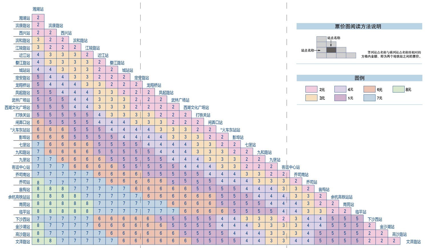
Mosaic plots are divided into two types: uniform and non-uniform. Uniform mosaic plots are more common in daily life, such as subway fare charts, while non-uniform mosaic plots are more frequently used in statistical fields.
Other Names: Mosaic Plot, Marimekko Chart
| Chart Type | Non-uniform Axis Mosaic Plot |
|---|---|
| Suitable Data | Multi-dimensional categorical data |
| Functionality | Display distribution of multi-dimensional categorical data |
| Data Mapping | Categorical data fields map to non-uniform coordinate axis Area and color represent data proportions and classifications |
| Data Size Limit | More effective with higher dimensional data |
| Chart Type | Uniform Axis Mosaic Plot |
|---|---|
| Suitable Data | Two-dimensional categorical data |
| Functionality | Display distribution of two-dimensional categorical data |
| Data Mapping | Categorical data fields map to uniform coordinate axis Color represents data classifications |
| Data Size Limit | More effective with lower dimensional data |
Example 1: Suitable for multi-dimensional categorical data analysis
Example 2: Suitable for two-dimensional categorical data analysis
const chart = new G2.Chart({container: 'container',autoFit: true,height: 400,});chart.options({type: 'cell',data: [{ product: 'Phone', region: 'North', sales: 120, category: 'Premium' },{ product: 'Phone', region: 'East', sales: 180, category: 'Premium' },{ product: 'Phone', region: 'South', sales: 150, category: 'Premium' },{ product: 'Computer', region: 'North', sales: 80, category: 'Mid-range' },{ product: 'Computer', region: 'East', sales: 110, category: 'Mid-range' },{ product: 'Computer', region: 'South', sales: 95, category: 'Mid-range' },{ product: 'Tablet', region: 'North', sales: 60, category: 'Mid-range' },{ product: 'Tablet', region: 'East', sales: 85, category: 'Mid-range' },{ product: 'Tablet', region: 'South', sales: 70, category: 'Budget' },{ product: 'Headphone', region: 'North', sales: 40, category: 'Budget' },{ product: 'Headphone', region: 'East', sales: 55, category: 'Budget' },{ product: 'Headphone', region: 'South', sales: 45, category: 'Budget' },],encode: {x: 'product',y: 'region',color: 'category',size: 'sales',},scale: {color: {palette: 'category10',type: 'ordinal',},size: {type: 'linear',range: [0.3, 1],},},style: {stroke: '#fff',strokeWidth: 2,inset: 2,},legend: {color: {title: 'Product Category',position: 'top',},size: {title: 'Sales Volume',position: 'right',},},axis: {x: {title: 'Product Type',labelAutoRotate: false,},y: {title: 'Sales Region',},},tooltip: {title: (d) => `${d.product} - ${d.region}`,items: [{ field: 'sales', name: 'Sales', valueFormatter: (v) => `${v}K` },{ field: 'category', name: 'Category' },],},});chart.render();
Example 3: Market Segmentation Analysis (Non-uniform Mosaic Plot)
This example demonstrates how to use a non-uniform mosaic plot to display the distribution of different market segments, where the width of each rectangle represents market size, and the height represents the proportion of each market segment.
import { Chart } from '@antv/g2';const chart = new Chart({container: 'container',width: 900,height: 800,paddingLeft: 0,paddingRight: 0,});chart.options({type: 'interval',data: {type: 'fetch',value:'https://gw.alipayobjects.com/os/bmw-prod/3041da62-1bf4-4849-aac3-01a387544bf4.csv',},transform: [{ type: 'flexX', reducer: 'sum' }, // Flexible X-axis width{ type: 'stackY' }, // Y-axis stacking{ type: 'normalizeY' }, // Y-axis normalization],encode: {x: 'market',y: 'value',color: 'segment',},axis: {y: false,},scale: {x: { paddingOuter: 0, paddingInner: 0.01 },},tooltip: 'value',labels: [{text: 'segment',x: 5,y: 5,textAlign: 'start',textBaseline: 'top',fontSize: 10,fill: '#fff',},{text: 'value',x: 5,y: 5,textAlign: 'start',dy: 15,fontSize: 10,fill: '#fff',},],});chart.render();
Example 4: Movie Rating Distribution Analysis (Density Mosaic Plot)
This example demonstrates how to use a density mosaic plot to analyze the relationship between IMDB and Rotten Tomatoes ratings, where the color intensity represents the number of movies.
import { Chart } from '@antv/g2';const chart = new Chart({container: 'container',autoFit: true,});chart.options({type: 'rect',data: {type: 'fetch',value: 'https://assets.antv.antgroup.com/g2/movies.json',},encode: {x: 'IMDB Rating',y: 'Rotten Tomatoes Rating',},transform: [{ type: 'bin', color: 'count', thresholdsX: 30, thresholdsY: 20 },],scale: {color: { palette: 'ylGnBu' },},tooltip: {title: { channel: 'color' },items: [(d, i, data, column) => ({name: 'IMDB Rating',value: `${column.x.value[i]}, ${column.x1.value[i]}`,}),(d, i, data, column) => ({name: 'Rotten Tomatoes Rating',value: `${column.y.value[i]}, ${column.y1.value[i]}`,}),],render: () => '1',},});chart.render();
Example 5: Athletes' Physiological Data Analysis (Grouped Density Mosaic Plot)
This example shows how to use a mosaic plot to display the height and weight distribution of athletes grouped by gender, with opacity representing data point density.
import { Chart } from '@antv/g2';const chart = new Chart({container: 'container',autoFit: true,});chart.options({type: 'rect',data: {type: 'fetch',value: 'https://assets.antv.antgroup.com/g2/athletes.json',},encode: {x: 'weight',y: 'height',color: 'sex',},transform: [{ type: 'bin', opacity: 'count' }],legend: {opacity: false,},style: {inset: 0.5,},tooltip: {title: { channel: 'opacity' },items: [(d, i, data, column) => ({name: 'Weight',value: `${column.x.value[i]}, ${column.x1.value[i]}`,}),(d, i, data, column) => ({name: 'Height',value: `${column.y.value[i]}, ${column.y1.value[i]}`,}),],},});chart.render();
Mosaic plots are not suitable for:

