Radar Chart
Previous
Bubble Map
Next
Bi-directional Bar Chart
Loading...
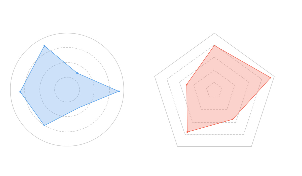
Radar chart, also known as spider chart or web chart, is traditionally considered a chart for displaying multi-dimensional (4+ dimensions) data. It maps multiple dimensions of data onto coordinate axis that start from the same center point and typically end at the circumference. Connecting points of the same group with lines forms the radar chart. While it can display multi-dimensional data, the relative positions of points and angles between axis carry no informational value. With proper axis settings, the area enclosed by the radar chart can convey some information.
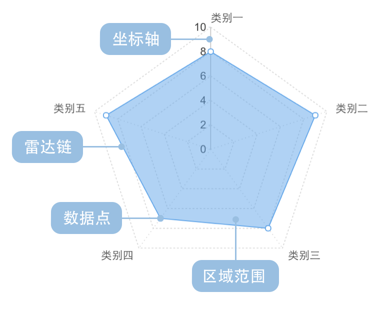
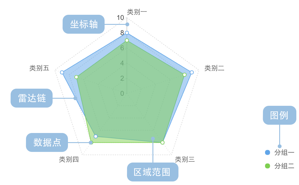
Each dimension's data corresponds to a coordinate axis. These axis share the same center point, are equally spaced radially, and have identical scales. Grid lines connecting the axis serve mainly as auxiliary elements. Connecting data points on each axis forms a polygon. The combination of axis, points, lines, and polygons constitutes a radar chart.
It's important to emphasize that although each axis represents a different dimension, for easier understanding and uniform comparison, radar charts often artificially unify all axis to a single metric (e.g., scores or percentages). This effectively reduces the chart to two dimensions, and this simplified version is more commonly used in daily life. Additionally, radar charts can effectively display the relative weights of variables in a dataset, making them particularly suitable for performance data visualization.
Main disadvantages of radar charts:
Too many polygons can reduce readability and make the chart overly cluttered, especially when polygons are color-filled and overlap.
Too many variables can also decrease readability since each variable requires its own axis, making the chart appear complex. Best practice is to limit the number of variables to keep the radar chart simple and clear.
Notes:
Other Names: Spider Chart, Web Chart, Polar Chart, Star Plots
| Chart Type | Single-Series Radar Chart |
|---|---|
| Suitable Data | One categorical field, one continuous field |
| Function | Compare numerical values across categories |
| Data Mapping | Categorical field maps to angular position in polar coordinates; continuous field maps to radial length |
| Recommended Data Count | No more than 30 items |
| Chart Type | Multi-Series Radar Chart |
|---|---|
| Suitable Data | One continuous field, two categorical fields |
| Function | Compare numerical values across different categories |
| Data Mapping | One categorical field maps to angular position; another maps to color; continuous field maps to radial length |
| Recommended Data Count | No more than 30 items |
Example 1: Multi-dimensional Data Comparison
Below is a radar chart evaluating personal comprehensive abilities.
| Ability | Score (Max 10) |
|---|---|
| Language | 8.8 |
| Logic | 9.0 |
| Affinity | 7.2 |
| Sports | 4.5 |
| Learning | 8.3 |
import { Chart } from '@antv/g2';const chart = new Chart({container: 'container',theme: 'classic',});chart.options({type: 'area',coordinate: {type: 'polar',},autoFit: true,data: [{ ability: 'Language', score: 8.8 },{ ability: 'Logic', score: 9.0 },{ ability: 'Affinity', score: 7.2 },{ ability: 'Sports', score: 4.5 },{ ability: 'Learning', score: 8.3 },],encode: { x: 'ability', y: 'score' },scale: {x: { padding: 0.5, align: 0 },y: {domainMin: 0,domainMax: 10,tickCount: 5,label: false,},},style: {fillOpacity: 0.5,lineWidth: 2,},axis: {x: { grid: true },y: { tick: false, grid: true, title: false, zIndex: 1 },},interaction: {tooltip: { crosshairsLineDash: [4, 4] },},});chart.render();
Explanation:
ability field maps to angular position in polar coordinatesscore field maps to radial lengthExample 2: Performance Comparison Across Multiple Dimensions
This radar chart compares Huawei Mate and ZTE Grand Memo smartphones across five dimensions (sample data).
| Performance | Type | Score (Max 100) |
|---|---|---|
| Usability | Huawei Mate | 80 |
| Features | Huawei Mate | 90 |
| Camera | Huawei Mate | 80 |
| Benchmark | Huawei Mate | 70 |
| Battery | Huawei Mate | 90 |
| Usability | ZTE Grand Memo | 70 |
| Features | ZTE Grand Memo | 82 |
| Camera | ZTE Grand Memo | 81 |
| Benchmark | ZTE Grand Memo | 82 |
| Battery | ZTE Grand Memo | 78 |
import { Chart } from '@antv/g2';const chart = new Chart({container: 'container',theme: 'classic',});chart.options({type: 'line',coordinate: {type: 'polar',},autoFit: true,data: [{ performance: 'Usability', type: 'Huawei Mate', score: 80 },{ performance: 'Features', type: 'Huawei Mate', score: 90 },{ performance: 'Camera', type: 'Huawei Mate', score: 80 },{ performance: 'Benchmark', type: 'Huawei Mate', score: 70 },{ performance: 'Battery', type: 'Huawei Mate', score: 90 },{ performance: 'Usability', type: 'ZTE Grand Memo', score: 70 },{ performance: 'Features', type: 'ZTE Grand Memo', score: 82 },{ performance: 'Camera', type: 'ZTE Grand Memo', score: 81 },{ performance: 'Benchmark', type: 'ZTE Grand Memo', score: 82 },{ performance: 'Battery', type: 'ZTE Grand Memo', score: 78 },],encode: { x: 'performance', y: 'score', color: 'type' },scale: {x: { padding: 0.5, align: 0 },y: {domainMin: 0,domainMax: 100,tickCount: 5,label: false,},},style: {fillOpacity: 0.5,lineWidth: 2,},axis: {x: { grid: true, tick: false, gridLineDash: [0, 0] },y: {tick: false,grid: true,title: false,zIndex: 1,gridLineDash: [0, 0],gridAreaFill: (dataum, index, data) => {return index % 2 === 1 ? 'rgba(0, 0, 0, 0.04)' : '';},},},interaction: {tooltip: { crosshairsLineDash: [4, 4] },},});chart.render();
Explanation:
performance maps to angular positiontype maps to color differentiationscore maps to radial length