logo

G2

  • Docs
  • Chart Introduction
  • API
  • Examples
  • Theme
  • Ecosystem
  • Productsantv logo arrow
  • 5.3.3
  • 📈 Chart Introduction
  • Mosaic Plot
  • Bar Chart
  • Bubble Chart
  • Color Map
  • Histogram Chart
  • Radial Bar Chart
  • Stacked Bar Chart
  • Area Chart
  • Box Plot
  • Bubble Map
  • Radar Chart
  • Bi-directional Bar Chart
  • Multi-set Bar Chart
  • Donut Chart
  • Heatmap
  • Choropleth Map
  • Funnel Chart
  • K-Chart
  • Gauge Chart
  • Contour Line Chart
  • Bullet Chart
  • Sankey Diagram
  • Chord Diagram

Contour Line Chart

Previous
Gauge Chart
Next
Bullet Chart

Resources

Ant Design
Galacea Effects
Umi-React Application Framework
Dumi-Component doc generator
ahooks-React Hooks Library

Community

Ant Financial Experience Tech
seeconfSEE Conf-Experience Tech Conference

Help

GitHub
StackOverflow

more productsMore Productions

Ant DesignAnt Design-Enterprise UI design language
yuqueYuque-Knowledge creation and Sharing tool
EggEgg-Enterprise-class Node development framework
kitchenKitchen-Sketch Tool set
GalaceanGalacean-互动图形解决方案
xtechLiven Experience technology
© Copyright 2025 Ant Group Co., Ltd..备案号:京ICP备15032932号-38

Loading...

contourline

Introduction to Contour Line Charts

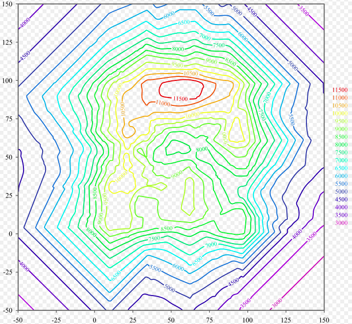
A contour line chart displays closed curves connecting points of equal value on a map or data visualization. The most common example is topographic maps where contour lines connect points of equal elevation, with numbers marked on the lines indicating the elevation height. Contour lines can be classified into four types based on their function: index contours, intermediate contours, supplementary contours, and auxiliary contours.

Beyond topographic maps, contour lines are widely used in data visualization to display three-dimensional data distribution on a two-dimensional plane, such as temperature distribution, pressure distribution, probability density distribution, etc. Contour lines generally do not intersect, but sometimes they may coincide. All points on the same contour line have the same value. In areas where contour lines are sparse, the value changes gradually; where contour lines are dense, the value changes steeply.

Other Names: Contour Plot, Isoline Chart, Level Curve Chart

Components of a Contour Line Chart

contourline-structure
Chart TypeContour Line Chart
Suitable DataThree-dimensional data: two continuous variables (X, Y coordinates) and one numerical variable (Z value)
FunctionDisplay distribution patterns and value changes of continuous data on a two-dimensional plane
Data-to-Visual MappingX coordinate maps to horizontal axis position
Y coordinate maps to vertical axis position
Z value shown through contour line levels and labels
Optionally use color to represent value magnitude
Suitable Data VolumeContinuous two-dimensional grid data; more data points result in smoother contour lines

Use Cases of Contour Line Charts

Suitable Use Cases

  • Terrain Representation: The classic application, using contour lines to represent elevation, clearly showing topographic features like mountains and valleys.
  • Meteorological Data: Displaying spatial variations in temperature distribution, pressure distribution, precipitation distribution, and other meteorological elements.
  • Scientific Research: Showing two-dimensional distributions of electric fields, magnetic fields, concentrations, etc. in physics, chemistry, biology, and other fields.
  • Business Analysis: Displaying the spatial distribution of market share, population density, consumption levels, etc.
  • Probability Density: Showing the distribution patterns of two-dimensional probability density functions in statistics.

Unsuitable Use Cases

  • Discrete Data: Contour lines require continuous value distributions and are not suitable for displaying discrete categorical data.
  • Time Series: Contour lines are primarily used for spatial distribution and are not suitable for showing changes over time.
  • Precise Value Reading: While values can be labeled, contour lines are mainly used to show trends and patterns, not for precise value reading.
  • Sparse Data Points: When data points are too sparse, contour lines generated through interpolation may not be accurate enough.

Here is a typical application scenario for contour line charts:

Terrain Elevation Distribution Map. The chart below shows the elevation distribution of a mountainous area. Through contour lines, you can intuitively see the distribution of peaks, valleys, and slopes. Dense contour lines indicate steep slopes, while sparse contour lines indicate gentle terrain.

import { Chart } from '@antv/g2';
// Simulate terrain elevation data
const terrainData = [];
for (let x = 0; x <= 50; x += 2) {
for (let y = 0; y <= 50; y += 2) {
// Simulate mountain terrain: elevation distribution of two peaks
const elevation1 = 100 * Math.exp(-((x - 15) ** 2 + (y - 15) ** 2) / 200);
const elevation2 = 80 * Math.exp(-((x - 35) ** 2 + (y - 35) ** 2) / 150);
const elevation = elevation1 + elevation2 + 10; // Base elevation
terrainData.push({ x, y, elevation });
}
}
const chart = new Chart({
container: 'container',
autoFit: true,
});
chart.options({
type: 'cell',
data: terrainData,
encode: {
x: 'x',
y: 'y',
color: 'elevation',
},
style: {
stroke: '#333',
strokeWidth: 0.5,
inset: 0.5,
},
scale: {
color: {
palette: 'viridis',
type: 'sequential',
},
},
legend: {
color: {
length: 300,
layout: { justifyContent: 'center' },
labelFormatter: (value) => `${Math.round(value)}m`,
},
},
tooltip: {
title: 'Elevation Information',
items: [
{ field: 'x', name: 'Longitude' },
{ field: 'y', name: 'Latitude' },
{ field: 'elevation', name: 'Elevation', valueFormatter: (value) => `${Math.round(value)}m` },
],
},
});
chart.render();

This example demonstrates:

  1. Using grid cells to simulate contour line effects, displaying terrain elevation distribution
  2. Using color gradients to represent different elevation heights, creating a contour line-like visual effect
  3. Providing interactive hover tooltips showing specific location and elevation information
  4. Using appropriate color mapping (viridis palette) to enhance visual effects
  5. Adding strokes to highlight grid boundaries, enhancing contour line visual perception

Contour Line Chart Extensions

Contour Outline Chart

Using lines to draw contour outlines, closer to traditional topographic map representation.

import { Chart } from '@antv/g2';
// Generate contour line data
const generateContourLines = () => {
const lines = [];
const levels = [20, 40, 60, 80, 100]; // Contour line levels
levels.forEach((level, index) => {
// Generate circular lines for each contour level
const points = [];
const centerX = 25;
const centerY = 25;
const baseRadius = 5 + index * 4;
for (let angle = 0; angle <= 360; angle += 5) {
const radian = (angle * Math.PI) / 180;
const radius = baseRadius + Math.sin(angle * Math.PI / 45) * 2; // Add some variation
const x = centerX + radius * Math.cos(radian);
const y = centerY + radius * Math.sin(radian);
points.push({ x, y, level, lineId: `line_${level}` });
}
lines.push(...points);
});
return lines;
};
const contourLines = generateContourLines();
const chart = new Chart({
container: 'container',
autoFit: true,
height: 400,
});
chart.options({
type: 'line',
data: contourLines,
encode: {
x: 'x',
y: 'y',
color: 'level',
series: 'lineId',
},
style: {
strokeWidth: 2,
strokeOpacity: 0.8,
},
scale: {
color: {
type: 'sequential',
palette: 'oranges',
},
x: { nice: true },
y: { nice: true },
},
axis: {
x: { title: 'Distance (km)' },
y: { title: 'Distance (km)' },
},
legend: {
color: {
title: 'Elevation (m)',
layout: { justifyContent: 'center' },
},
},
tooltip: {
title: 'Contour Information',
items: [
{ field: 'level', name: 'Elevation', valueFormatter: (value) => `${value}m` },
],
},
});
chart.render();
  • 3D Contour Lines: Combining three-dimensional visualization technology to create three-dimensional contour charts that more intuitively display spatial data distribution.
  • Dynamic Contour Lines: Using animation to show data changes over time, such as the temporal evolution of meteorological data.
  • Interactive Annotation: Allowing users to click on contour lines to view specific values or dynamically adjust contour line intervals.
  • Multi-layer Overlay: Overlaying contour lines from multiple data layers in the same chart, such as simultaneously displaying temperature and pressure distributions.

Comparing Contour Line Charts to Other Charts

Contour Line Charts and Heatmaps

  • Contour Line Charts: Use lines to represent areas of equal value, emphasizing value continuity and gradient changes, suitable for showing gradual trends.
  • Heatmaps: Use color filling to represent value magnitude, more intuitively showing absolute value size and spatial distribution patterns.

Contour Line Charts and Scatter Plots

  • Contour Line Charts: Display continuous distribution data patterns, generating smooth isolines through interpolation.
  • Scatter Plots: Display discrete data point distributions, maintaining data originality without interpolation processing.

Contour Line Charts and Topographic Maps

  • Contour Line Charts: Pure data visualization tools that can be used for any two-dimensional continuous data.
  • Topographic Maps: Specifically for geographic information, including roads, rivers, buildings, and other geographic elements in addition to contour lines.

Similar Charts

Categories

Heatmap
Heatmap
Distribution
Comparison
Choropleth Map
Choropleth Map
Map
Distribution