Regression Curve Chart
Previous
Radial Bar Chart
Next
Stacked Area Chart
Loading...

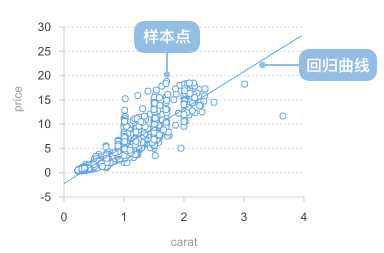
A regression curve chart is a statistical chart that adds regression curves on top of scatter plots to show mathematical relationships between two or more variables and predict trends. Regression curves use mathematical algorithms to fit data points, finding the best functional relationship between variables, helping analyze the inherent patterns in data and make trend predictions.
Regression curve charts combine the data distribution display capability of scatter plots with the predictive functionality of mathematical modeling. They not only intuitively show the distribution of data points but also reveal potential relationships between variables through fitted curves, making them an important tool in data analysis and scientific research.
Common regression types include linear regression, polynomial regression, exponential regression, logarithmic regression, etc. Different regression methods are suitable for different data patterns and relationship types.
English Name: Regression Curve Chart
| Chart Type | Regression Curve Chart |
|---|---|
| Suitable Data | Two continuous data fields: one independent variable field, one dependent variable field |
| Function | Display mathematical relationships between variables, identify data trends, perform predictive analysis |
| Data-Graphics Mapping | Independent variable field maps to horizontal axis position Dependent variable field maps to vertical axis position Data points show original observations Regression curve shows fitted mathematical relationship |
| Suitable Data Amount | 10-1000 data points, enough data points are needed for effective regression analysis |
Components:
Example 1: Linear Relationship Data Analysis
Linear regression is suitable for showing linear relationships between two variables, such as height vs. weight, temperature vs. sales, etc.
import { Chart } from '@antv/g2';import { regressionLinear } from 'd3-regression';const chart = new Chart({container: 'container',theme: 'classic',});chart.options({type: 'view',autoFit: true,data: {type: 'fetch',value: 'https://assets.antv.antgroup.com/g2/linear-regression.json',},children: [{type: 'point',encode: { x: (d) => d[0], y: (d) => d[1] },scale: { x: { domain: [0, 1] }, y: { domain: [0, 5] } },style: { fillOpacity: 0.75, fill: '#1890ff' },},{type: 'line',data: {transform: [{type: 'custom',callback: regressionLinear(),},],},encode: { x: (d) => d[0], y: (d) => d[1] },style: { stroke: '#30BF78', lineWidth: 2 },labels: [{text: 'y = 1.7x + 3.01',selector: 'last',position: 'right',textAlign: 'end',dy: -8,},],tooltip: false,},],axis: {x: { title: 'Independent Variable X' },y: { title: 'Dependent Variable Y' },},});chart.render();
Description:
Example 2: Non-linear Relationship - Quadratic Regression
When data shows a curved trend, quadratic regression (parabola) can be used to fit the data.
import { Chart } from '@antv/g2';import { regressionQuad } from 'd3-regression';const chart = new Chart({container: 'container',theme: 'classic',});const data = [{ x: -4, y: 5.2 },{ x: -3, y: 2.8 },{ x: -2, y: 1.5 },{ x: -1, y: 0.8 },{ x: 0, y: 0.5 },{ x: 1, y: 0.8 },{ x: 2, y: 1.5 },{ x: 3, y: 2.8 },{ x: 4, y: 5.2 },];chart.options({type: 'view',autoFit: true,data,children: [{type: 'point',encode: { x: 'x', y: 'y' },style: { fillOpacity: 0.75, fill: '#1890ff' },},{type: 'line',data: {transform: [{type: 'custom',callback: regressionQuad().x((d) => d.x).y((d) => d.y).domain([-4, 4]),},],},encode: { x: (d) => d[0], y: (d) => d[1] },style: { stroke: '#30BF78', lineWidth: 2 },labels: [{text: 'y = 0.3x² + 0.5',selector: 'last',textAlign: 'end',dy: -8,},],tooltip: false,},],axis: {x: { title: 'Independent Variable X' },y: { title: 'Dependent Variable Y' },},});chart.render();
Description:
Example 3: Exponential Growth Trend Analysis
Exponential regression is suitable for displaying exponential growth or decay data patterns, such as population growth, bacterial reproduction, etc.
import { Chart } from '@antv/g2';import { regressionExp } from 'd3-regression';const chart = new Chart({container: 'container',theme: 'classic',});chart.options({type: 'view',autoFit: true,data: {type: 'fetch',value: 'https://assets.antv.antgroup.com/g2/exponential-regression.json',},children: [{type: 'point',encode: { x: (d) => d[0], y: (d) => d[1] },scale: {x: { domain: [0, 18] },y: { domain: [0, 100000] },},style: { fillOpacity: 0.75, fill: '#1890ff' },},{type: 'line',data: {transform: [{type: 'custom',callback: regressionExp(),},],},encode: {x: (d) => d[0],y: (d) => d[1],shape: 'smooth',},style: { stroke: '#30BF78', lineWidth: 2 },labels: [{text: 'y = 3477.32e^(0.18x)\nR² = 0.998',selector: 'last',textAlign: 'end',dy: -20,},],tooltip: false,},],axis: {x: { title: 'Time' },y: {title: 'Value',labelFormatter: '~s',},},});chart.render();
Description:
Example 1: Insufficient Data Points
When there are too few data points, regression analysis may not be reliable and can lead to misleading conclusions.
import { Chart } from '@antv/g2';import { regressionLinear } from 'd3-regression';const chart = new Chart({container: 'container',theme: 'classic',});const insufficientData = [{ x: 1, y: 2 },{ x: 3, y: 4 },{ x: 5, y: 3 },];chart.options({type: 'view',autoFit: true,data: insufficientData,children: [{type: 'point',encode: { x: 'x', y: 'y' },style: {fillOpacity: 0.8,fill: '#ff4d4f',r: 8,},},{type: 'line',data: {transform: [{type: 'custom',callback: regressionLinear().x((d) => d.x).y((d) => d.y),},],},encode: { x: (d) => d[0], y: (d) => d[1] },style: {stroke: '#ff4d4f',lineWidth: 2,strokeDasharray: [4, 4],},tooltip: false,},],axis: {x: { title: 'Variable X' },y: { title: 'Variable Y' },},title: 'Unsuitable: Regression Analysis with Too Few Data Points',});chart.render();
Problem Description:
Example 2: Data with No Clear Correlation
When there is no clear correlation between two variables, forcing a regression line may mislead the analysis.
import { Chart } from '@antv/g2';import { regressionLinear } from 'd3-regression';const chart = new Chart({container: 'container',theme: 'classic',});// Generate randomly distributed data (no correlation)const randomData = Array.from({ length: 30 }, (_, i) => ({x: Math.random() * 10,y: Math.random() * 10,}));chart.options({type: 'view',autoFit: true,data: randomData,children: [{type: 'point',encode: { x: 'x', y: 'y' },style: {fillOpacity: 0.8,fill: '#ff4d4f',r: 6,},},{type: 'line',data: {transform: [{type: 'custom',callback: regressionLinear().x((d) => d.x).y((d) => d.y),},],},encode: { x: (d) => d[0], y: (d) => d[1] },style: {stroke: '#ff4d4f',lineWidth: 2,strokeDasharray: [4, 4],},labels: [{text: 'R² ≈ 0.02 (extremely low)',selector: 'last',textAlign: 'end',dy: -8,},],tooltip: false,},],axis: {x: { title: 'Variable X' },y: { title: 'Variable Y' },},title: 'Unsuitable: Data with No Correlation',});chart.render();
Problem Description:
When data shows complex curved trends, polynomial regression can be used to fit more complex curves.
import { Chart } from '@antv/g2';import { regressionPoly } from 'd3-regression';const chart = new Chart({container: 'container',theme: 'classic',});const polynomialData = [{ x: 0, y: 140 },{ x: 1, y: 149 },{ x: 2, y: 159.6 },{ x: 3, y: 159 },{ x: 4, y: 155.9 },{ x: 5, y: 169 },{ x: 6, y: 162.9 },{ x: 7, y: 169 },{ x: 8, y: 180 },];chart.options({type: 'view',autoFit: true,data: polynomialData,children: [{type: 'point',encode: { x: 'x', y: 'y' },style: { fillOpacity: 0.75, fill: '#1890ff' },},{type: 'line',data: {transform: [{type: 'custom',callback: regressionPoly().x((d) => d.x).y((d) => d.y),},],},encode: {x: (d) => d[0],y: (d) => d[1],shape: 'smooth',},style: { stroke: '#30BF78', lineWidth: 2 },labels: [{text: 'y = 0.24x³ - 3.00x² + 13.45x + 139.77\nR² = 0.92',selector: 'last',textAlign: 'end',dx: -8,dy: -20,},],tooltip: false,},],axis: {x: { title: 'Time' },y: { title: 'Value' },},});chart.render();
Description:
Logarithmic regression is suitable for data patterns where the growth rate gradually slows down.
import { Chart } from '@antv/g2';import { regressionLog } from 'd3-regression';const chart = new Chart({container: 'container',theme: 'classic',});chart.options({type: 'view',autoFit: true,data: {type: 'fetch',value: 'https://assets.antv.antgroup.com/g2/logarithmic-regression.json',},children: [{type: 'point',encode: { x: 'x', y: 'y' },scale: { x: { domain: [0, 35] } },style: { fillOpacity: 0.75, fill: '#1890ff' },},{type: 'line',data: {transform: [{type: 'custom',callback: regressionLog().x((d) => d.x).y((d) => d.y).domain([0.81, 35]),},],},encode: {x: (d) => d[0],y: (d) => d[1],shape: 'smooth',},style: { stroke: '#30BF78', lineWidth: 2 },labels: [{text: 'y = 0.881·ln(x) + 4.173\nR² = 0.958',selector: 'last',textAlign: 'end',dy: -20,},],tooltip: false,},],axis: {x: { title: 'Variable X' },y: { title: 'Variable Y' },},});chart.render();
Description:
Multiple regression methods can be compared in the same chart to show their comparative effects.
import { Chart } from '@antv/g2';import {regressionLinear,regressionQuad,regressionPoly,} from 'd3-regression';const chart = new Chart({container: 'container',theme: 'classic',});const comparisonData = [{ x: 1, y: 2.1 },{ x: 2, y: 3.9 },{ x: 3, y: 6.8 },{ x: 4, y: 10.2 },{ x: 5, y: 15.1 },{ x: 6, y: 21.5 },{ x: 7, y: 29.8 },{ x: 8, y: 40.2 },];chart.options({type: 'view',autoFit: true,data: comparisonData,children: [{type: 'point',encode: { x: 'x', y: 'y' },style: {fillOpacity: 0.8,fill: '#1890ff',r: 6,},},// Linear regression{type: 'line',data: {transform: [{type: 'custom',callback: regressionLinear().x((d) => d.x).y((d) => d.y),},],},encode: { x: (d) => d[0], y: (d) => d[1] },style: {stroke: '#ff4d4f',lineWidth: 2,strokeDasharray: [4, 4],},tooltip: false,},// Quadratic regression{type: 'line',data: {transform: [{type: 'custom',callback: regressionQuad().x((d) => d.x).y((d) => d.y),},],},encode: { x: (d) => d[0], y: (d) => d[1] },style: {stroke: '#30BF78',lineWidth: 2,},tooltip: false,},],axis: {x: { title: 'Variable X' },y: { title: 'Variable Y' },},legends: [{color: {position: 'top',itemMarker: (color, index) => {if (index === 0)return {symbol: 'line',style: { stroke: '#ff4d4f', strokeDasharray: [4, 4] },};if (index === 1)return { symbol: 'line', style: { stroke: '#30BF78' } };},data: [{ color: '#ff4d4f', value: 'Linear Regression' },{ color: '#30BF78', value: 'Quadratic Regression' },],},},],});chart.render();
Description: