
Line Chart
Previous
Histogram Chart
Next
Pack Chart
Loading...
A line chart is a statistical chart that connects data points in chronological or categorical order to form a line, used to display data trends over time or ordered categories. Through the rise or fall of the line, it can intuitively show the speed, amplitude, range, and periodicity of data changes.
Line charts are particularly suitable for displaying continuous time series data changes and can effectively reflect data trends, fluctuations, periodicity, and anomalies. When comparing multiple data series, line charts use lines of different colors or styles to clearly show the comparison and relationships between different data series.
Compared to area charts, line charts focus more on showing trends and trajectories of data changes rather than total quantities. Compared to bar charts, line charts are more suitable for showing continuous trends rather than discrete numerical comparisons.
Other Names: Line Chart
| Chart Type | Basic Line Chart |
|---|---|
| Suitable Data | Time series data: one ordered/continuous data field (usually time), one continuous data field |
| Function | Display data trends over time or ordered dimensions |
| Data-to-Graphics Mapping | Time field maps to x-axis position Value field maps to y-axis height Data points are connected by lines to show change trajectory |
| Suitable Scenarios | Single data series change trends over time |
| Chart Type | Multi-Series Line Chart |
|---|---|
| Suitable Data | Multi-series time data: one ordered/continuous data field (usually time), one continuous data field, one categorical data field |
| Function | Display trends of multiple data series over time, facilitating comparison of relationships between different series |
| Data-to-Graphics Mapping | Time field maps to x-axis position Value field maps to y-axis height Category field maps to different colored lines |
| Suitable Scenarios | Comparison of multiple data series trends over time |
Example 1: Suitable for displaying continuous time series trends
The following chart is a line chart of stock price trends, showing the change trend of a company's stock price over time.
| date | close |
|---|---|
| 2015/1/5 | 121.73 |
| 2015/1/6 | 115.07 |
| 2015/1/7 | 116.75 |
| ... | ... |
import { Chart } from '@antv/g2';const chart = new Chart({container: 'container',theme: 'classic',});chart.options({type: 'line',autoFit: true,data: {type: 'fetch',value: 'https://assets.antv.antgroup.com/g2/aapl.json',transform: [{type: 'map',callback: (d) => ({...d,date: new Date(d.date),}),},],},encode: { x: 'date', y: 'close' },axis: {x: {title: null,},y: {title: null,},},style: {lineWidth: 2,stroke: '#1890ff',},});chart.render();
Explanation:
date field maps to the x-axis position, representing chronological orderclose field maps to the y-axis height, showing price trends over timeExample 2: Suitable for displaying comparative trends of multiple data series
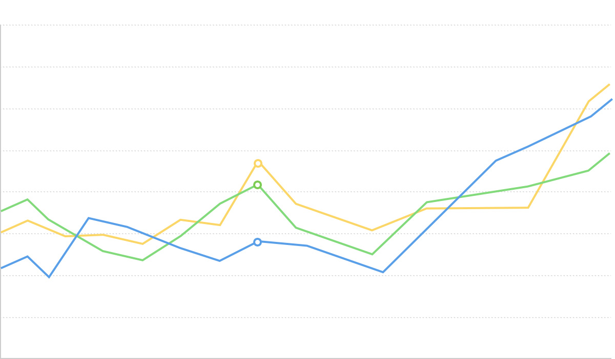
Multi-series line charts can simultaneously display changes of multiple data series over time, facilitating comparative analysis. The following chart shows unemployment rate trends in different regions.
import { Chart } from '@antv/g2';const chart = new Chart({container: 'container',theme: 'classic',});chart.options({type: 'line',autoFit: true,data: {type: 'fetch',value:'https://gw.alipayobjects.com/os/bmw-prod/728a4bdc-9d0b-49e0-a92f-6320a6cddeed.csv',},encode: {x: 'date',y: 'unemployment',color: 'division',},axis: {x: {title: null,},y: {title: null,},},});chart.render();
Explanation:
date field maps to the x-axis, representing the time dimensionunemployment field maps to the y-axis, representing unemployment ratedivision field maps to color, distinguishing different regionsExample 3: Displaying subtle data changes and fluctuations
Line charts can clearly display subtle data changes and fluctuations, especially when there are many data points with frequent changes.
import { Chart } from '@antv/g2';const chart = new Chart({container: 'container',theme: 'classic',});chart.options({type: 'line',autoFit: true,data: [{ month: 'Jan', city: 'Tokyo', temperature: 7 },{ month: 'Jan', city: 'London', temperature: 3.9 },{ month: 'Feb', city: 'Tokyo', temperature: 6.9 },{ month: 'Feb', city: 'London', temperature: 4.2 },{ month: 'Mar', city: 'Tokyo', temperature: 9.5 },{ month: 'Mar', city: 'London', temperature: 5.7 },{ month: 'Apr', city: 'Tokyo', temperature: 14.5 },{ month: 'Apr', city: 'London', temperature: 8.5 },{ month: 'May', city: 'Tokyo', temperature: 18.4 },{ month: 'May', city: 'London', temperature: 11.9 },{ month: 'Jun', city: 'Tokyo', temperature: 21.5 },{ month: 'Jun', city: 'London', temperature: 15.2 },{ month: 'Jul', city: 'Tokyo', temperature: 25.2 },{ month: 'Jul', city: 'London', temperature: 17 },{ month: 'Aug', city: 'Tokyo', temperature: 26.5 },{ month: 'Aug', city: 'London', temperature: 16.6 },{ month: 'Sep', city: 'Tokyo', temperature: 23.3 },{ month: 'Sep', city: 'London', temperature: 14.2 },{ month: 'Oct', city: 'Tokyo', temperature: 18.3 },{ month: 'Oct', city: 'London', temperature: 10.3 },{ month: 'Nov', city: 'Tokyo', temperature: 13.9 },{ month: 'Nov', city: 'London', temperature: 6.6 },{ month: 'Dec', city: 'Tokyo', temperature: 9.6 },{ month: 'Dec', city: 'London', temperature: 4.8 },],encode: { x: 'month', y: 'temperature', color: 'city' },axis: {y: {title: null,labelFormatter: (d) => d + '°C',},x: {title: null,},},style: {lineWidth: 2,},});chart.render();
Explanation:
Example 1: Not suitable for displaying discrete category comparisons
When the horizontal axis data type is unordered categories or the vertical axis data type is continuous time, line charts are not suitable.
We take a scenario comparing sales of different game types as an example. For data representing categorical comparisons, we should use bar charts instead of line charts.
Wrong approach (using line chart):
import { Chart } from '@antv/g2';const chart = new Chart({container: 'container',theme: 'classic',height: 250,});chart.options({type: 'line',autoFit: true,data: [{ genre: 'Sports', sold: 27500 },{ genre: 'Strategy', sold: 11500 },{ genre: 'Action', sold: 6000 },{ genre: 'Shooter', sold: 3500 },{ genre: 'Other', sold: 1500 },],encode: { x: 'genre', y: 'sold' },axis: {x: {title: 'Game Type',},y: {title: 'Sales',labelFormatter: (val) => val / 1000 + 'k',},},style: {lineWidth: 3,stroke: '#1890ff',},});chart.render();
Correct approach (using bar chart):
import { Chart } from '@antv/g2';const chart = new Chart({container: 'container',theme: 'classic',height: 250,});chart.options({type: 'interval',autoFit: true,data: [{ genre: 'Sports', sold: 27500 },{ genre: 'Strategy', sold: 11500 },{ genre: 'Action', sold: 6000 },{ genre: 'Shooter', sold: 3500 },{ genre: 'Other', sold: 1500 },],encode: { x: 'genre', y: 'sold', color: 'genre' },axis: {x: {title: 'Game Type',},y: {title: 'Sales',labelFormatter: (val) => val / 1000 + 'k',},},});chart.render();
Problem description:
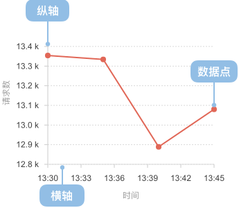
Example 2: Poor effectiveness when data points are few or changes are insignificant
When there are few data points or changes are insignificant, line charts may not fully leverage their advantage of showing trend changes. In such cases, consider using bar charts or dot plots to emphasize comparisons between individual data points.
import { Chart } from '@antv/g2';const chart = new Chart({container: 'container',theme: 'classic',});chart.options({type: 'line',autoFit: true,data: [{ quarter: 'Q1', value: 100 },{ quarter: 'Q2', value: 101 },{ quarter: 'Q3', value: 99 },{ quarter: 'Q4', value: 102 },],encode: { x: 'quarter', y: 'value' },axis: {x: { title: null },y: { title: null },},style: {lineWidth: 2,stroke: '#1890ff',},});chart.render();
Problem description:
Step line charts use horizontal and vertical line segments to connect data points, creating a step-like effect, suitable for displaying data that changes abruptly at specific time points.
import { Chart } from '@antv/g2';const chart = new Chart({container: 'container',theme: 'classic',});chart.options({type: 'line',autoFit: true,data: [{ month: 'Jan', value: 51 },{ month: 'Feb', value: 91 },{ month: 'Mar', value: 34 },{ month: 'Apr', value: 47 },{ month: 'May', value: 63 },{ month: 'June', value: 58 },{ month: 'July', value: 56 },{ month: 'Aug', value: 77 },{ month: 'Sep', value: 99 },{ month: 'Oct', value: 106 },{ month: 'Nov', value: 88 },{ month: 'Dec', value: 56 },],encode: { x: 'month', y: 'value', shape: 'hv' },axis: {x: {title: null,},y: {title: null,},},style: {lineWidth: 2,stroke: '#1890ff',},});chart.render();
Explanation:
encode: { shape: 'hv' } to specify step-like line shapeDashed line charts use different line styles to distinguish different data series or represent specific meanings, such as predicted values, reference lines, etc.
import { Chart } from '@antv/g2';const chart = new Chart({container: 'container',theme: 'classic',});chart.options({type: 'view',autoFit: true,data: [{ year: '1991', value: 3, type: 'Actual' },{ year: '1992', value: 4, type: 'Actual' },{ year: '1993', value: 3.5, type: 'Actual' },{ year: '1994', value: 5, type: 'Actual' },{ year: '1995', value: 4.9, type: 'Actual' },{ year: '1996', value: 6, type: 'Actual' },{ year: '1997', value: 7, type: 'Actual' },{ year: '1998', value: 9, type: 'Actual' },{ year: '1999', value: 13, type: 'Actual' },{ year: '1999', value: 13, type: 'Predicted' },{ year: '2000', value: 16, type: 'Predicted' },{ year: '2001', value: 21, type: 'Predicted' },{ year: '2002', value: 25, type: 'Predicted' },{ year: '2003', value: 30, type: 'Predicted' },],children: [{type: 'line',encode: { x: 'year', y: 'value', color: 'type' },style: {lineWidth: 2,lineDash: (d) => (d[0].type === 'Predicted' ? [4, 4] : null),},},{type: 'point',encode: { x: 'year', y: 'value', color: 'type', shape: 'circle' },},],scale: {color: {range: ['#1890FF', '#FF6B3B'],},},axis: {x: { title: null },y: { title: null },},});chart.render();
Explanation:
lineDash: (d) => (d[0].type === 'Predicted' ? [4, 4] : null) to set dashed line style for predicted values

