Spiral
Previous
Contour Line Chart
Next
Word Cloud
Loading...
 ## Introduction
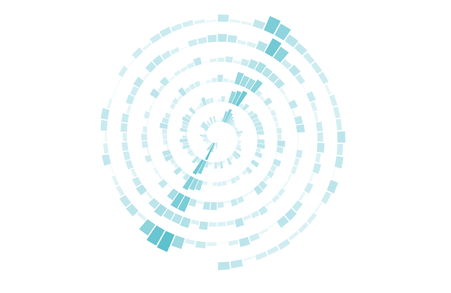
A spiral chart is based on the Archimedes spiral coordinate system and is commonly used to plot time-varying data, drawing from the center of the spiral outward.
Spiral charts have two major advantages:
By converting a linear time axis into a spiral shape in polar coordinates, spiral charts not only clearly show temporal trends but also highlight periodic patterns and outliers in the data. This representation offers unique visual advantages when handling large amounts of time series data, particularly suitable for observing data cycles and change trends.
Chinese Name: 螺旋图
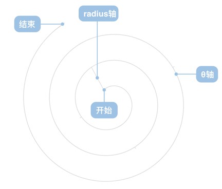
A spiral chart consists of several main components:
| Chart Type | Spiral Chart |
|---|---|
| Suitable Data | One time data field, one continuous field |
| Function | Observe data cycles and change trends |
| Data to Visual Mapping | Time data field maps to rotation angle θ axis, continuous field maps to coil spacing radius axis |
| Suitable Data Volume | 100+ records |
Example 1: Displaying Trends in Large Datasets
Due to the nonlinear nature of the spiral graph, it is not easy to accurately compare specific values or rates of change.
import { Chart } from "@antv/g2";// 需要精确对比的数据示例const data = [];const categories = ['产品A', '产品B', '产品C', '产品D'];categories.forEach((category, index) => {for (let month = 1; month <= 12; month++) {data.push({time: `2023-${month.toString().padStart(2, '0')}`,category: category,sales: 80 + index * 5 + Math.random() * 10 // 接近的数值,需要精确比较});}});const chart = new Chart({container: "container",autoFit: true,height: 400,padding: [50, 50, 50, 50]});chart.options({type: 'interval',data,coordinate: {type: 'helix',startAngle: 1 * Math.PI,endAngle: 5 * Math.PI},encode: {x: 'time',y: 'sales',color: 'category'},scale: {color: {palette: ['#1890ff', '#52c41a', '#fa8c16', '#f5222d']},time: {type: 'time',mask: 'yyyy.mm'}},style: {fillOpacity: 0.8},});chart.render();
While spiral charts have many advantages, they also have some limitations:
1. Scenarios with Too Little Data
Spiral charts require sufficient data points (usually 100+ records) to form a complete spiral shape. If there's too little data, the spiral effect is not obvious, and regular line charts or scatter plots would be more appropriate.
import { Chart } from "@antv/g2";const chart = new Chart({ container: "container" });chart.options({type: "interval",autoFit: true,height: 500,data: {value: [{ time: "2025.07.11", value: 15 },{ time: "2025.07.12", value: 50 },{ time: "2025.07.13", value: 50 },{ time: "2025.07.14", value: 86 },{ time: "2025.07.15", value: 60 },],},encode: { x: "time", y: "value", color: "value" },scale: { color: { type: "linear", range: ["#ffffff", "#1890FF"] } },coordinate: {type: "helix",startAngle: 1.5707963267948966,endAngle: 39.269908169872416,},animate: { enter: { type: "fadeIn" } },tooltip: { title: "time" },});chart.render();
Better Line Chart Example:
import { Chart } from "@antv/g2";// Same 5-day data displayed as a line chartconst data = [];const dates = ['2023-01-01', '2023-01-02', '2023-01-03', '2023-01-04', '2023-01-05'];const values = [45, 68, 52, 71, 59]; // Simulate 5 days of sales datadates.forEach((date, index) => {data.push({time: date,value: values[index]});});const chart = new Chart({container: "container",autoFit: true,height: 400,padding: [50, 50, 50, 50]});chart.options({type: 'line',data,encode: {x: 'time',y: 'value'},scale: {time: {type: 'time',mask: 'yyyy.mm.dd'}},style: {stroke: '#1890ff',strokeWidth: 3,lineJoin: 'round'},point: {style: {fill: '#1890ff',stroke: '#ffffff',strokeWidth: 2,r: 6}},axis: {x: {title: 'Time',labelAutoRotate: false},y: { title: 'Sales' }},title: 'Recommended: Line Chart for Small Data Sets (5 days)'});chart.render();
2. Scenarios Requiring Precise Value Comparison
Due to the non-linear nature of spiral charts, they are not convenient for precise comparison of specific values or rates of change. In such cases, charts in a Cartesian coordinate system are more suitable.
import { Chart } from "@antv/g2";// Data requiring precise comparisonconst data = [];const categories = ['Product A', 'Product B', 'Product C', 'Product D'];categories.forEach((category, index) => {for (let month = 1; month <= 12; month++) {data.push({time: `2023-${month.toString().padStart(2, '0')}`,category: category,sales: 80 + index * 5 + Math.random() * 10 // Close values requiring precise comparison});}});const chart = new Chart({container: "container",autoFit: true,height: 400,padding: [50, 50, 50, 50]});chart.options({type: 'interval',data,coordinate: {type: 'helix',startAngle: 1 * Math.PI,endAngle: 5 * Math.PI},encode: {x: 'time',y: 'sales',color: 'category'},scale: {color: {palette: ['#1890ff', '#52c41a', '#fa8c16', '#f5222d']},time: {type: 'time',mask: 'yyyy.mm'}},style: {fillOpacity: 0.8},title: 'Unsuitable Case: Difficult to Compare Precise Values'});chart.render();
Displaying spiral comparisons of multiple related data series:
import { Chart } from "@antv/g2";// Generate multi-layer spiral dataconst data = [];const series = ['Series A', 'Series B', 'Series C'];series.forEach((seriesName, seriesIndex) => {for (let i = 0; i < 120; i++) {const angle = (i / 120) * 4 * Math.PI;const baseRadius = 30 + seriesIndex * 15; // Different radius for different seriesconst radius = baseRadius + i * 0.8;// Different series have different data patternslet value;if (seriesIndex === 0) {value = 50 + 20 * Math.sin(angle);} else if (seriesIndex === 1) {value = 45 + 25 * Math.cos(angle * 0.5);} else {value = 55 + 15 * Math.sin(angle * 2);}value += Math.random() * 10;data.push({time: i,angle: angle * 180 / Math.PI,radius: radius,value: value,series: seriesName});}});const chart = new Chart({container: "container",autoFit: true,height: 600,padding: [50, 50, 50, 50]});chart.options({type: 'line',data,coordinate: { type: 'polar' },encode: {x: 'angle',y: 'radius',color: 'series'},scale: {color: {palette: ['#1890ff', '#52c41a', '#fa8c16']},x: { type: 'linear' },y: { type: 'linear' }},style: {strokeWidth: 2,strokeOpacity: 0.8},axis: {x: { title: null },y: { title: 'Spiral Progress' }},legend: {color: { title: 'Data Series' }},title: 'Multi-layer Spiral Comparison Chart'});chart.render();
Gene spiral charts are a specialized application of spiral charts in bioinformatics, commonly used to display patterns of gene expression data over time. Through the helical coordinate system, differences in gene expression under different conditions (such as wild-type WT and knockout KO) can be clearly observed:
import { Chart } from "@antv/g2";// Simulate gene expression dataconst data = [];const groups = ['WT', 'KO']; // Wild-type and knockoutconst hours = 72; // 72-hour time seriesconst baseValues = {WT: 2.0, // Wild-type baseline expression levelKO: 2.3, // Knockout baseline expression level};for (let i = 0; i < hours; i++) {const time = `${i}h`;groups.forEach((group) => {// Simulate cyclical changes and random fluctuations in gene expressionconst cyclicPattern = Math.sin(i / 10) * 0.3; // Cyclical patternconst randomNoise = Math.random() * 0.4 - 0.2; // Random noiseconst trendFactor = group === 'KO' ? 0.1 : 0; // Knockout may have slight upward trenddata.push({time,group,logFPKM: baseValues[group] + cyclicPattern + randomNoise + (i * trendFactor / 100)});});}const chart = new Chart({container: "container",autoFit: true,height: 600,padding: [50, 50, 50, 50]});chart.options({type: 'interval',data,coordinate: {type: 'helix',startAngle: 0.2 * Math.PI,endAngle: 6.5 * Math.PI,innerRadius: 0.1,},encode: {x: 'time',y: 'group',color: 'logFPKM'},scale: {color: {type: 'linear',range: ['#fff', '#ec4839']}},style: {fillOpacity: 0.8},tooltip: {title: 'time',items: [{ field: 'group', name: 'Group' },{field: 'logFPKM',name: 'log(FPKM)',valueFormatter: (value) => value.toFixed(2),},],},animate: {enter: { type: 'fadeIn', duration: 1000 }},axis: {x: { title: 'Time Course' },y: { title: 'Gene Group' }},legend: {color: { title: 'Gene Expression Level log(FPKM)' }},title: 'Gene Expression Spiral Chart: WT vs KO (72 hours)'});chart.render();
This visualization approach is particularly suitable for: