
Radial Bar Chart
Previous
Parallel Coordinates
Next
Regression Curve Chart
Loading...

The Radial Bar Chart (also known as Circular Bar Chart) is an affine transformation of a bar chart from Cartesian coordinate system to polar coordinate system. Its meaning and usage are similar to Bar Charts.
The Radial Bar Chart has a radius feedback effect. Since the radial bar chart uses angle to represent the size of each ring's value, the angle is the determining factor. So, even if the value of the outer ring (larger radius) is smaller than the inner ring (smaller radius), each outer ring will appear relatively longer than the inner rings. This can cause visual misunderstanding.
Moreover, because our visual system is better at comparing straight lines, the Cartesian coordinate system is more suitable for comparing the numerical values of different categories. Therefore, from a practical perspective, radial bar charts are more of an aesthetic need.
Other Names: Circular Bar Chart
| Chart Type | Radial Bar Chart |
|---|---|
| Suitable Data | List: one categorical data field, one continuous data field |
| Function | Display comparison of categorical data values in an aesthetic way |
| Data-Visual Mapping | Category field maps to circular position Value field maps to arc length (angle) Colors can distinguish different categories |
| Suitable Data Volume | No more than 15 data points |
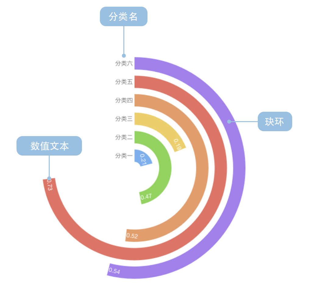
A complete radial bar chart contains the following elements:
Example 1: Displaying categorical data comparison (requires sorting)
The chart below shows the level of American public concern about different areas of US-China issues.
| Issue | Attention Rate |
|---|---|
| Taiwan Relations | 0.21 |
| China's Growing Military Power | 0.47 |
| China's Impact on Global Environment | 0.49 |
| US Trade Deficit with China | 0.52 |
| China's Human Rights Policy | 0.53 |
| Cyber Attacks from China | 0.54 |
| China Taking Away American Jobs | 0.60 |
| China Holding US Massive Debt | 0.67 |
import { Chart } from '@antv/g2';const chart = new Chart({container: 'container',theme: 'classic',width: 1000,height: 700,});chart.options({type: 'interval',data: [{ question: 'Taiwan Relations', percent: 0.21, odd: 0 },{ question: "China's Growing Military Power", percent: 0.47, odd: 1 },{ question: "China's Impact on Global Environment", percent: 0.49, odd: 0 },{ question: 'US Trade Deficit with China', percent: 0.52, odd: 1 },{ question: "China's Human Rights Policy", percent: 0.53, odd: 0 },{ question: 'Cyber Attacks from China', percent: 0.54, odd: 1 },{ question: 'China Taking Away American Jobs', percent: 0.6, odd: 0 },{ question: 'China Holding US Massive Debt', percent: 0.67, odd: 1 },],coordinate: { type: 'radial', innerRadius: 0.2 },encode: {x: 'question',y: 'percent',color: 'odd',},scale: {color: {range: ['rgb(211,0,57)', 'rgb(224,74,116)'],},y: { domain: [0, 1] },},style: {radiusTopLeft: 4,radiusTopRight: 4,},label: {text: 'percent',position: 'inside',style: {fontWeight: 'bold',fill: 'white',},},axis: {x: {label: {autoRotate: true,autoEllipsis: true,style: {fontSize: 10,},},},y: {label: false,grid: false,},},interaction: [{type: 'elementHighlight',background: true,},],});chart.render();
Example 2: Displaying country data comparison
The chart below shows the percentage of people in each country who think climate change is a serious problem.
import { Chart } from '@antv/g2';const chart = new Chart({container: 'container',theme: 'classic',width: 1200,height: 800,});chart.options({type: 'interval',data: [{ country: 'China', percent: 0.18, condition: 'Special' },{ country: 'Russia', percent: 0.33, condition: 'Normal' },{ country: 'UK', percent: 0.41, condition: 'Normal' },{ country: 'USA', percent: 0.45, condition: 'Normal' },{ country: 'South Korea', percent: 0.48, condition: 'Normal' },{ country: 'Canada', percent: 0.51, condition: 'Normal' },{ country: 'Germany', percent: 0.55, condition: 'Normal' },{ country: 'Vietnam', percent: 0.69, condition: 'Normal' },{ country: 'Brazil', percent: 0.86, condition: 'Normal' },],coordinate: {type: 'radial',innerRadius: 0.3,startAngle: -Math.PI,endAngle: -0.25 * Math.PI,},encode: {x: 'country',y: 'percent',color: 'condition',},scale: {color: {range: ['#2370AE', '#A34265', '#505051'],},},style: {radiusTopLeft: 2,radiusTopRight: 2,},label: {text: 'percent',position: 'inside',style: {fontWeight: 'bold',fill: 'white',fontSize: 10,},},axis: {x: {label: {autoRotate: true,autoEllipsis: true,style: {fontSize: 12,},},},y: {label: false,grid: false,},},interaction: [{type: 'elementHighlight',background: true,},],});chart.render();
Example 1: Unsorted data can be misleading
As mentioned in the introduction, radial bar charts have a radius feedback effect. Visually, rings with larger radius will appear bigger, while those with smaller radius appear smaller. This can cause misuse of radial bar charts. Therefore, we believe that radial bar charts must be sorted when used.
The following shows a comparison between incorrect and correct usage:
Incorrect Example (Unsorted):
import { Chart } from '@antv/g2';const chart = new Chart({container: 'container',theme: 'classic',width: 1000,height: 700,});chart.options({type: 'interval',data: [{ country: 'Brazil', percent: 0.86, condition: 'Normal' },{ country: 'Vietnam', percent: 0.69, condition: 'Normal' },{ country: 'Germany', percent: 0.55, condition: 'Normal' },{ country: 'Canada', percent: 0.51, condition: 'Normal' },{ country: 'South Korea', percent: 0.48, condition: 'Normal' },{ country: 'USA', percent: 0.45, condition: 'Normal' },{ country: 'UK', percent: 0.41, condition: 'Normal' },{ country: 'Russia', percent: 0.33, condition: 'Normal' },{ country: 'China', percent: 0.18, condition: 'Special' },],coordinate: {type: 'radial',innerRadius: 0.2,startAngle: -Math.PI,endAngle: -0.25 * Math.PI,},encode: {x: 'country',y: 'percent',color: 'condition',},scale: {color: {range: ['#2370AE', '#A34265', '#505051'],},},style: {radiusTopLeft: 2,radiusTopRight: 2,},axis: {x: {label: {autoRotate: true,autoEllipsis: true,style: {fontSize: 10,},},},y: {label: false,grid: false,},},interaction: [{type: 'elementHighlight',background: true,},],});chart.render();
In the incorrect example above, due to unsorted data, the outer ring Brazil (0.86) will visually appear much larger than the inner ring China (0.18), but this visual difference will be further amplified by the radius effect, causing misleading interpretations.
You can use colors or grouping to display multi-dimensional data comparisons:
import { Chart } from '@antv/g2';const chart = new Chart({container: 'container',theme: 'classic',width: 1000,height: 700,});chart.options({type: 'interval',data: [{ category: 'Product A', value: 85, quarter: 'Q1' },{ category: 'Product B', value: 75, quarter: 'Q1' },{ category: 'Product C', value: 65, quarter: 'Q1' },{ category: 'Product D', value: 55, quarter: 'Q1' },{ category: 'Product E', value: 45, quarter: 'Q1' },],coordinate: { type: 'radial', innerRadius: 0.2 },encode: {x: 'category',y: 'value',color: 'category',},scale: {y: { domain: [0, 100] },},style: {radiusTopLeft: 8,radiusTopRight: 8,},label: {text: 'value',position: 'inside',style: {fontWeight: 'bold',fill: 'white',},},axis: {x: {label: {autoRotate: true,autoEllipsis: true,style: {fontSize: 10,},},},y: {label: false,grid: false,},},interaction: [{type: 'elementHighlight',background: true,},],});chart.render();


