
Bullet Chart
Previous
Word Cloud
Next
Sankey Diagram
Loading...
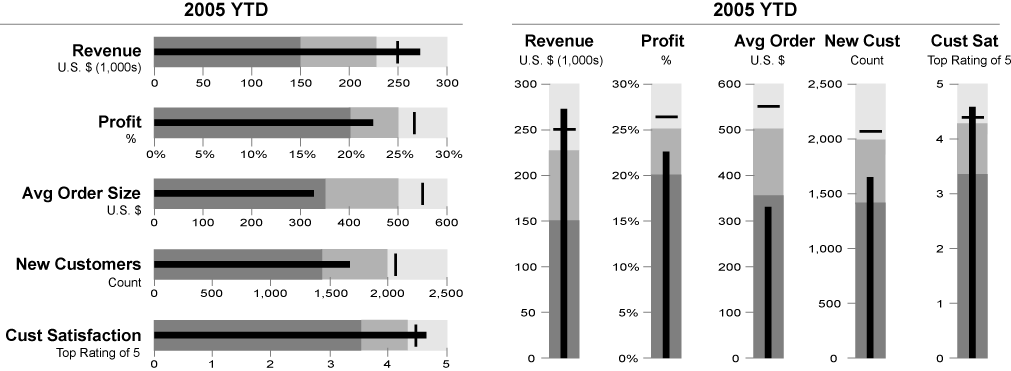
A Bullet Chart is a linear chart type originally designed by data visualization expert Stephen Few as a more compact and information-rich alternative to traditional dashboard gauges. Bullet charts can simultaneously display actual values, target values, and performance ranges within a limited space, clearly showing the completion rate and performance status through comparison.
The design philosophy of bullet charts is to maximize the data-ink ratio, displaying the most useful information in the smallest space, making them particularly suitable for dashboard and performance monitoring scenarios.
English Names: Bullet Chart
Other Names: Progress Bar Chart, Target Comparison Chart, Bullet Graph
| Chart Type | Bullet Chart |
|---|---|
| Suitable Data | One categorical data field, one continuous data field (actual value), one target value, optional performance ranges |
| Functionality | Display comparison between actual and target values, evaluate performance levels |
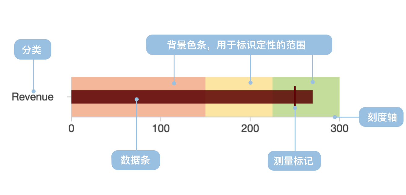
| Data Mapping | Categorical data field maps to vertical axis position Continuous data field maps to bar length Target value maps to marker line Performance ranges map to background color bands |
| Data Size Limit | Single or multiple indicators, recommended not to exceed 10 |
The main components of a bullet chart include:
import { Chart } from '@antv/g2';const chart = new Chart({container: 'container',theme: 'classic',});const data = [{title: 'Sales Completion Rate',ranges: 100,measures: 80,target: 85,},];chart.options({type: 'view',coordinate: { transform: [{ type: 'transpose' }] },children: [{type: 'interval',data,encode: { x: 'title', y: 'ranges', color: '#f0efff' },style: { maxWidth: 30 },axis: {y: {grid: true,gridLineWidth: 2,title: 'Completion Rate (%)',},x: {title: false,},},},{type: 'interval',data,encode: { x: 'title', y: 'measures', color: '#5B8FF9' },style: { maxWidth: 20 },label: {text: 'measures',position: 'right',textAlign: 'left',dx: 5,formatter: (d) => `${d}%`,},},{type: 'point',data,encode: {x: 'title',y: 'target',shape: 'line',color: '#3D76DD',size: 8,},tooltip: {title: false,items: [{channel: 'y',name: 'Target Value',valueFormatter: (d) => `${d}%`,},],},},],});chart.render();
Scenario 1: Performance Indicator Monitoring
Bullet charts are ideal tools for displaying performance indicator completion status, clearly comparing actual performance with target requirements.
import { Chart } from '@antv/g2';const chart = new Chart({container: 'container',theme: 'classic',});const colors = {ranges: ['#ffebee', '#fff3e0', '#e8f5e8'],measures: '#1890ff',target: '#ff4d4f',};// Transform data structureconst transformedData = [{ title: 'Project Progress', value: 40, level: 'Poor' },{ title: 'Project Progress', value: 30, level: 'Good' },{ title: 'Project Progress', value: 30, level: 'Excellent' },];chart.options({type: 'view',coordinate: { transform: [{ type: 'transpose' }] },children: [{type: 'interval',data: transformedData,encode: { x: 'title', y: 'value', color: 'level' },transform: [{ type: 'stackY' }],scale: {color: {domain: ['Poor', 'Good', 'Excellent'],range: colors.ranges,},},style: { maxWidth: 30 },},{type: 'interval',data: {value: [{ title: 'Project Progress', value: 60, type: 'Actual Progress' },{ title: 'Project Progress', value: 80, type: 'Target Progress' },],transform: [{ type: 'filter', callback: (d) => d.type === 'Actual Progress' },],},encode: { x: 'title', y: 'value', color: colors.measures },style: { maxWidth: 16 },},{type: 'point',data: {value: [{ title: 'Project Progress', value: 60, type: 'Actual Progress' },{ title: 'Project Progress', value: 80, type: 'Target Progress' },],transform: [{ type: 'filter', callback: (d) => d.type === 'Target Progress' },],},encode: {x: 'title',y: 'value',shape: 'line',color: colors.target,size: 8,},axis: { y: { grid: true, title: 'Progress (%)' }, x: { title: false } },},],});chart.render();
Scenario 2: Budget Execution Tracking
Bullet charts can effectively display budget execution status, including actual expenditure, budget targets, and warning ranges.
Scenario 3: Resource Utilization Monitoring
Through bullet charts, you can intuitively understand the usage of various resources and identify overused or underutilized resources.
import { Chart } from '@antv/g2';const chart = new Chart({container: 'container',theme: 'classic',});const resourceData = [{resource: 'CPU Usage',ranges: 100,measures: 65,target: 80,},{resource: 'Memory Usage',ranges: 100,measures: 45,target: 70,},{resource: 'Disk Usage',ranges: 100,measures: 88,target: 85,},{resource: 'Network Bandwidth',ranges: 100,measures: 72,target: 75,},];chart.options({type: 'view',coordinate: { transform: [{ type: 'transpose' }] },children: [{type: 'interval',data: resourceData,encode: { x: 'resource', y: 'ranges', color: '#f5f5f5' },style: { maxWidth: 30 },},{type: 'interval',data: resourceData,encode: {x: 'resource',y: 'measures',color: (d) => (d.measures > d.target ? '#ff7875' : '#52c41a'),},style: { maxWidth: 20 },label: {text: 'measures',position: 'right',textAlign: 'left',dx: 5,formatter: (d) => `${d}%`,},},{type: 'point',data: resourceData,encode: {x: 'resource',y: 'target',shape: 'line',color: '#1890ff',size: 6,},axis: {y: {grid: true,title: 'Usage Rate (%)',},x: {title: 'System Resources',},},},],});chart.render();
Scenario 1: Time Trend Analysis
Bullet charts primarily display status comparisons at a specific point in time and are not suitable for showing trends over time. Line charts should be used in such cases.
Scenario 2: Part-to-Whole Relationships
If you need to show the proportional relationship of parts to the whole, pie charts or donut charts are more appropriate.
Scenario 3: Large Data Volume
When displaying a large number of indicators, bullet charts can cause visual confusion. It's recommended to use grouped displays or other chart types.
Display the performance of multiple related indicators through grouping, facilitating horizontal comparison.
import { Chart } from '@antv/g2';const chart = new Chart({container: 'container',theme: 'classic',});const multiData = [{department: 'Sales',indicator: 'Sales Revenue',ranges: 100,measures: 85,target: 90,},{department: 'Sales',indicator: 'Customer Count',ranges: 100,measures: 92,target: 85,},{department: 'Marketing',indicator: 'Brand Awareness',ranges: 100,measures: 78,target: 80,},{department: 'Marketing',indicator: 'Marketing ROI',ranges: 100,measures: 88,target: 85,},];chart.options({type: 'view',coordinate: { transform: [{ type: 'transpose' }] },children: [{type: 'interval',data: multiData,encode: { x: 'indicator', y: 'ranges', color: '#f0f0f0' },style: { maxWidth: 30 },},{type: 'interval',data: multiData,encode: { x: 'indicator', y: 'measures', color: 'department' },style: { maxWidth: 20 },label: {text: 'measures',position: 'right',textAlign: 'left',dx: 5,},},{type: 'point',data: multiData,encode: {x: 'indicator',y: 'target',shape: 'line',color: '#666',size: 6,},axis: {y: {grid: true,title: 'Completion Rate',},x: {title: 'Key Indicators',},},},],});chart.render();
Provide more detailed performance evaluation criteria through background ranges of different color shades.
import { Chart } from '@antv/g2';const chart = new Chart({container: 'container',theme: 'classic',});const colors = {ranges: ['#ffebee', '#fff3e0', '#e8f5e8'],measures: '#1890ff',target: '#ff4d4f',};// Transform data structureconst transformedData = [{ title: 'Project Progress', value: 40, level: 'Poor' },{ title: 'Project Progress', value: 30, level: 'Good' },{ title: 'Project Progress', value: 30, level: 'Excellent' },];chart.options({type: 'view',coordinate: { transform: [{ type: 'transpose' }] },children: [{type: 'interval',data: transformedData,encode: { x: 'title', y: 'value', color: 'level' },transform: [{ type: 'stackY' }],scale: {color: {domain: ['Poor', 'Good', 'Excellent'],range: colors.ranges,},},style: { maxWidth: 30 },},{type: 'interval',data: {value: [{ title: 'Project Progress', value: 60, type: 'Actual Progress' },{ title: 'Project Progress', value: 80, type: 'Target Progress' },],transform: [{ type: 'filter', callback: (d) => d.type === 'Actual Progress' },],},encode: { x: 'title', y: 'value', color: colors.measures },style: { maxWidth: 16 },},{type: 'point',data: {value: [{ title: 'Project Progress', value: 60, type: 'Actual Progress' },{ title: 'Project Progress', value: 80, type: 'Target Progress' },],transform: [{ type: 'filter', callback: (d) => d.type === 'Target Progress' },],},encode: {x: 'title',y: 'value',shape: 'line',color: colors.target,size: 8,},axis: { y: { grid: true, title: 'Progress (%)' }, x: { title: false } },},],});chart.render();
When space is limited or special layouts are needed, vertical bullet charts can be used.
import { Chart } from '@antv/g2';const chart = new Chart({container: 'container',theme: 'classic',});const verticalData = [{metric: 'Q1 Sales',ranges: 100,measures: 80,target: 85,},{metric: 'Q2 Sales',ranges: 100,measures: 92,target: 88,},{metric: 'Q3 Sales',ranges: 100,measures: 76,target: 90,},];chart.options({type: 'view',children: [{type: 'interval',data: verticalData,encode: { x: 'metric', y: 'ranges', color: '#f0f0f0' },style: { maxWidth: 30 },},{type: 'interval',data: verticalData,encode: { x: 'metric', y: 'measures', color: '#52c41a' },style: { maxWidth: 20 },label: {text: 'measures',position: 'top',textAlign: 'center',dy: -5,},},{type: 'point',data: verticalData,encode: {x: 'metric',y: 'target',shape: 'line',color: '#ff4d4f',size: 6,},axis: {y: {grid: true,title: 'Sales (10k CNY)',},x: {title: 'Quarter',},},},],});chart.render();


