
Scatter Plot
Previous
K-Chart
Next
Gauge Chart
Loading...
A scatter plot is a visualization chart that displays the relationship between two continuous variables through points on a two-dimensional coordinate plane. The position of each data point is determined by the values of two variables, where one variable determines the horizontal position (x-axis) and the other determines the vertical position (y-axis).
Scatter plots differ from line charts in that scatter plots are primarily used for exploring and displaying correlations between variables, distribution patterns, and identifying outliers, while line charts are better suited for showing trends in continuous data.
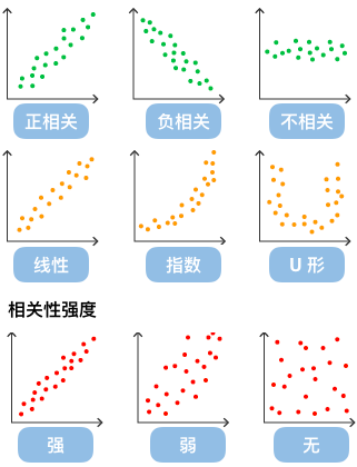
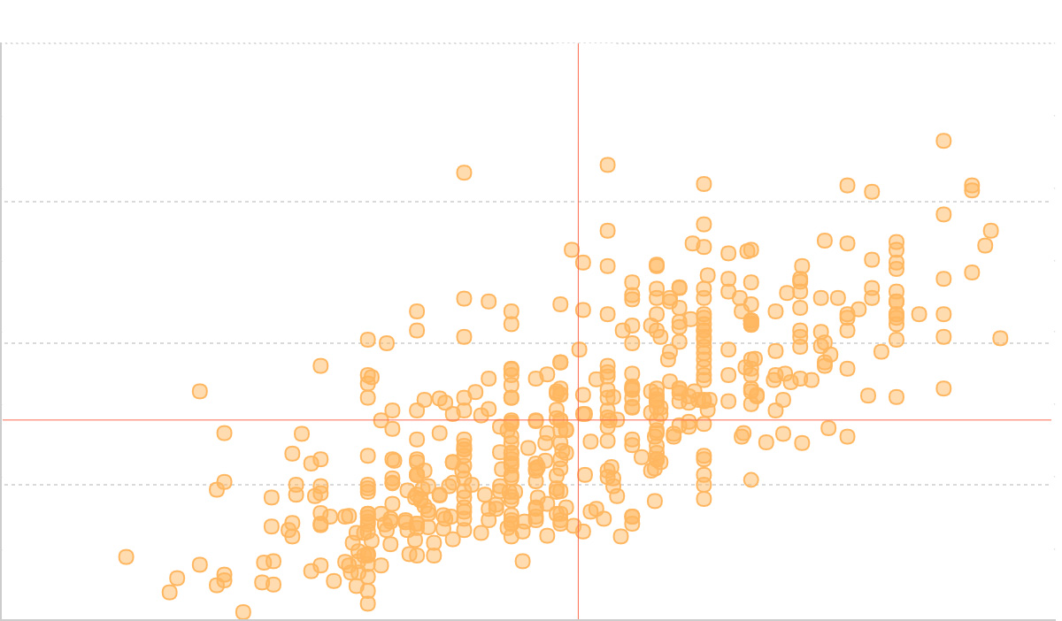
By observing the distribution of data points on a scatter plot, we can infer correlations between variables. If there is no relationship between variables, they will appear as randomly distributed discrete points on the scatter plot. If there is some correlation, most data points will be relatively dense and show some trend. Data correlation relationships mainly include: positive correlation (both variable values increase simultaneously), negative correlation (one variable value increases while the other decreases), no correlation, linear correlation, exponential correlation, etc.
Other Names: Scatter chart, Point plot
| Chart Type | Scatter Plot |
|---|---|
| Suitable Data | List: Two continuous data fields |
| Function | Explore correlations between two variables, identify data patterns and outliers |
| Data-Graphics Mapping | First continuous data field mapped to horizontal axis position Second continuous data field mapped to vertical axis position Optional categorical field mapped to point color or size |
| Suitable Data Volume | 10-1000 data points, consider sampling or using density plots for larger datasets |
Components:
import { Chart } from '@antv/g2';const chart = new Chart({ container: 'container' });chart.options({type: 'view',autoFit: true,data: [{ height: 161, weight: 50 },{ height: 167, weight: 55 },{ height: 171, weight: 63 },{ height: 174, weight: 58 },{ height: 176, weight: 65 },{ height: 178, weight: 70 },{ height: 180, weight: 72 },{ height: 182, weight: 75 },{ height: 185, weight: 78 },{ height: 188, weight: 82 },],encode: { x: 'height', y: 'weight' },scale: { x: { range: [0, 1] }, y: { domainMin: 0, nice: true } },children: [{type: 'point',style: {fill: '#1890ff',fillOpacity: 0.7,stroke: '#1890ff',strokeWidth: 2,r: 6,},},],axis: {x: { title: 'Height (cm)' },y: { title: 'Weight (kg)' },},});chart.render();
Scatter plots are particularly suitable for displaying data distribution and correlations between variables. The following four progressive examples demonstrate different applications of scatter plots:
The most basic scatter plot is used to show the distribution relationship between two continuous variables:
import { Chart } from '@antv/g2';const chart = new Chart({ container: 'container' });chart.options({type: 'point',data: {type: 'fetch',value:'https://assets.antv.antgroup.com/g2/top-30-countries-by-quality-of-life.json',},encode: { x: 'x', y: 'y' },scale: { x: { domain: [137.5, 212] }, y: { domain: [0, 80] } },labels: [{ text: 'name', fontSize: 10, dy: 6 }],style: { mainStroke: '#5B8FF9', mainLineWidth: 2 },});chart.render();
Adding data annotations such as line and range annotations to help users better understand the data:
import { Chart } from '@antv/g2';const chart = new Chart({ container: 'container' });chart.options({type: 'view',data: {type: 'fetch',value:'https://assets.antv.antgroup.com/g2/top-30-countries-by-quality-of-life.json',},style: { mainStroke: '#5B8FF9', mainLineWidth: 2 },axis: { x: false, y: false },children: [{type: 'range',data: [{ x: [0, 0.5], y: [0, 0.5] },{ x: [0.5, 1], y: [0.5, 1] },],encode: { x: 'x', y: 'y' },scale: {x: { independent: true, domain: [0, 1] },y: { independent: true, domain: [0, 1] },},style: { stroke: '#5B8FF9', lineWidth: 1, fillOpacity: 0.15 },animate: false,tooltip: false,},{type: 'point',encode: { x: 'x', y: 'y', shape: 'point' },scale: { x: { domain: [137.5, 212] }, y: { domain: [0, 80] } },labels: [{ text: 'name', fontSize: 10, dy: 6 }],},],});chart.render();
Using color channel to distinguish different categories of data:
import { Chart } from '@antv/g2';const chart = new Chart({ container: 'container' });chart.options({type: 'point',autoFit: true,data: {type: 'fetch',value:'https://gw.alipayobjects.com/os/basement_prod/6b4aa721-b039-49b9-99d8-540b3f87d339.json',},encode: { x: 'height', y: 'weight', color: 'gender' },});chart.render();
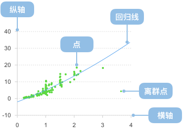
You can also use custom data transform functions to preprocess data and add regression lines to show trend relationships between variables:
import { Chart } from '@antv/g2';import { regressionLinear } from 'd3-regression';const chart = new Chart({ container: 'container' });chart.options({type: 'view',autoFit: true,data: {type: 'fetch',value: 'https://assets.antv.antgroup.com/g2/linear-regression.json',},children: [{type: 'point',encode: { x: (d) => d[0], y: (d) => d[1], shape: 'point' },scale: { x: { domain: [0, 1] }, y: { domain: [0, 5] } },style: { fillOpacity: 0.75 },},{type: 'line',data: {transform: [{type: 'custom',callback: regressionLinear(),},],},encode: { x: (d) => d[0], y: (d) => d[1] },style: { stroke: '#30BF78', lineWidth: 2 },labels: [{text: 'y = 1.7x+3.01',selector: 'last',position: 'right',textAlign: 'end',dy: -8,},],tooltip: false,},],});chart.render();
When data points are heavily overlapped at certain positions, regular scatter plots cannot clearly show the true distribution of data. For example, the following chart shows a scatter plot with serious overlap issues:
import { Chart } from '@antv/g2';const chart = new Chart({ container: 'container' });chart.options({type: 'point',autoFit: true,data: {type: 'fetch',value:'https://gw.alipayobjects.com/os/bmw-prod/2c813e2d-2276-40b9-a9af-cf0a0fb7e942.csv',},encode: {y: 'Horsepower',x: 'Cylinders',shape: 'hollow',color: 'Cylinders',},transform: [{ type: 'sortX', channel: 'x' }],scale: { x: { type: 'point' }, color: { type: 'ordinal' } },});chart.render();
Solution: Using Jitter Transform
Adding random offset to avoid overlap and make data distribution clearer:
import { Chart } from '@antv/g2';const chart = new Chart({ container: 'container' });chart.options({type: 'point',autoFit: true,data: {type: 'fetch',value:'https://gw.alipayobjects.com/os/bmw-prod/2c813e2d-2276-40b9-a9af-cf0a0fb7e942.csv',},encode: {y: 'Horsepower',x: 'Cylinders',shape: 'hollow',color: 'Cylinders',},transform: [{ type: 'sortX', channel: 'x' }, { type: 'jitterX' }],scale: { x: { type: 'point' }, color: { type: 'ordinal' } },});chart.render();
Example 2: Unsuitable for Categorical Data Comparison
Scatter plots are not suitable for displaying numerical comparisons of categorical data. The following chart attempts to use a scatter plot to show sales of different products:
import { Chart } from '@antv/g2';const chart = new Chart({container: 'container',});chart.options({type: 'view',autoFit: true,data: [{ product: 'Product A', sales: 275 },{ product: 'Product B', sales: 115 },{ product: 'Product C', sales: 120 },{ product: 'Product D', sales: 350 },{ product: 'Product E', sales: 150 },],encode: { x: 'product', y: 'sales' },scale: { x: { range: [0, 1] }, y: { domainMin: 0, nice: true } },children: [{type: 'point',style: {fill: '#1890ff',fillOpacity: 0.8,stroke: '#1890ff',strokeWidth: 2,r: 8,},},],axis: {x: { title: 'Product Type' },y: { title: 'Sales' },},title: 'Inappropriate Usage: Using Scatter Plot for Categorical Data',});chart.render();
For categorical data comparison, bar charts are more suitable:
import { Chart } from '@antv/g2';const chart = new Chart({container: 'container',});chart.options({type: 'interval',autoFit: true,data: [{ product: 'Product A', sales: 275 },{ product: 'Product B', sales: 115 },{ product: 'Product C', sales: 120 },{ product: 'Product D', sales: 350 },{ product: 'Product E', sales: 150 },],encode: { x: 'product', y: 'sales', color: 'product' },axis: {x: { title: 'Product Type' },y: { title: 'Sales' },},title: 'Better Choice: Using Bar Chart for Categorical Data',});chart.render();
Add regression lines to more clearly show data trends:
import { Chart } from '@antv/g2';const chart = new Chart({ container: 'container' });const data = [{ x: 1, y: 2.1 },{ x: 2, y: 3.8 },{ x: 3, y: 5.2 },{ x: 4, y: 6.9 },{ x: 5, y: 8.1 },{ x: 6, y: 9.8 },{ x: 7, y: 11.2 },{ x: 8, y: 13.1 },{ x: 9, y: 14.8 },{ x: 10, y: 16.5 },];chart.options({type: 'view',autoFit: true,data,encode: { x: 'x', y: 'y' },scale: { x: { range: [0, 1] }, y: { domainMin: 0, nice: true } },children: [{type: 'point',style: {fill: '#1890ff',fillOpacity: 0.8,stroke: '#1890ff',strokeWidth: 2,r: 6,},},{type: 'line',style: {stroke: '#ff4d4f',strokeWidth: 2,strokeDasharray: [4, 4],},},],axis: {x: { title: 'X Variable' },y: { title: 'Y Variable' },},title: 'Scatter Plot with Trend Line',});chart.render();
Add text labels to important data points to enhance data readability:
import { Chart } from '@antv/g2';const chart = new Chart({ container: 'container' });const data = [{ product: 'Product A', satisfaction: 8.5, sales: 120, category: 'Technology' },{ product: 'Product B', satisfaction: 7.2, sales: 85, category: 'Home' },{ product: 'Product C', satisfaction: 9.1, sales: 200, category: 'Technology' },{ product: 'Product D', satisfaction: 6.8, sales: 95, category: 'Clothing' },{ product: 'Product E', satisfaction: 8.9, sales: 160, category: 'Technology' },{ product: 'Product F', satisfaction: 7.5, sales: 110, category: 'Home' },{ product: 'Product G', satisfaction: 6.2, sales: 70, category: 'Clothing' },{ product: 'Product H', satisfaction: 8.7, sales: 185, category: 'Technology' },];chart.options({type: 'view',autoFit: true,data,encode: { x: 'satisfaction', y: 'sales', color: 'category' },children: [{type: 'point',style: {r: 8,fillOpacity: 0.8,strokeWidth: 2,},},{type: 'text',encode: { text: 'product' },style: {fontSize: 10,textAlign: 'center',dy: -12,fontWeight: 'bold',},},],axis: {x: { title: 'Customer Satisfaction' },y: { title: 'Sales (10k units)' },},legend: { color: { position: 'top' } },title: 'Product Satisfaction vs Sales Analysis',});chart.render();
Use facet to create faceted scatter plots for easy comparison between different groups:
import { Chart } from '@antv/g2';const chart = new Chart({ container: 'container' });const data = [// 2020 data{ year: 2020, quarter: 'Q1', revenue: 120, profit: 15, company: 'Company A' },{ year: 2020, quarter: 'Q2', revenue: 135, profit: 18, company: 'Company A' },{ year: 2020, quarter: 'Q3', revenue: 145, profit: 22, company: 'Company A' },{ year: 2020, quarter: 'Q4', revenue: 160, profit: 25, company: 'Company A' },{ year: 2020, quarter: 'Q1', revenue: 95, profit: 12, company: 'Company B' },{ year: 2020, quarter: 'Q2', revenue: 110, profit: 14, company: 'Company B' },{ year: 2020, quarter: 'Q3', revenue: 125, profit: 18, company: 'Company B' },{ year: 2020, quarter: 'Q4', revenue: 140, profit: 21, company: 'Company B' },// 2021 data{ year: 2021, quarter: 'Q1', revenue: 170, profit: 28, company: 'Company A' },{ year: 2021, quarter: 'Q2', revenue: 185, profit: 32, company: 'Company A' },{ year: 2021, quarter: 'Q3', revenue: 195, profit: 35, company: 'Company A' },{ year: 2021, quarter: 'Q4', revenue: 210, profit: 38, company: 'Company A' },{ year: 2021, quarter: 'Q1', revenue: 150, profit: 23, company: 'Company B' },{ year: 2021, quarter: 'Q2', revenue: 165, profit: 26, company: 'Company B' },{ year: 2021, quarter: 'Q3', revenue: 175, profit: 29, company: 'Company B' },{ year: 2021, quarter: 'Q4', revenue: 190, profit: 32, company: 'Company B' },];chart.options({type: 'facetRect',autoFit: true,margin: 30,data,encode: { x: 'year' },children: [{type: 'point',encode: {x: 'revenue',y: 'profit',color: 'company',shape: 'quarter',},scale: {shape: { range: ['circle', 'square', 'triangle', 'diamond'] },x: { nice: true },y: { nice: true },},style: {r: 6,fillOpacity: 0.8,stroke: '#fff',strokeWidth: 1,},},],axis: {x: { title: 'Revenue (10k)' },y: { title: 'Profit (10k)' },},legend: {color: { position: 'top' },shape: { position: 'right' },},title: 'Company Revenue-Profit Relationship Annual Comparison',});chart.render();
Use multiple scatter plots to form a matrix, displaying correlations between multiple variables:
import { Chart } from '@antv/g2';const chart = new Chart({ container: 'container' });// Generate correlation dataconst generateCorrelationData = () => {const data = [];const variables = ['Sales', 'Ad Spend', 'Satisfaction'];for (let i = 0; i < 50; i++) {const sales = 100 + Math.random() * 200;const advertising = sales * 0.1 + Math.random() * 20;const satisfaction = 6 + (sales - 100) / 50 + Math.random() * 2;data.push({id: i,Sales: sales,'Ad Spend': advertising,Satisfaction: Math.min(10, Math.max(1, satisfaction)),});}return data;};const rawData = generateCorrelationData();// Transform data to matrix formatconst matrixData = [];const variables = ['Sales', 'Ad Spend', 'Satisfaction'];variables.forEach((xVar) => {variables.forEach((yVar) => {rawData.forEach((d) => {matrixData.push({xVar,yVar,x: d[xVar],y: d[yVar],id: d.id,});});});});chart.options({type: 'facetRect',autoFit: true,margin: 30,data: matrixData,encode: { x: 'xVar', y: 'yVar' },children: [{type: 'point',encode: { x: 'x', y: 'y' },style: {r: 3,fillOpacity: 0.6,fill: '#1890ff',stroke: '#fff',strokeWidth: 0.5,},scale: {x: { nice: true },y: { nice: true },},},],axis: {x: {title: false,labelFormatter: (d) => (typeof d === 'number' ? d.toFixed(0) : d),},y: {title: false,labelFormatter: (d) => (typeof d === 'number' ? d.toFixed(0) : d),},},title: 'Multi-variable Correlation Matrix Scatter Plot',});chart.render();
| Chart Type | Use Case | Advantages | Disadvantages |
|---|---|---|---|
| Scatter Plot | Explore variable relationships, outlier detection | Intuitive correlation display, easy pattern recognition | Point overlap with large datasets |
| Line Chart | Time series data, trend display | Clear trend visualization | Not suitable for variable correlation |
| Bar Chart | Categorical data comparison | Easy category comparison | Cannot show continuous variable relationships |
| Bubble Chart | Three-dimensional data display | More information content | Higher complexity, harder to interpret |