Donut Chart
Previous
Pie Chart
Next
Heatmap
Loading...
A donut chart (also known as a doughnut chart) is essentially a pie chart with its center area removed. Donut charts encourage us to focus more on arc length rather than area, making it relatively simple to compare different donut charts.
While donut charts and pie charts are similar in terms of data representation, donut charts have their unique advantages:
Other Names: Doughnut Chart
| Chart Type | Donut Chart |
|---|---|
| Suitable Data | A dataset containing one categorical field and one numerical field |
| Functionality | Compare the size of numerical values across categories |
| Data Mapping | Categorical data maps to arc colors Numerical data maps to arc angles Proportional relationships shown by arc size |
| Data Size Limit | Recommended for no more than 9 data points |
Example 1: Displaying Categorical Proportions
This usage is similar to pie charts. The chart below shows sales data from a gaming company:
| Genre | Sales |
|---|---|
| Sports | 27,500 |
| Strategy | 11,500 |
| Action | 6,000 |
| Shooter | 3,500 |
| Other | 1,500 |
import { Chart } from '@antv/g2';const chart = new Chart({container: 'container',theme: 'classic',});chart.options({type: 'interval',autoFit: true,transform: [{ type: 'stackY' }], // Add stackY transformdata: [{ genre: 'Sports', sold: 27500 },{ genre: 'Strategy', sold: 11500 },{ genre: 'Action', sold: 6000 },{ genre: 'Shooter', sold: 3500 },{ genre: 'Other', sold: 1500 },],coordinate: { type: 'theta', innerRadius: 0.5 },encode: { y: 'sold', color: 'genre' },legend: {color: { position: 'bottom', layout: { justifyContent: 'center' } },},labels: [{text: 'genre',style: {fontWeight: 'bold',},},{text: (d, i, data) => {const total = data.reduce((acc, curr) => acc + curr.sold, 0);const percent = ((d.sold / total) * 100).toFixed(2);return `${percent}%`;},style: {fontSize: 10,dy: 12,},},],});chart.render();
Explanation:
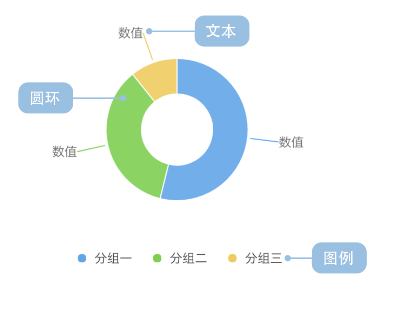
genre field maps to color to distinguish different game typessold field maps to angle to represent the proportion of salescoordinate: { type: 'theta', innerRadius: 0.5 } creates the donut effectExample 2: Displaying Additional Information in the Center
The hollow center area of donut charts can be used to display totals, titles, or other important information:
import { Chart } from '@antv/g2';const chart = new Chart({container: 'container',theme: 'classic',});const data = [{ type: 'Mobile', value: 54.2 },{ type: 'Desktop', value: 32.1 },{ type: 'Tablet', value: 13.7 },];const total = data.reduce((acc, curr) => acc + curr.value, 0);chart.options({type: 'interval',autoFit: true,data,coordinate: { type: 'theta', innerRadius: 0.6 },encode: { y: 'value', color: 'type' },style: { stroke: '#fff', lineWidth: 2 },legend: {color: { position: 'bottom', layout: { justifyContent: 'center' } },},labels: [{text: (d) => `${d.value}%`,style: {fontWeight: 'bold',fontSize: 12,},},],});chart.render();
Example 1: Too Many Categories
The chart below shows population proportions by province. Due to the excessive number of categories, it's difficult to clearly compare population data across provinces. In such cases, we recommend using bar charts.
import { Chart } from '@antv/g2';const chart = new Chart({container: 'container',theme: 'classic',});chart.options({type: 'interval',autoFit: true,data: [{ province: 'Beijing', population: 19612368 },{ province: 'Tianjin', population: 12938693 },{ province: 'Hebei', population: 71854210 },{ province: 'Shanxi', population: 27500000 },{ province: 'Inner Mongolia', population: 24706291 },{ province: 'Liaoning', population: 43746323 },{ province: 'Jilin', population: 27452815 },{ province: 'Heilongjiang', population: 38313991 },{ province: 'Shanghai', population: 23019196 },{ province: 'Jiangsu', population: 78660941 },{ province: 'Zhejiang', population: 54426891 },{ province: 'Anhui', population: 59500468 },{ province: 'Fujian', population: 36894217 },{ province: 'Jiangxi', population: 44567797 },{ province: 'Shandong', population: 95792719 },{ province: 'Henan', population: 94029939 },{ province: 'Hubei', population: 57237727 },{ province: 'Hunan', population: 65700762 },{ province: 'Guangdong', population: 104320459 },{ province: 'Guangxi', population: 46023761 },{ province: 'Hainan', population: 8671485 },{ province: 'Chongqing', population: 28846170 },{ province: 'Sichuan', population: 80417528 },{ province: 'Guizhou', population: 34748556 },{ province: 'Yunnan', population: 45966766 },{ province: 'Tibet', population: 3002165 },{ province: 'Shaanxi', population: 37327379 },{ province: 'Gansu', population: 25575263 },{ province: 'Qinghai', population: 5626723 },],coordinate: { type: 'theta', innerRadius: 0.4 },encode: { y: 'population', color: 'province' },legend: false, // Too many categories, disable legendlabels: false, // Too many categories, disable labels});chart.render();
Explanation: The chart above has too many categories, making colors difficult to distinguish and labels severely overlapping, making it unsuitable for donut charts.
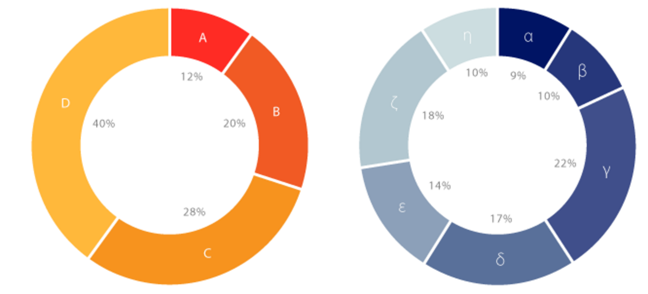
Example 2: Similar Proportions Among Categories
In the chart below, different game genres have similar sales volumes with very small angular differences, making donut charts unsuitable. In this case, bar charts would be more appropriate.
import { Chart } from '@antv/g2';const chart = new Chart({container: 'container',theme: 'classic',});chart.options({type: 'interval',autoFit: true,data: [{ genre: 'Sports', sold: 15000 },{ genre: 'Strategy', sold: 14900 },{ genre: 'Action', sold: 15050 },{ genre: 'Shooter', sold: 13000 },{ genre: 'Other', sold: 13900 },],coordinate: { type: 'theta', innerRadius: 0.5 },encode: { y: 'sold', color: 'genre' },legend: {color: { position: 'bottom', layout: { justifyContent: 'center' } },},labels: [{text: (d, i, data) => {const total = data.reduce((acc, curr) => acc + curr.sold, 0);const percent = ((d.sold / total) * 100).toFixed(2);return `${percent}%`;},style: {fontSize: 10,},},],});chart.render();
Explanation: Each category in the chart above has a proportion close to 20%, with very small differences that are difficult to clearly compare through angular sizes.
Using G2's faceting functionality, grouped data can be rendered as multiple donut charts. The chart below shows the profit proportions of the world's largest 1000 banks by region in 2007 and 2011:
| Year | Region | Profit (Billion USD) |
|---|---|---|
| 2007 | Asia Pacific | 1485.54 |
| 2007 | Africa & Middle East | 330.12 |
| 2007 | Latin America | 196.5 |
| ... | ... | ... |
| 2011 | Asia Pacific | 4107.18 |
| 2011 | Africa & Middle East | 495.3 |
| 2011 | Latin America | 495.3 |
| ... | ... | ... |
import { Chart } from '@antv/g2';const chart = new Chart({container: 'container',theme: 'classic',});chart.options({type: 'facetRect',autoFit: true,data: [{ year: '2007', area: 'Asia Pacific', profit: 1485.54 },{ year: '2007', area: 'Western Europe', profit: 3631.32 },{ year: '2007', area: 'North America', profit: 2083.9 },{ year: '2007', area: 'Africa & Middle East', profit: 330.12 },{ year: '2007', area: 'Central & Eastern Europe', profit: 141.48 },{ year: '2007', area: 'Latin America', profit: 196.5 },{ year: '2011', area: 'Asia Pacific', profit: 4107.18 },{ year: '2011', area: 'Western Europe', profit: 480.06 },{ year: '2011', area: 'North America', profit: 1783.08 },{ year: '2011', area: 'Africa & Middle East', profit: 495.3 },{ year: '2011', area: 'Central & Eastern Europe', profit: 259.08 },{ year: '2011', area: 'Latin America', profit: 495.3 },],encode: { x: 'year' },children: [{type: 'interval',transform: [{ type: 'stackY' }], // Add stackY transformcoordinate: { type: 'theta', innerRadius: 0.5 },encode: { y: 'profit', color: 'area' },legend: {color: { position: 'bottom', layout: { justifyContent: 'center' } },},labels: [{text: (d, i, data) => {const total = data.reduce((acc, curr) => acc + curr.profit, 0);const percent = ((d.profit / total) * 100).toFixed(1);return `${percent}%`;},style: {fontSize: 10,},},],},],});chart.render();