Chord Diagram
Previous
Kagi Chart
Loading...
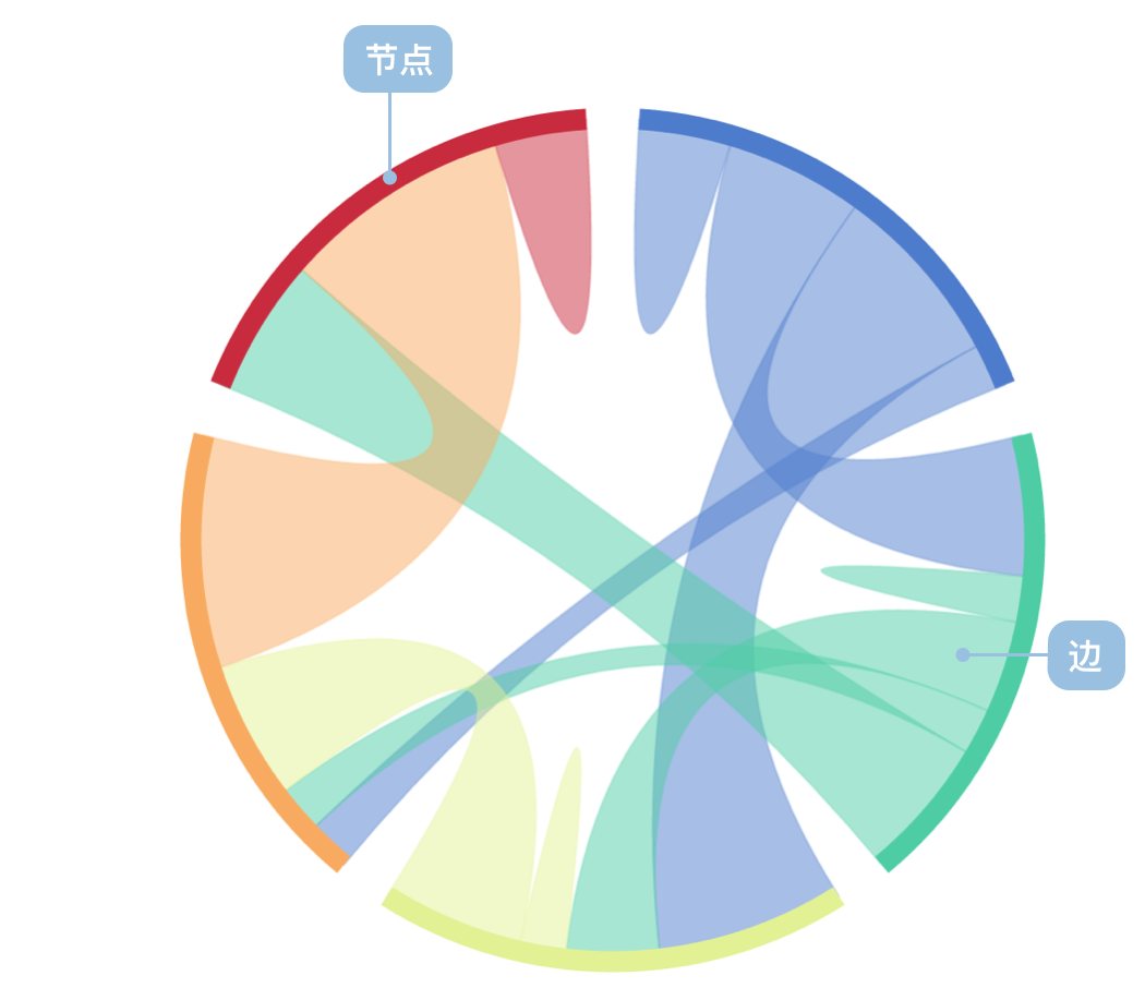
A Chord Diagram is a visualization method that displays the relationships between data in a matrix. Nodes are arranged radially around a circle, connected by weighted arcs that represent the relationships and flow between different entities. It's particularly effective for showing mutual relationships and flows between multiple entities.
Chord diagrams can intuitively display complex relationship networks between multiple nodes, especially suitable for visualizing bidirectional flow data such as population migration, trade flows, fund transfers, software dependencies, and other scenarios.
Other Names: Chord Chart, Chord Graph
| Chart Type | Chord Diagram |
|---|---|
| Suitable Data | Node dataset (optional), edge dataset: source node, target node, flow value |
| Function | Observe node relationships, display bidirectional flow relationships between multiple entities |
| Data-to-Visual Mapping | Weight mapped to node and edge width Source and target nodes mapped to arc positions on circle Nodes can be distinguished by color |
| Suitable Data Volume | Two or more node groups, optimal with 5-15 nodes |
Example 1: Suitable for displaying flow relationships
The following chart shows population flow between different cities, clearly displaying bidirectional flow relationships between cities through a chord diagram.
| source (Source City) | target (Target City) | value (Population Flow) |
|---|---|---|
| Beijing | Shanghai | 100,000 |
| Beijing | Guangzhou | 80,000 |
| Shanghai | Beijing | 70,000 |
| Shanghai | Guangzhou | 90,000 |
| Guangzhou | Shenzhen | 120,000 |
import { Chart } from '@antv/g2';const chart = new Chart({container: 'container',theme: 'classic',});chart.options({type: 'chord',autoFit: true,data: {value: {links: [{ source: 'Beijing', target: 'Shanghai', value: 100 },{ source: 'Beijing', target: 'Guangzhou', value: 80 },{ source: 'Beijing', target: 'Shenzhen', value: 60 },{ source: 'Shanghai', target: 'Beijing', value: 70 },{ source: 'Shanghai', target: 'Guangzhou', value: 90 },{ source: 'Shanghai', target: 'Shenzhen', value: 50 },{ source: 'Guangzhou', target: 'Beijing', value: 40 },{ source: 'Guangzhou', target: 'Shanghai', value: 85 },{ source: 'Guangzhou', target: 'Shenzhen', value: 120 },{ source: 'Shenzhen', target: 'Beijing', value: 35 },{ source: 'Shenzhen', target: 'Shanghai', value: 45 },{ source: 'Shenzhen', target: 'Guangzhou', value: 110 },],},},layout: { nodeWidthRatio: 0.05 },scale: {color: {type: 'ordinal',range: ['#5B8FF9', '#5AD8A6', '#F6BD16', '#E86452'],},},style: {labelFontSize: 12,labelFill: '#333',linkFillOpacity: 0.6,},tooltip: {items: [{ field: 'source', name: 'Source City' },{ field: 'target', name: 'Target City' },{ field: 'value', name: 'Population Flow' },],},interaction: [{type: 'elementHighlight',background: true,},],});chart.render();
Example 2: Displaying software dependencies
The following chart shows dependency relationships between software packages. Each node represents an independent package, and each edge shows the dependency relationship between packages. The thickness of edges indicates the strength of dependencies.
import { Chart } from '@antv/g2';const chart = new Chart({container: 'container',theme: 'classic',});chart.options({type: 'chord',autoFit: true,data: {value: {links: [{ source: 'vis.core', target: 'vis.data', value: 85 },{ source: 'vis.core', target: 'vis.event', value: 45 },{ source: 'vis.core', target: 'vis.util', value: 120 },{ source: 'vis.data', target: 'vis.core', value: 30 },{ source: 'vis.data', target: 'vis.util', value: 60 },{ source: 'vis.event', target: 'vis.core', value: 25 },{ source: 'vis.event', target: 'vis.data', value: 40 },{ source: 'vis.util', target: 'vis.core', value: 15 },{ source: 'vis.render', target: 'vis.core', value: 95 },{ source: 'vis.render', target: 'vis.util', value: 55 },{ source: 'vis.layout', target: 'vis.core', value: 75 },{ source: 'vis.layout', target: 'vis.util', value: 35 },],},},layout: { nodeWidthRatio: 0.05 },scale: {color: {type: 'ordinal',range: ['#1f77b4', '#ff7f0e', '#2ca02c', '#d62728', '#9467bd'],},},style: {labelFontSize: 11,labelFill: '#333',linkFillOpacity: 0.6,},tooltip: {items: [{ field: 'source', name: 'Source Package' },{ field: 'target', name: 'Target Package' },{ field: 'value', name: 'Dependency Strength' },],},interaction: [{type: 'elementHighlight',background: true,},],});chart.render();
Description:
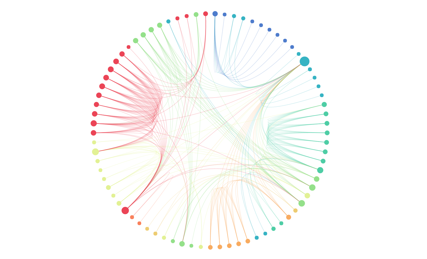
Example 1: Too many nodes leading to poor readability
When the number of nodes exceeds 15, chord diagrams become crowded and difficult to read, with severely overlapping connection lines.
import { Chart } from '@antv/g2';const chart = new Chart({container: 'container',theme: 'classic',});// Simulate data for 20 provinces, too many nodes leading to poor readabilityconst provinces = ['Beijing','Shanghai','Guangzhou','Shenzhen','Hangzhou','Nanjing','Wuhan','Chengdu','Xian','Chongqing','Tianjin','Suzhou','Qingdao','Dalian','Xiamen','Ningbo','Changsha','Zhengzhou','Jinan','Fuzhou',];const data = [];provinces.forEach((source, i) => {provinces.forEach((target, j) => {if (i !== j && Math.random() > 0.7) {data.push({source,target,value: Math.floor(Math.random() * 50) + 10,});}});});chart.options({type: 'chord',autoFit: true,data: {value: {links: data.slice(0, 40), // Only take first 40 data points for demo},},layout: { nodeWidthRatio: 0.05 },style: {labelFontSize: 8, // Smaller font to accommodate more labelslabelFill: '#666',linkFillOpacity: 0.5,},});chart.render();
Example 2: Not suitable for displaying hierarchical relationships
Chord diagrams are mainly used to show relationships between equal nodes and are not suitable for displaying data with obvious hierarchical structures.