
Bi-directional Bar Chart
Previous
Radar Chart
Next
Multi-set Bar Chart
Loading...
Bi-directional Bar Chart (also known as Positive-Negative Bar Chart) uses positive and negative bars to display numerical comparisons between categories. The categorical axis represents the dimensions to be compared, while the continuous axis represents the corresponding values. There are two cases: one where the positive and negative scales are completely symmetrical, and another where they are inversely symmetrical (i.e., opposites).
Other Names: Bi-Directional Bar,Bi-Directional Column
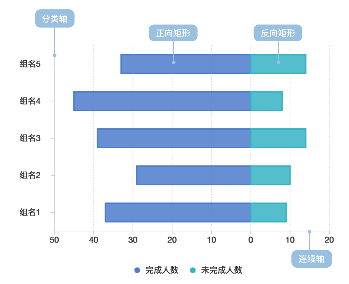
| Chart Type | Bi-directional Bar Chart |
|---|---|
| Suitable Data | List: one categorical field, two continuous fields |
| Function | Compare numerical values across categories |
| Data Mapping | Categorical field maps to position on categorical axis; one continuous field maps to length of positive bars; another continuous field maps to length of negative bars; positive/negative data can be distinguished by color or shape; categorical data can use color to enhance distinction |
| Recommended Data Count | No more than 30 items horizontally, 12 items vertically |
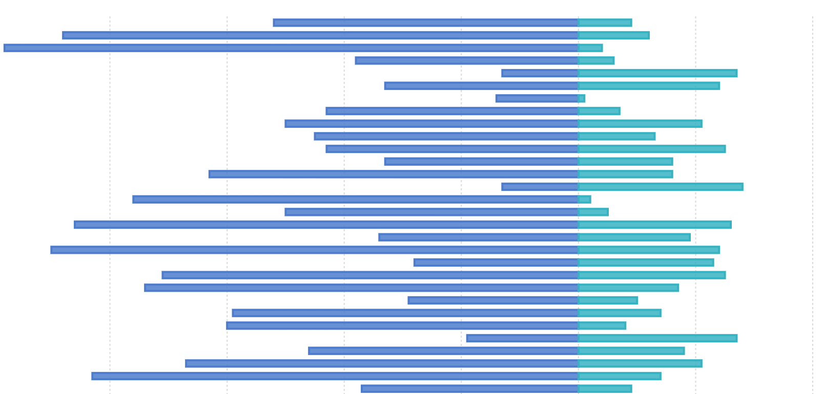
Example 1: Positive-Negative Category Comparison
The chart below simulates completion status of tasks by different departments in a company, with completed counts shown as positive bars and uncompleted counts as negative bars.
| Department | Group | Completed | Uncompleted |
|---|---|---|---|
| Dept 0 | Group0 | 37 | 9 |
| ... | ... | ... | ... |
import { Chart } from '@antv/g2';const chart = new Chart({container: 'container',});const data = [{ department: 'Dept 0', group: 'Group0', people: 37, type: 'completed' },{ department: 'Dept 0', group: 'Group0', people: 9, type: 'uncompleted' },{ department: 'Dept 0', group: 'Group1', people: 27, type: 'completed' },{ department: 'Dept 0', group: 'Group1', people: 10, type: 'uncompleted' },{ department: 'Dept 1', group: 'Group2', people: 37, type: 'completed' },{ department: 'Dept 1', group: 'Group2', people: 19, type: 'uncompleted' },{ department: 'Dept 1', group: 'Group3', people: 37, type: 'completed' },{ department: 'Dept 1', group: 'Group3', people: 29, type: 'uncompleted' },{ department: 'Dept 2', group: 'Group4', people: 20, type: 'completed' },{ department: 'Dept 2', group: 'Group4', people: 2, type: 'uncompleted' },{ department: 'Dept 2', group: 'Group5', people: 40, type: 'completed' },{ department: 'Dept 2', group: 'Group5', people: 10, type: 'uncompleted' },{ department: 'Dept 3', group: 'Group6', people: 25, type: 'completed' },{ department: 'Dept 3', group: 'Group6', people: 3, type: 'uncompleted' },{ department: 'Dept 3', group: 'Group7', people: 55, type: 'completed' },{ department: 'Dept 3', group: 'Group7', people: 8, type: 'uncompleted' },];const range = ['#7593ed', '#95e3b0', '#6c7893', '#e7c450', '#7460eb'];chart.options({type: 'interval',coordinate: { transform: [{ type: 'transpose' }] },autoFit: true,data: data,encode: {x: 'group',y: (d) => (d.type === 'completed' ? d.people : -d.people),color: 'department',},scale: {x: { padding: 0.5 },color: {type: 'ordinal',range,},},axis: {x: { title: '' },y: {labelFormatter: (d) => {return Math.abs(d);},},},style: {fill: ({ type }, i, data) => {if (type === 'uncompleted') {return 'transparent';}},stroke: (d, i, data, ...re) => {const { type } = d;if (type === 'uncompleted') {return range[i / 2];}},lineWidth: 2,},tooltip: {title: (d) => {return `${d.department}-${d.group}`;},items: [(d, i, data, column) => ({name: d.type === 'completed' ? 'Completed' : 'Uncompleted',value: d.people,}),],},});chart.render();
Explanation:
color to distinguish different departmentsshape (hollow vs solid) to distinguish completed vs uncompleted countsposition to distinguish different groupsBi-directional bar charts are not suitable for data without opposite meanings
Example 1: Stacked Bi-directional Bar Chart
The chart below shows statistics of agreement levels for different types of people on a certain question, divided into five levels: Strongly disagree, Disagree, Neither agree nor disagree, Agree and Strongly agree. The negative levels are shown as negative bars with different colors. Sample data
| type | Strongly agree | Agree | Neither agree nor disagree | Disagree | Strongly disagree |
|---|---|---|---|---|---|
| Question 1 | 11.7 | 59.9 | 18.5 | 9.1 | 0.7 |
| ... | ... | ... | ... | ... | ... |
import { Chart } from '@antv/g2';const chart = new Chart({container: 'container',});const types = ['Strongly disagree','Disagree','Neither agree nor disagree','Agree','Strongly agree',];const colors = ['#c30d24', '#f3a583', '#cccccc', '#94c6da', '#1770ab'];chart.options({type: 'interval',coordinate: { transform: [{ type: 'transpose' }] },autoFit: true,data: {type: 'fetch',value:'https://gw.alipayobjects.com/os/bmw-prod/82c97016-0f99-433b-ab21-9ecf14244610.csv',},transform: [{ type: 'stackY' }],encode: {x: 'question',y: (d) =>d.type === 'Disagree' || d.type === 'Strongly disagree'? -d.percentage: d.type === 'Neither agree nor disagree'? -d.percentage / 2: +d.percentage,color: 'type',},scale: {x: { padding: 0.5 },color: { domain: types, range: colors },},axis: {x: { title: '' },y: {labelFormatter: (d) => {return Math.abs(d);},},},tooltip: {items: [(d, i, data, column) => ({name: d.type,value: d.percentage,}),],},});chart.render();
Explanation:
color to distinguish different agreement levelsposition to distinguish different questions


