Distribution Curve
Previous
Color Map
Next
Dot Map
Loading...
A distribution curve is a statistical chart used to display the frequency distribution of data, intuitively reflecting the distribution density and central tendency of data across different value intervals through smooth curve forms. It is an important visualization tool for understanding data distribution characteristics and identifying data patterns.
Distribution curves are particularly suitable for exploratory data analysis, comparing distributions across multiple groups, data quality checking, and identifying statistical distribution characteristics, making them important tools in statistical analysis and data science.
English Name: Distribution Curve, Frequency Curve, Density Curve
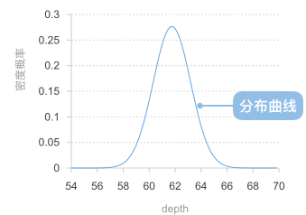
A distribution curve consists of the following elements:
Example 1: Displaying distribution characteristics of normal distribution data
Distribution curves are very suitable for displaying normal distribution data, clearly showing the central tendency, symmetry, and distribution shape of the data.
import { Chart } from '@antv/g2';// Generate normal distribution dataconst generateNormalData = (count, mean, std) => {const data = [];for (let i = 0; i < count; i++) {// Use Box-Muller transform to generate normal distribution dataconst u1 = Math.random();const u2 = Math.random();const z0 = Math.sqrt(-2 * Math.log(u1)) * Math.cos(2 * Math.PI * u2);data.push({ value: mean + std * z0 });}return data;};const chart = new Chart({container: 'container',theme: 'classic',});chart.options({type: 'line',data: {value: generateNormalData(1000, 100, 15),transform: [{type: 'custom',callback: (data) => {// Extract numerical dataconst values = data.map(d => d.value).filter(v => !isNaN(v));// Calculate data rangeconst min = Math.min(...values);const max = Math.max(...values);const binCount = 30;const binWidth = (max - min) / binCount;// Create binsconst bins = Array.from({ length: binCount }, (_, i) => ({x0: min + i * binWidth,x1: min + (i + 1) * binWidth,count: 0,}));// Count frequency for each binvalues.forEach(value => {const binIndex = Math.min(Math.floor((value - min) / binWidth),binCount - 1);bins[binIndex].count++;});// Calculate frequency density and generate curve dataconst total = values.length;return bins.map(bin => ({x: (bin.x0 + bin.x1) / 2, // Bin center pointy: bin.count / total, // Frequency densityfrequency: bin.count,range: `${bin.x0.toFixed(1)}-${bin.x1.toFixed(1)}`,}));},},],},encode: {x: 'x',y: 'y',shape: 'smooth',},style: {lineWidth: 3,stroke: '#1890ff',},axis: {x: { title: 'Measured Value' },y: { title: 'Frequency Density' },},tooltip: {title: (d) => `Range: ${d.range}`,items: [{ field: 'frequency', name: 'Frequency' },{ field: 'y', name: 'Frequency Density', valueFormatter: '.3f' },],},});chart.render();
Description:
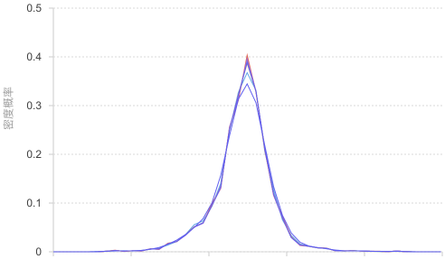
Example 2: Comparative analysis of multiple group distributions
When comparing data distributions under different conditions or groups, distribution curves can intuitively show distribution differences between groups.
import { Chart } from '@antv/g2';const chart = new Chart({container: 'container',theme: 'classic',});chart.options({type: 'line',data: {type: 'fetch',value: 'https://assets.antv.antgroup.com/g2/species.json',transform: [{type: 'custom',callback: (data) => {// Group data by speciesconst groups = {};data.forEach(d => {if (!groups[d.species]) groups[d.species] = [];groups[d.species].push(d.y);});const binCount = 20;const results = [];// Create distribution curve data for each speciesObject.entries(groups).forEach(([species, values]) => {const filteredValues = values.filter(v => !isNaN(v));if (filteredValues.length === 0) return;const min = Math.min(...filteredValues);const max = Math.max(...filteredValues);const binWidth = (max - min) / binCount;// Create binsconst bins = Array.from({ length: binCount }, (_, i) => ({x0: min + i * binWidth,x1: min + (i + 1) * binWidth,count: 0,}));// Count frequenciesfilteredValues.forEach(value => {const binIndex = Math.min(Math.floor((value - min) / binWidth),binCount - 1);bins[binIndex].count++;});// Generate curve dataconst total = filteredValues.length;bins.forEach(bin => {results.push({x: (bin.x0 + bin.x1) / 2,y: bin.count / total,species,frequency: bin.count,range: `${bin.x0.toFixed(2)}-${bin.x1.toFixed(2)}`,});});});return results;},},],},encode: {x: 'x',y: 'y',color: 'species',shape: 'smooth',},style: {lineWidth: 2,strokeOpacity: 0.8,},axis: {x: { title: 'Petal Length' },y: { title: 'Frequency Density' },},legend: {color: {title: 'Species',position: 'right',},},tooltip: {title: (d) => `${d.species} - Range: ${d.range}`,items: [{ field: 'frequency', name: 'Frequency' },{ field: 'y', name: 'Frequency Density', valueFormatter: '.3f' },],},});chart.render();
Description:
Example 1: Poor effectiveness with insufficient data
When there are too few data points, binning statistics may not be accurate enough, and the generated distribution curve may not accurately reflect true distribution characteristics.
import { Chart } from '@antv/g2';// Simulate small amount of dataconst smallData = [12, 15, 13, 14, 16, 18, 11, 17, 15, 13];const chart = new Chart({container: 'container',theme: 'classic',height: 250,});chart.options({type: 'point',data: smallData.map((value, index) => ({ index: index + 1, value })),encode: {x: 'index',y: 'value',size: 6,},style: {fill: '#1890ff',fillOpacity: 0.8,},axis: {x: { title: 'Data Point Index' },y: { title: 'Value' },},title: 'Scatter plot recommended for small datasets',});chart.render();
Problem Description:
Example 2: Discrete categorical data is not applicable
For discrete categorical data, continuous distribution curves have no practical meaning because there is no continuity relationship between categories.
import { Chart } from '@antv/g2';// Discrete categorical dataconst discreteData = [{ category: 'Product A', sales: 45 },{ category: 'Product B', sales: 67 },{ category: 'Product C', sales: 33 },{ category: 'Product D', sales: 52 },{ category: 'Product E', sales: 28 },];const chart = new Chart({container: 'container',theme: 'classic',height: 250,});chart.options({type: 'interval',data: discreteData,encode: {x: 'category',y: 'sales',color: 'category',},style: {fillOpacity: 0.8,},axis: {x: { title: 'Product Category' },y: { title: 'Sales Quantity' },},title: 'Bar chart recommended for categorical data',});chart.render();
Problem Description: