
Chart API
Previous
Experimental Spec API
Next
G2's complete configuration system
Loading...
new Chart(params: ChartCfg) => View;
Creates a Chart object.
const chart = new Chart({container: 'container',width: 640,height: 480,});
Specifies the DOM container for chart rendering. Accepts either a DOM ID or DOM element instance.
// Pass DOM idconst chart = new Chart({container: 'container',});// Pass DOM instanceconst container = document.createElement('div');const chart = new Chart({container,});// Get default containerconst chart = new Chart();chart.options({});chart.render();return chart.getContainer();
false
Whether the chart auto-adapts to container dimensions. Default false requires manual width/height setting. When autoFit: true, automatically uses container dimensions while respecting user-defined height.
false
Whether to clip graphics exceeding the drawing area.
With clip = false, out-of-bound graphics remain visible:
import { Chart } from '@antv/g2';const chart = new Chart({container: 'container',});chart.data([{ year: '1991', value: 3 },{ year: '1992', value: 4 },{ year: '1993', value: 3.5 },{ year: '1994', value: 5 },{ year: '1995', value: 4.9 },{ year: '1996', value: 6 },{ year: '1997', value: 7 },{ year: '1998', value: 9 },{ year: '1999', value: 13 },]).encode('x', 'year').encode('y', 'value').scale('x', { range: [0, 1] }).scale('y', { domainMin: 6, nice: true });chart.options({type: 'view',children: [{type: 'line',labels: [{ text: 'value', style: { dx: -10, dy: -12 } }],},{ type: 'point', style: { fill: 'white' }, tooltip: false },],});chart.render();
Set clip = true to enable clipping. Adjust inset if points get clipped:
import { Chart } from '@antv/g2';const chart = new Chart({container: 'container',clip: true,inset: 20,});chart.options({type: 'view',data: [{ year: '1991', value: 3 },{ year: '1992', value: 4 },{ year: '1993', value: 3.5 },{ year: '1994', value: 5 },{ year: '1995', value: 4.9 },{ year: '1996', value: 6 },{ year: '1997', value: 7 },{ year: '1998', value: 9 },{ year: '1999', value: 13 },],encode: { x: 'year', y: 'value' },scale: { x: { range: [0, 1] }, y: { domainMin: 6, nice: true } },children: [{type: 'line',labels: [{ text: 'value', style: { dx: -10, dy: -12 } }],},{ type: 'point', style: { fill: 'white' }, tooltip: false },],});chart.render();
640
Chart width.
480
Chart height.
0
Chart depth for 3D visualizations.
'auto'
Sets chart padding using CSS box model conventions.
const chart = new Chart({container: 'container',width: 1000,height: 500,padding: 20,});

16
Sets chart margin using CSS box model .
const chart = new Chart({container: 'container',width: 1000,height: 500,margin: 20,});
0
Sets breathing space around chart area.
const chart = new G2.Chart({container: 'container',width: 1000,height: 500,inset: 20,});
See Chart Layout for layout details.
Specifies rendering engine (default: Canvas). For SVG/WebGL, import respective packages:
import { Chart } from '@antv/g2';import { Renderer as SVGRenderer } from '@antv/g-svg';import { Renderer as WebGLRenderer } from '@antv/g-webgl';const chart = new Chart({container: 'container',// Alternatively, you can choose the WebGLRenderer. If not specified, the default will be CanvasRenderer.renderer: new SVGRenderer(),});
See renderer for renderer details.
Configures chart theme. Register custom themes using register :
import { Light, register, Chart } from '@antv/g2';// define themefunction CustomTheme() {const light = Light();return {...light,category20: ['#FFC0CB','#A2F5E8','#D4B0FF','#FFF3A3','#9AD6E3','#FFD8B1','#C3E6B4','#E8CFF8','#FFB7A0','#B8D0EB','#F5E6C3','#EED5B7','#C5D4EB','#D9C2F0','#D4EDC9','#B8E0A8','#EFD3A7','#F7CBD4','#F7ABD4','#F0E6E6',],};}// register themeregister('theme.custom', CustomTheme);const chart = new Chart({container: 'container',theme: { type: 'custom' }, // use theme});chart.options({type: 'interval',data: {type: 'fetch',value:'https://gw.alipayobjects.com/os/bmw-prod/fb9db6b7-23a5-4c23-bbef-c54a55fee580.csv',},encode: { x: 'letter', y: 'frequency', color: 'letter' },axis: { y: { labelFormatter: '.0%' } },});chart.render();
Specify the plugins to be used during rendering. As a flexible extension mechanism, plugins allow users to enhance G2's functionality, such as creating hand-drawn-style charts.
import { Plugin } from '@antv/g-plugin-rough-canvas-renderer';const chart = new Chart({container: 'container',plugins: [new Plugin()],});
Accessibility's text search functionality can also be achieved through plugins.
import { Plugin } from '@antv/g-plugin-a11y';const plugin = new Plugin({ enableExtractingText: true });const chart = new Chart({container: 'container',plugins: [plugin],});
For more information on plugin usage, see plugin-rough and plugin-a11y.
G2 provides an imperative Functional API for defining charts. Here's an example of declaring the simplest bar chart:
import { Chart } from '@antv/g2';// Initialize the chart instanceconst chart = new Chart({container: 'container',});// declare the visualizationchart.interval() // Create an Interval mark.data([// Bind the data{ genre: 'Sports', sold: 275 },{ genre: 'Strategy', sold: 115 },{ genre: 'Action', sold: 120 },{ genre: 'Shooter', sold: 350 },{ genre: 'Other', sold: 150 },]).encode('x', 'genre') // Encode data to the x channel.encode('y', 'sold'); // Encode data to the y channel// Render the visualizationchart.render();
The Functional API is built on top of the Spec API. Simply put, each Chart instance has an options object. The Functional API generates this options object through a series of methods, while the Spec API directly sets it. Regardless of which API you use, G2 ultimately renders the current options. Therefore, both APIs are equally capable of defining visualizations.
Setting Properties
Retrieve or set the overall chart configuration, known as the Spec.
// Retrieve configurationchart.point().data({type: 'fetch',value:'https://gw.alipayobjects.com/os/basement_prod/6b4aa721-b039-49b9-99d8-540b3f87d339.json',}).encode('x', 'height').encode('y', 'weight').encode('color', 'gender');console.log(chart.options());// Set configurationchart.options({type: 'point',autoFit: true,data: {type: 'fetch',value:'https://gw.alipayobjects.com/os/basement_prod/6b4aa721-b039-49b9-99d8-540b3f87d339.json',},encode: { x: 'height', y: 'weight', color: 'gender' },});
Creating Composite Containers
In G2, the Spec is essentially a hierarchical View Tree, consisting of various nodes. Each node is defined by node.type, which determines its role, and nesting can be achieved through node.children.
A "view" can be simply understood as a chart, or a Single View Plot. This "tree" uses different container nodes to manage charts in time and space, enabling the creation of Multiple View Plots.
For example:
({type: 'spaceFlex',children: [{type: 'view',children: [{ type: 'line' }, { type: 'point' }],},{type: 'interval',},],});
The hierarchy can be declared programmatically using the API by adding specific child nodes to a parent using the syntax parent.[child](). The above hierarchy can be expressed as follows:
const spaceFlex = chart.spaceFlex();const view = spaceFlex.view();view.line();view.point();spaceFlex.interval();
Add a view to the chart.In G2, a View is used to render multiple marks. A View possesses its own coordinate system and serves as the smallest unit for applying interactions.
const spaceFlex = chart.spaceFlex();const view = spaceFlex.view();view.line();view.point();
Add a spaceLayer composite container.spaceLayer does not divide the space in any way; multiple views share the same spatial area, which is often used for view overlapping.

import { Chart } from '@antv/g2';const chart = new Chart({container: 'container',});chart.options({type: 'spaceLayer',data: {type: 'fetch',value:'https://gw.alipayobjects.com/os/bmw-prod/fb9db6b7-23a5-4c23-bbef-c54a55fee580.csv',format: 'csv',},children: [// bar chart{type: 'interval',paddingLeft: 50,transform: [{ type: 'sortX', reverse: true, by: 'y' }],encode: { x: 'letter', y: 'frequency', color: 'letter' },},// pie chart{type: 'interval',paddingLeft: 400,paddingBottom: 200,coordinate: { type: 'theta' },transform: [{ type: 'stackY' }],legend: false,encode: { y: 'frequency', color: 'letter' },},],});chart.render();
Add a spaceFlex composite container.spaceFlex divides the spatial area using a layout method similar to CSS flex, commonly used for views that require comparison of multiple charts.

import { Chart } from '@antv/g2';const chart = new Chart({container: 'container',width: 900,});const flex = chart.spaceFlex().data({type: 'fetch',value: 'https://assets.antv.antgroup.com/g2/seattle-weather.json',}).attr('direction', 'col').attr('ratio', [1, 2]);flex.interval().attr('paddingBottom', 0).attr('paddingRight', 300).transform({ type: 'groupX', y: 'max' }).axis('x', false).encode('x', (d) => new Date(d.date).getUTCDate()).encode('y', 'temp_max').encode('color', 'steelblue');flex.spaceFlex().attr('ratio', [2, 1]).call((node) =>node.cell().attr('paddingRight', 0).attr('paddingBottom', 50).transform({ type: 'group', color: 'max' }).encode('x', (d) => new Date(d.date).getUTCDate()).encode('y', (d) => new Date(d.date).getUTCMonth()).encode('color', 'temp_max').style('inset', 0.5).axis('x', { title: 'Date' }).axis('y', { title: 'Month' }).legend({ color: false }).scale('color', {type: 'sequential',palette: 'gnBu',}),).call((node) =>node.interval().attr('paddingBottom', 50).transform({ type: 'groupX', y: 'max' }).coordinate({ transform: [{ type: 'transpose' }] });.axis('x', false).encode('x', (d) => new Date(d.date).getUTCMonth()).encode('y', 'temp_max').encode('color', 'steelblue'),);chart.render();
Add a facetRect composite container.facetRect divides space and data using the row and column field dimensions, visualizing data segments within each subspace.

import { Chart } from '@antv/g2';const chart = new Chart({container: 'container',width: 928,height: 270,paddingBottom: 50,});const facetRect = chart.facetRect().attr('paddingBottom', 50).data({type: 'fetch',value: 'https://assets.antv.antgroup.com/g2/anscombe.json',}).encode('x', 'series');facetRect.point().encode('x', 'x').encode('y', 'y').style('stroke', '#000').attr('inset', 10);chart.render();
Add a facetCircle composite container.facetCircle divides spatial data into segments using circular partitioning based on specified fields and then visualizes the data for each facet.

import { Chart } from '@antv/g2';const M = ['Jan.','Feb.','Mar.','Apr.','May','Jun.','Jul.','Aug.','Sept.','Oct.','Nov.','Dec.',];const N = ['A', 'B', 'C', 'D'];const data = M.flatMap((month) =>N.map((name) => ({month,name,value: Math.random(),})),);const chart = new Chart({container: 'container',width: 480,height: 480,});chart.options({type: 'facetCircle',data,encode: { position: 'month' },children: [{ type: 'interval', encode: { x: 'name', y: 'value', color: 'name' } },],});chart.render();
Add a repeatMatrix composite container.repeatMatrix partitions the space based on the number of fields and then visualizes the data within these subspaces.

import { Chart } from '@antv/g2';const chart = new Chart({container: 'container',width: 300,height: 720,paddingLeft: 50,paddingBottom: 60,});const repeatMatrix = chart.repeatMatrix().data({type: 'fetch',value: 'https://assets.antv.antgroup.com/g2/weather.json',transform: [{type: 'map',callback: ({ date, ...d }) => ({...d,date: new Date(date).getMonth() + '',}),},],}).encode('y', ['temp_max', 'precipitation', 'wind']).encode('x', 'date');repeatMatrix.line().transform({ type: 'groupX', y: 'mean' }).encode('color', 'location').scale('y', { zero: true });chart.render();
Add a geoView composite container.geoView serves as a container for map rendering, allowing the overlay of multiple geoPath layers. Like the normal view, its child mark will also inherit the parent's data.

import { Chart } from '@antv/g2';import { feature } from 'topojson-client';Promise.all([fetch('https://assets.antv.antgroup.com/g2/londonBoroughs.json').then((res) =>res.json(),),fetch('https://assets.antv.antgroup.com/g2/londonCentroids.json').then((res) => res.json(),),fetch('https://assets.antv.antgroup.com/g2/londonTubeLines.json').then((res) => res.json(),),]).then((values) => {const [londonBoroughs, londonCentroids, londonTubeLines] = values;const london = feature(londonBoroughs,londonBoroughs.objects.boroughs,).features;const line = feature(londonTubeLines, londonTubeLines.objects.line).features;const chart = new Chart({container: 'container',autoFit: true,});const geoView = chart.geoView();geoView.geoPath().data(london).style('fill', 'lightgray').style('stroke', 'white').style('strokeWidth', 2);geoView.text().data(londonCentroids).encode('x', 'cx').encode('y', 'cy').encode('text', (d) => d.name.split(/\W/)[0]).style('fontSize', 8).style('opacity', 0.6);geoView.geoPath().data(line).encode('color', 'id').encode('shape', 'hollow').scale('color', {domain: ['Bakerloo','Central','Circle','District','DLR','Hammersmith & City','Jubilee','Metropolitan','Northern','Piccadilly','Victoria','Waterloo & City',],range: ['rgb(137,78,36)','rgb(220,36,30)','rgb(255,206,0)','rgb(1,114,41)','rgb(0,175,173)','rgb(215,153,175)','rgb(106,114,120)','rgb(114,17,84)','rgb(0,0,0)','rgb(0,24,168)','rgb(0,160,226)','rgb(106,187,170)',],});chart.render();});
Add a timingKeyframe composite container.timingKeyframe performs seamless transition animations between different views, linking visual elements using mark.key and mark.groupKey.

fetch('https://gw.alipayobjects.com/os/bmw-prod/fbe4a8c1-ce04-4ba3-912a-0b26d6965333.json',).then((res) => res.json()).then((data) => {const chart = new Chart({container: 'container',paddingTop: 60,paddingLeft: 100,});const keyframe = chart.timingKeyframe().attr('direction', 'alternate').attr('iterationCount', 4);// bar chartkeyframe.interval().data(data).transform({ type: 'groupX', y: 'mean' }).encode('x', 'gender').encode('y', 'weight').encode('color', 'gender').encode('key', 'gender'); // Specify the key// scatter chartkeyframe.point().data(data).encode('x', 'height').encode('y', 'weight').encode('color', 'gender').encode('groupKey', 'gender') // Specify the key for grouping..encode('shape', 'point');chart.render();});
Creating Marks
Next, we'll introduce the API in G2 for creating marks. Marks can be added to different container nodes, including chart, view, geoView, spaceLayer, facetRect, spaceFlex, facetCircle, repeatMatrix, and timingKeyframe,They all inherit from view, so they are uniformly represented as view.${mark}().
Adds an interval mark. interval is commonly used to create visualizations like bar charts, column charts, or pie charts. By varying the coordinate system, scales, and data transformations, it offers a versatile range of visual styles. It is one of the most frequently used marks in chart grammar.

import { Chart } from '@antv/g2';const chart = new Chart({container: 'container',});chart.interval().data({type: 'fetch',value:'https://gw.alipayobjects.com/os/bmw-prod/87b2ff47-2a33-4509-869c-dae4cdd81163.csv',format: 'csv',transform: [{type: 'filter',callback: (d) => d.year === 2000,},],}).transform({ type: 'groupX', y: 'sum' }).encode('x', 'age').encode('y', 'people').encode('color', 'sex').scale('color', { type: 'ordinal', range: ['#ca8861', '#675193'] }).axis('y', { labelFormatter: '~s' }).style('fillOpacity', 0.7);chart.render();
Adds a rect mark. The rect mark is a core chart element used to draw rectangular shapes. By configuring properties such as starting point, endpoint, width, height, color, and style, it enables various visualization scenarios.
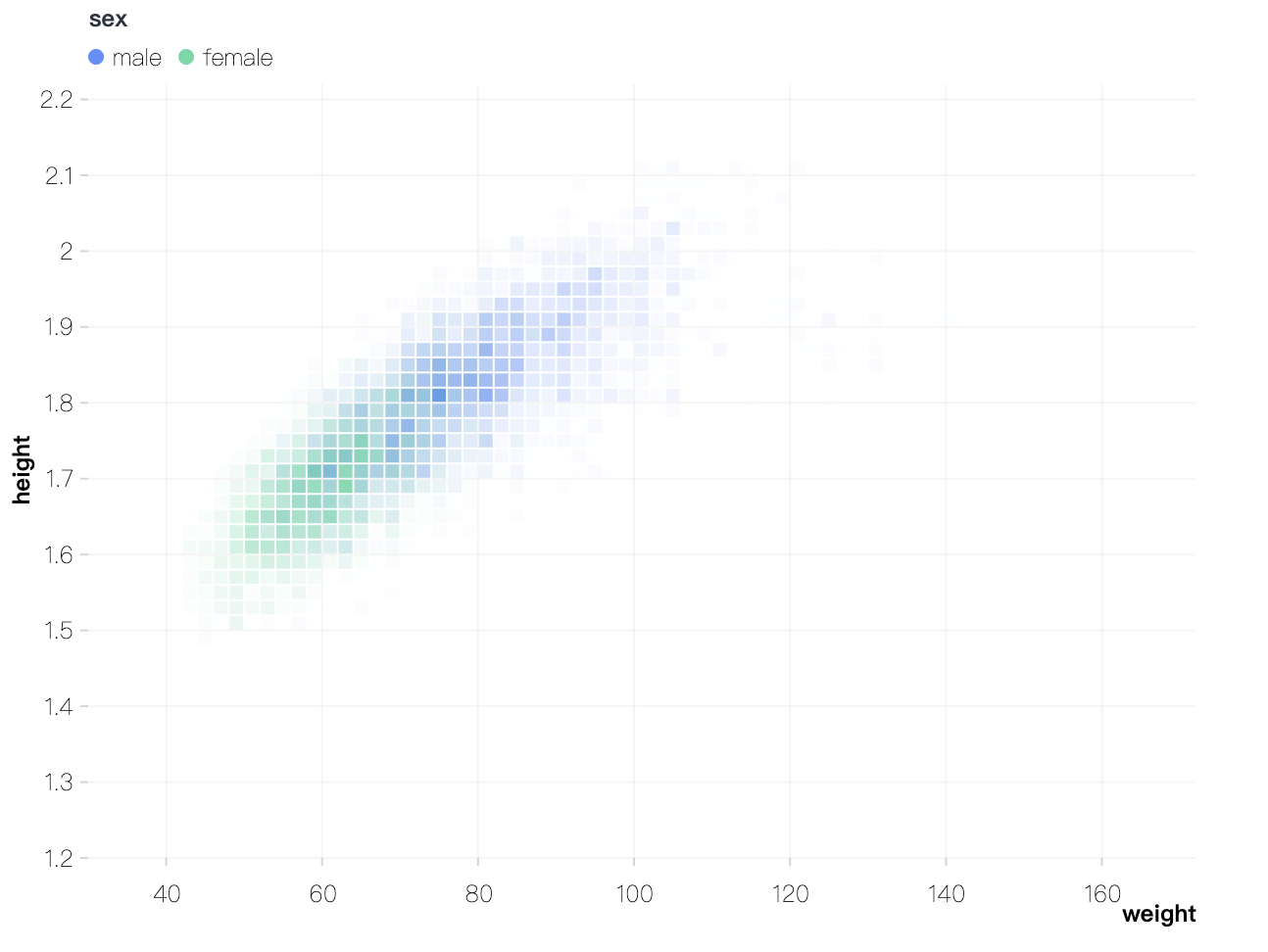
import { Chart } from '@antv/g2';const chart = new Chart({container: 'container',});chart.rect().data({type: 'fetch',value: 'data/athletes.csv',}).encode('x', 'weight').encode('y', 'height').encode('color', 'sex').transform([{ type: 'bin', opacity: 'count' }]).style('inset', 0.5);chart.render();
Adds a point mark. The point mark is primarily used for scatter plots, also known as dot plots or scatter diagrams. Scatter plots display data points on a Cartesian coordinate system, representing their values through position.

import { Chart } from '@antv/g2';const chart = new Chart({container: 'container',});chart.point().data({type: 'fetch',value: 'https://gw.alipayobjects.com/os/antvdemo/assets/data/bubble.json',}).encode('x', 'GDP').encode('y', 'LifeExpectancy').encode('size', 'Population').encode('color', 'continent').encode('shape', 'point').scale('size', { type: 'log', range: [4, 20] }).style('fillOpacity', 0.3).style('lineWidth', 1);chart.render();
Adds an area mark. The area mark is commonly used to create area charts. These charts illustrate changes in data values over ordered variables, often displaying trends or patterns in the data.

import { Chart } from '@antv/g2';const chart = new Chart({container: 'container',});chart.options({type: 'area',data: {type: 'fetch',value: 'https://assets.antv.antgroup.com/g2/aapl.json',transform: [{type: 'map',callback: (d) => ({...d,date: new Date(d.date),}),},],},encode: { x: 'date', y: 'close' },});chart.render();
Adds a line mark. The line mark uses a series of points to draw a line that represents changes in data across an ordered dimension. It is commonly used in line charts and is one of the most widely used marks.

import { Chart } from '@antv/g2';const chart = new Chart({container: 'container',});chart.line().data({type: 'fetch',value:'https://gw.alipayobjects.com/os/bmw-prod/551d80c6-a6be-4f3c-a82a-abd739e12977.csv',}).encode('x', 'date').encode('y', 'close');chart.render();
Adds a vector mark. The vector mark visualizes data as arrows, representing vector fields such as wind or flow patterns. The arrow's position, size, color, and angle can be customized to convey various information.

import { Chart } from '@antv/g2';const chart = new Chart({container: 'container',});chart.vector().data({type: 'fetch',value: 'https://gw.alipayobjects.com/os/antfincdn/F5VcgnqRku/wind.json',}).encode('x', 'longitude').encode('y', 'latitude').encode('rotate', ({ u, v }) => (Math.atan2(v, u) * 180) / Math.PI).encode('size', ({ u, v }) => Math.hypot(v, u)).encode('color', ({ u, v }) => Math.hypot(v, u)).scale('size', { range: [6, 20] }).scale('color', { type: 'sequential', palette: 'viridis' }).axis('x', { grid: false }).axis('y', { grid: false }).legend(false);chart.render();
Adds a link mark. The link mark is similar to a line chart, but it connects pairs of points specified by arrays of two values in the x and y channels. It retrieves corresponding (x, y) pairs and connects them with directed line segments, optionally adding arrows.

import { Chart } from '@antv/g2';const chart = new Chart({container: 'container',});chart.link().data({type: 'fetch',value: 'https://gw.alipayobjects.com/os/antfincdn/SM13%24lHuYH/metros.json',}).encode('x', ['POP_1980', 'POP_2015']).encode('y', ['R90_10_1980', 'R90_10_2015']).encode('color', (d) => d.R90_10_2015 - d.R90_10_1980).scale('x', { type: 'log' }).style('arrowSize', 6).axis('x', { labelFormatter: '~s', label: { autoHide: true } }).legend(false);chart.render();
Adds a polygon mark. The polygon mark uses a set of (x, y) data points to form a closed shape. It is often combined with community visualization layout algorithms to process and display data.

import { Chart } from '@antv/g2';import * as d3 from 'd3-voronoi';const layout = (data) => {return d3.voronoi().x((d) => d.x).y((d) => d.y).extent([[0, 0],[800, 600],]).polygons(data).map((p) =>Object.assign({}, p, {x: p.map((pi) => pi[0]),y: p.map((pi) => pi[1]),}),);};const chart = new Chart({container: 'container',paddingLeft: 0,paddingRight: 0,paddingTop: 0,paddingBottom: 0,});chart.polygon().data({type: 'fetch',value: 'https://gw.alipayobjects.com/os/antvdemo/assets/data/voronoi.json',transform: [{type: 'custom',callback: layout,},],}).encode('x', 'x').encode('y', 'y').encode('color', (d) => d.data.value).scale('x', { domain: [0, 800] }).scale('y', { domain: [0, 600] }).axis(false).style('stroke', '#fff').style('fillOpacity', 0.65);chart.render();
Adds an image mark. The image mark is typically not used alone but enhances other marks by adding visual elements like icons or logos. This helps convey information more intuitively and improves the overall visualization.

import { Chart } from '@antv/g2';const data = [{name: 'Internet Explorer',value: 26,url: 'https://gw.alipayobjects.com/zos/rmsportal/eOYRaLPOmkieVvjyjTzM.png',},{name: 'Chrome',value: 40,url: 'https://gw.alipayobjects.com/zos/rmsportal/dWJWRLWfpOEbwCyxmZwu.png',},{name: 'Firefox',value: 30,url: 'https://gw.alipayobjects.com/zos/rmsportal/ZEPeDluKmAoTioCABBTc.png',},{name: 'Safari',value: 24,url: 'https://gw.alipayobjects.com/zos/rmsportal/eZYhlLzqWLAYwOHQAXmc.png',},{name: 'Opera',value: 15,url: 'https://gw.alipayobjects.com/zos/rmsportal/vXiGOWCGZNKuVVpVYQAw.png',},{name: 'Undetectable',value: 8,url: 'https://gw.alipayobjects.com/zos/rmsportal/NjApYXminrnhBgOXyuaK.png',},];const chart = new Chart({container: 'container',});chart.data(data);chart.link().encode('x', ['name', 'name']).encode('y', (d) => [0, d.value]).style('stroke', '#dfdfdf').style('lineDash', [2, 2]);chart.line().encode('x', 'name').encode('y', 'value').encode('shape', 'smooth').scale('x', { type: 'band' }).scale('y', { domain: [0, 50] }).style('opacity', 0.5);chart.image().encode('x', 'name').encode('y', 'value').encode('src', 'url').scale('x', { type: 'band' }).scale('y', { domain: [0, 50] });chart.render();
Adds a text mark. The text mark is a graphical element used to add textual annotations, labels, or explanatory content directly onto a chart. This enhances the readability and effectiveness of data visualizations.

import { Chart } from '@antv/g2';const chart = new Chart({container: 'container',});chart.data({type: 'fetch',value:'https://gw.alipayobjects.com/os/bmw-prod/fb9db6b7-23a5-4c23-bbef-c54a55fee580.csv',});chart.interval().encode('x', 'letter').encode('y', 'frequency').axis('y', { labelFormatter: '.0%' });chart.text().encode('x', 'letter').encode('y', 'frequency').encode('text', 'frequency').style('fill', 'black').style('textAlign', 'center').style('dy', -5);chart.render();
Adds a lineX mark. The lineX mark draws a vertical auxiliary line perpendicular to the x-axis. It is commonly used to highlight averages or other aggregated data points.

import { Chart } from '@antv/g2';const chart = new Chart({container: 'container',paddingLeft: 50,});chart.data({type: 'fetch',value: 'https://assets.antv.antgroup.com/g2/movies.json',transform: [{type: 'filter',callback: (d) => d['IMDB Rating'] > 0,},],});chart.rect().transform({ type: 'binX', y: 'count', thresholds: 9 }).encode('x', 'IMDB Rating').scale('y', { domainMax: 1000 }).style('inset', 1);chart.lineX().transform({ type: 'groupColor', y: 'mean' }).encode('x', 'IMDB Rating').style('stroke', '#F4664A').style('strokeOpacity', 1).style('lineWidth', 5);chart.render();
Adds a lineY mark. The lineY mark draws a horizontal auxiliary line perpendicular to the y-axis. It is often used to highlight averages or other aggregated data points.

import { Chart } from '@antv/g2';const chart = new Chart({container: 'container',});chart.data({type: 'fetch',value: 'https://assets.antv.antgroup.com/g2/seattle-weather.json',});chart.interval().transform({ type: 'groupX', y: 'mean' }).encode('x', (d) => new Date(d.date).getUTCMonth()).encode('y', 'precipitation').scale('y', { tickCount: 5, domainMax: 6 });chart.lineY().transform({ type: 'groupX', y: 'mean' }).encode('y', 'precipitation').style('stroke', '#F4664A').style('strokeOpacity', 1).style('lineWidth', 2);chart.render();
Adds a range mark. The range mark defines a rectangular area using two sets of coordinates: one for the horizontal direction (x1, x2) and another for the vertical direction (y1, y2). It is commonly used to highlight background regions or mark specific areas.

import { Chart } from '@antv/g2';const chart = new Chart({ container: 'container' });chart.data({type: 'fetch',value:'https://gw.alipayobjects.com/os/bmw-prod/0b37279d-1674-42b4-b285-29683747ad9a.json',});chart.options({type: 'view',children: [{ type: 'lineX', data: [0] },{ type: 'lineY', data: [0] },{type: 'range',data: [{ x: [-25, 0], y: [-30, 0], region: '1' },{ x: [-25, 0], y: [0, 20], region: '2' },{ x: [0, 5], y: [-30, 0], region: '2' },{ x: [0, 5], y: [0, 20], region: '1' },],encode: { x: 'x', y: 'y', color: 'region' },scale: {color: { range: ['#d8d0c0', '#a3dda1'], independent: true, guide: null },},style: { fillOpacity: 0.2 },},{type: 'point',encode: {x: 'change in female rate',y: 'change in male rate',size: 'pop',color: 'continent',shape: 'point',},scale: {color: { range: ['#ffd500', '#82cab2', '#193442', '#d18768', '#7e827a'] },x: { domain: [-25, 5] },y: { domain: [-30, 20] },size: { range: [4, 30] },},axis: { x: { title: false }, y: { title: false } },style: { stroke: '#bbb', fillOpacity: 0.8 },},],});chart.render();
Adds a rangeX mark. The rangeX mark uses a pair of x values (x1, x2) to define a rectangular area along the x-axis. It is often used to highlight specific regions.

import { Chart } from '@antv/g2';const chart = new Chart({container: 'container',height: 360,paddingLeft: 60,});chart.data({type: 'fetch',value: 'https://assets.antv.antgroup.com/g2/year-population.json',});chart.options({type: 'view',children: [{type: 'rangeX',data: [{ year: [new Date('1933'), new Date('1945')], event: 'Nazi Rule' },{ year: [new Date('1948'), new Date('1989')], event: 'GDR (East Germany)' },],encode: { x: 'year', color: 'event' },scale: { color: { independent: true, range: ['#FAAD14', '#30BF78'] } },style: { fillOpacity: 0.75 },},{type: 'line',encode: { x: (d) => new Date(d.year), y: 'population', color: '#333' },},{type: 'point',encode: { x: (d) => new Date(d.year), y: 'population', color: '#333' },style: { lineWidth: 1.5 },},],});chart.render();
Additionally, rangeX supports a shorthand syntax:
chart.rangeX().data([[new Date('2010'), new Date('2011')]]).encode('x', (d) => d);// Simplified version:chart.rangeX().data([new Date('2010'), new Date('2011')]);
Adds a rangeY mark. The rangeY mark uses a pair of y values (y1, y2) to define a rectangular area along the y-axis. It is often used to highlight specific regions.

import { Chart } from '@antv/g2';const chart = new Chart({container: 'container',});chart.options({type: 'view',children: [{type: 'point',data: {type: 'fetch',value:'https://gw.alipayobjects.com/os/basement_prod/6b4aa721-b039-49b9-99d8-540b3f87d339.json',},encode: { x: 'height', y: 'weight', color: 'gender' },},{type: 'rangeY',data: [{ y: [54, 72] }],encode: { y: 'y' },},],});chart.render();
Additionally, rangeY supports a shorthand syntax:
chart.rangeY().data([[54, 60],[65, 72],]).encode('y', (d) => d);// Simplified version:chart.rangeY().data([[54, 60],[65, 72],]);
Adds a connector mark. The connector is used to draw auxiliary lines that connect two elements, often highlighting relationships or transitions between data points.

import { Chart } from '@antv/g2';const chart = new Chart({container: 'container',autoFit: true,insetTop: 30,});chart.data([{ x: 'Net Sales', value: 5085000, start: 0, end: 5085000 },{ x: 'Cost of Sales', value: -1250450, start: 5085000, end: 3834550 },{ x: 'Operating Expenses', value: -2350050, start: 3834550, end: 1484500 },{ x: 'Other Income', value: 750000, start: 1484500, end: 2234500 },{ x: 'Extraordinary Gain', value: -230050, start: 2234500, end: 2004450 },{ x: 'Interest Expense', value: -500000, start: 2004450, end: 1504450 },{ x: 'Taxis', value: 490000, start: 1504450, end: 1994450 },{ x: 'Net Income', isTotal: true, value: 1994450, start: 0, end: 1994450 },]).axis('x', { title: false, labelTransform: 'rotate(-90)' }).axis('y', { labelFormatter: '~s' }).legend(null);chart.link().data({ transform: [{ type: 'custom', callback: linkData }] }).encode('x', ['x1', 'x2']).encode('y', 'value').style('stroke', '#697474').style('lineDash', [4, 2]).tooltip(false);chart.connector().data({ transform: [{ type: 'custom', callback: connectorData }] }).encode('x', ['x1', 'x2']).encode('y', ['y1', 'y2']).label({text: (d) => `${d.y2 - d.y1}`,formatter: '~s',fontSize: 10,dy: 2,}).style({ stroke: '#697474', offset: 16 }).tooltip(false);chart.interval().encode('x', 'x').encode('y', ['start', 'end']).encode('color', (d, idx) =>idx === 0 || d.isTotal ? 'D' : d.value > 0 ? 'P' : 'N',).scale('color', {domain: ['P', 'N', 'D'],range: ['#64b5f6', '#ef6c00', '#96a6a6'],}).encode('size', 24).style('stroke', '#697474').label({text: 'value',formatter: '~s',position: (d) => (d.value > 0 ? 'top' : 'bottom'),textBaseline: (d) => (d.value > 0 ? 'bottom' : 'top'),fontSize: 10,dy: (d) => (d.value > 0 ? -4 : 4),}).tooltip({ channel: 'y', valueFormatter: '~s' }).tooltip({ channel: 'y1', valueFormatter: '~s' });chart.render();// Process data.function linkData(data) {return data.reduce((r, d, idx) => {if (idx > 0) {return r.concat({x1: data[idx - 1].x,x2: d.x,value: d.isTotal ? d.end : d.start,});}return r;}, []);}function connectorData(data) {return [{x1: data[0].x,y1: data[0].end,x2: data[data.length - 1].x,y2: data[data.length - 1].end,},];}
Adds a sankey mark. A Sankey diagram is a specialized flow diagram used to depict the flow of values from one set of nodes to another. It’s particularly effective for visualizing resource distribution, energy flows, or hierarchical data.

import { Chart } from '@antv/g2';const chart = new Chart({container: 'container',padding: 10,});chart.sankey().data({type: 'fetch',value: 'https://assets.antv.antgroup.com/g2/energy.json',transform: [{type: 'custom',callback: (data) => ({ links: data }),},],}).layout({nodeAlign: 'center',nodePadding: 0.03,}).scale('color', { range: schemeTableau10 }).style('labelSpacing', 3).style('labelFontWeight', 'bold').style('nodeStrokeWidth', 1.2).style('linkFillOpacity', 0.4);chart.render();
Adds a treemap mark. A treemap recursively divides space into rectangles based on the associated values of each node, making it ideal for visualizing weighted, hierarchical data. It provides a clear and intuitive way to compare data at the same level.

import { Chart } from '@antv/g2';import { schemeTableau10 } from 'd3-scale-chromatic';const chart = new Chart({container: 'container',});chart.treemap().data({type: 'fetch',value: 'https://assets.antv.antgroup.com/g2/flare-treemap.json',}).layout({path: (d) => d.name.replace(/\./g, '/'),tile: 'treemapBinary',paddingInner: 1,}).encode('value', 'size').scale('color', { range: schemeTableau10 }).style('labelText',(d) =>d.data.name.split('.').pop().split(/(?=[A-Z][a-z])/g)[0],).style('labelFill', '#000').style('labelPosition', 'top-left').style('fillOpacity', 0.5);chart.render();
Adds a box mark. The box mark is used to create boxplots (also known as box-and-whisker plots), which are statistical charts that display the distribution of a dataset. Typically, they include the minimum, first quartile, median, third quartile, and maximum values. You can also combine it with point marks to highlight outliers.

import { Chart } from '@antv/g2';const data = [{ x: 'Oceania', y: [1, 9, 16, 22, 24] },{ x: 'East Europe', y: [1, 5, 8, 12, 16] },{ x: 'Australia', y: [1, 8, 12, 19, 26] },{ x: 'South America', y: [2, 8, 12, 21, 28] },{ x: 'North Africa', y: [1, 8, 14, 18, 24] },{ x: 'North America', y: [3, 10, 17, 28, 30] },{ x: 'West Europe', y: [1, 7, 10, 17, 22] },{ x: 'West Africa', y: [1, 6, 8, 13, 16] },];const chart = new Chart({container: 'container',});chart.box().data(data).encode('x', 'x').encode('y', 'y').encode('color', 'x').scale('x', { paddingInner: 0.6, paddingOuter: 0.3 }).scale('y', { zero: true }).legend(false).style('stroke', 'black');chart.render();
Adds a boxplot mark. While similar to box, the boxplot is a higher-level mark that automatically performs data grouping and statistical aggregation. This makes it particularly useful for exploratory data analysis in the front end, whereas box is better suited for pre-aggregated data.

import { Chart } from '@antv/g2';const chart = new Chart({container: 'container',paddingLeft: 60,inset: 6,});chart.boxplot().data({type: 'fetch',value: 'https://assets.antv.antgroup.com/g2/morley.json',}).encode('x', 'Expt').encode('y', 'Speed');chart.render();
Adds a density mark. A density plot visualizes the probability density of a continuous variable using Kernel Density Estimation (KDE). It smooths discrete data points into a continuous curve, offering insights into the data's central tendency, distribution shape, and potential outliers.

import { Chart } from '@antv/g2';const chart = new Chart({container: 'container',autoFit: true,});chart.data({type: 'fetch',value: 'https://assets.antv.antgroup.com/g2/species.json',transform: [{type: 'kde',field: 'y',groupBy: ['x'],size: 20,},],});chart.density().encode('x', 'x').encode('y', 'y').encode('color', 'x').encode('size', 'size').tooltip(false);chart.render();
Adds a heatmap mark. A heatmap uses color intensity to map the density or magnitude of two-dimensional data. It excels at revealing patterns, clusters, and anomalies within datasets.

import { Chart } from '@antv/g2';const chart = new Chart({container: 'container',autoFit: true,padding: 0,});chart.axis(false);chart.image().style('src','https://gw.alipayobjects.com/zos/rmsportal/NeUTMwKtPcPxIFNTWZOZ.png',).style('x', '50%').style('y', '50%').style('width', '100%').style('height', '100%').tooltip(false);chart.heatmap().data({type: 'fetch',value: 'https://assets.antv.antgroup.com/g2/heatmap.json',}).encode('x', 'g').encode('y', 'l').encode('color', 'tmp').style('opacity', 0).tooltip(false);chart.render();
Adds a custom shape mark. The shape mark in G2 is a flexible tool for drawing static, custom graphics on a chart. It’s commonly used for annotations, watermarks, badges, or other personalized elements.

In the example below, the "Confidential Data" badge is drawn using the shape mark. To render custom shapes, you can retrieve the document object from the chart context and use document.createElement to create basic shapes like circles.
import { Chart } from '@antv/g2';function point(style) {const { x, y, fill } = style;const {canvas: { document },} = chart.getContext();return document.createElement('circle', {style: {cx: x,cy: y,fill,},});}chart.options({type: 'shape',style: {x: '50%',y: '50%',fill: 'red',render: point,},});chart.render();
Adds a pack mark. Circle packing is a variation of tree diagrams where hierarchical structures are represented using nested circles instead of rectangles. It’s particularly effective for illustrating containment relationships.

import { Chart } from '@antv/g2';import { interpolateHcl } from 'd3-interpolate';const chart = new Chart({container: 'container',padding: 20,});chart.pack().data({type: 'fetch',value: 'https://assets.antv.antgroup.com/g2/flare.json',}).layout({padding: 5,}).encode('value', 'value').encode('color', 'depth').scale('color', {domain: [0, 5],range: ['hsl(152,80%,80%)', 'hsl(228,30%,40%)'],interpolate: interpolateHcl,}).style('labelText', (d) =>d.r >= 10 && d.height === 0 ? `${d.data.name}` : '',).axis(false).legend(false);chart.render();
Adds a force-directed graph mark. Force-directed graphs are used to visualize complex relational networks. In this layout, nodes act like charged particles that repel each other while edges act as springs, pulling connected nodes together.

import { Chart } from '@antv/g2';import { schemeTableau10 } from 'd3-scale-chromatic';const chart = new Chart({container: 'container',});chart.forceGraph().data({type: 'fetch',value: 'https://assets.antv.antgroup.com/g2/miserable.json',}).scale('color', { range: schemeTableau10 });chart.render();
Adds a tree mark. A tree diagram visually breaks down a system or phenomenon into a branch-like structure, also known as a tree map or hierarchy diagram. In a tree structure, the root node has no predecessor, while every other node has exactly one predecessor. Leaf nodes have no successors, and the number of successors for other nodes can be one or multiple.

import { Chart } from '@antv/g2';const chart = new Chart({container: 'container',height: 1500,width: 800,});chart.tree().coordinate({ transform: [{ type: 'transpose' }] }).data({type: 'fetch',value: 'https://assets.antv.antgroup.com/g2/flare.json',}).layout({sortBy: (a, b) => a.value - b.value,}).style('nodeFill', (d) => (d.height === 0 ? '#999' : '#000')).style('linkStroke', '#999').style('labelText', (d) => d.data.name || '-').style('labelFontSize', (d) => (d.height === 0 ? 7 : 12)).style('labelTextAlign', (d) => (d.height === 0 ? 'start' : 'end')).style('labelPosition', (d) => (d.height !== 0 ? 'left' : 'right')).style('labelDx', (d) => (d.height === 0 ? 5 : -5)).style('labelBackground', true).style('labelBackgroundFill', '#fff');chart.render();
Adds a wordCloud mark. The wordCloud mark is specifically designed to generate word clouds, a visualization method that intuitively displays the frequency of keywords in text data. Words are represented with varying sizes, colors, and positions to reflect their importance or weight.

import { Chart } from '@antv/g2';const chart = new Chart({container: 'container',padding: 0,});chart.wordCloud().data({type: 'fetch',value: 'https://assets.antv.antgroup.com/g2/philosophy-word.json',}).layout({spiral: 'rectangular',}).encode('color', 'text').axis(false);chart.render();
Adds a gauge mark. The gauge is used to create dashboard-style visualizations, commonly employed to show progress, proportions, or comparisons.

import { Chart } from '@antv/g2';const chart = new Chart({container: 'container',autoFit: true,});chart.gauge().data({value: {target: 120,total: 400,name: 'score',},}).legend(false);chart.render();
Adds a geoPath mark. The geoPath mark is used to render maps by integrating GeoJSON data.

import { Chart } from '@antv/g2';import { feature } from 'topojson-client';Promise.all([fetch('https://assets.antv.antgroup.com/g2/us-10m.json').then((res) =>res.json(),),fetch('https://assets.antv.antgroup.com/g2/unemployment2.json').then((res) =>res.json(),),]).then((values) => {const [us, unemployment] = values;const counties = feature(us, us.objects.counties).features;const chart = new Chart({container: 'container',});chart.geoPath().projection({ type: 'albersUsa' }).data({value: counties,transform: [{type: 'join',join: unemployment,on: ['id', 'id'],select: ['rate'],},],}).scale('color', {type: 'sequential',palette: 'ylGnBu',unknown: '#fff',}).encode('color', 'rate');chart.render();});
Adds a point3D mark. The point3D mark is primarily used to create 3D scatter plots, analyzing data distribution through point granularity.

import { CameraType } from '@antv/g';import { Renderer as WebGLRenderer } from '@antv/g-webgl';import { Plugin as ThreeDPlugin, DirectionalLight } from '@antv/g-plugin-3d';import { Plugin as ControlPlugin } from '@antv/g-plugin-control';import { Runtime, corelib, extend } from '@antv/g2';import { threedlib } from '@antv/g2-extension-3d';// Create a WebGL renderer.const renderer = new WebGLRenderer();renderer.registerPlugin(new ThreeDPlugin());renderer.registerPlugin(new ControlPlugin());// Customize our own Chart with threedlib.const Chart = extend(Runtime, { ...corelib(), ...threedlib() });const chart = new Chart({container: 'container',renderer,depth: 400, // Define the depth of the chart.});chart.point3D().data({type: 'fetch',value:'https://gw.alipayobjects.com/os/bmw-prod/2c813e2d-2276-40b9-a9af-cf0a0fb7e942.csv',}).encode('x', 'Horsepower').encode('y', 'Miles_per_Gallon').encode('z', 'Weight_in_lbs').encode('color', 'Origin').encode('shape', 'cube').coordinate({ type: 'cartesian3D' }).scale('x', { nice: true }).scale('y', { nice: true }).scale('z', { nice: true }).legend(false).axis('x', { gridLineWidth: 2 }).axis('y', { gridLineWidth: 2, titleBillboardRotation: -Math.PI / 2 }).axis('z', { gridLineWidth: 2 });chart.render().then(() => {const { canvas } = chart.getContext();const camera = canvas.getCamera();camera.setType(CameraType.ORBITING);// Add a directional light to the scene.const light = new DirectionalLight({style: {intensity: 3,fill: 'white',direction: [-1, 0, 1],},});canvas.appendChild(light);});
Adds a line3D mark. The line3D mark is used to create 3D line charts.

import { CameraType } from '@antv/g';import { Renderer as WebGLRenderer } from '@antv/g-webgl';import { Plugin as ThreeDPlugin } from '@antv/g-plugin-3d';import { Plugin as ControlPlugin } from '@antv/g-plugin-control';import { Runtime, corelib, extend } from '@antv/g2';import { threedlib } from '@antv/g2-extension-3d';// Create a WebGL renderer.const renderer = new WebGLRenderer();renderer.registerPlugin(new ThreeDPlugin());renderer.registerPlugin(new ControlPlugin());// Customize our own Chart with threedlib.const Chart = extend(Runtime, { ...corelib(), ...threedlib() });const chart = new Chart({container: 'container',renderer,depth: 400, // Define the depth of the chart.});/*** 3D Line* @see https://plotly.com/javascript/3d-line-plots/*/const pointCount = 31;let r;const data = [];for (let i = 0; i < pointCount; i++) {r = 10 * Math.cos(i / 10);data.push({x: r * Math.cos(i),y: r * Math.sin(i),z: i,});}chart.line3D().data(data).encode('x', 'x').encode('y', 'y').encode('z', 'z').encode('size', 4).coordinate({ type: 'cartesian3D' }).scale('x', { nice: true }).scale('y', { nice: true }).scale('z', { nice: true }).legend(false).axis('x', { gridLineWidth: 2 }).axis('y', { gridLineWidth: 2, titleBillboardRotation: -Math.PI / 2 }).axis('z', { gridLineWidth: 2 });chart.render().then(() => {const { canvas } = chart.getContext();const camera = canvas.getCamera();// Use perspective projection mode.camera.setPerspective(0.1, 5000, 45, 640 / 480);camera.setType(CameraType.ORBITING);});
Adds an interval3D mark. The interval3D mark is used to create 3D bar charts.

import { CameraType } from '@antv/g';import { Renderer as WebGLRenderer } from '@antv/g-webgl';import { Plugin as ThreeDPlugin, DirectionalLight } from '@antv/g-plugin-3d';import { Plugin as ControlPlugin } from '@antv/g-plugin-control';import { Runtime, corelib, extend } from '@antv/g2';import { threedlib } from '@antv/g2-extension-3d';// Create a WebGL renderer.const renderer = new WebGLRenderer();renderer.registerPlugin(new ThreeDPlugin());renderer.registerPlugin(new ControlPlugin());// Customize our own Chart with threedlib.const Chart = extend(Runtime, { ...corelib(), ...threedlib() });const chart = new Chart({container: 'container',renderer,depth: 400, // Define the depth of the chart.});const data: { x: string; z: string; y: number; color: number }[] = [];for (let x = 0; x < 5; ++x) {for (let z = 0; z < 5; ++z) {data.push({x: `x-${x}`,z: `z-${z}`,y: 10 - x - z,color: Math.random() < 0.33 ? 0 : Math.random() < 0.67 ? 1 : 2,});}}chart.interval3D().data({type: 'inline',value: data,}).encode('x', 'x').encode('y', 'y').encode('z', 'z').encode('color', 'color').encode('shape', 'cube').coordinate({ type: 'cartesian3D' }).scale('x', { nice: true }).scale('y', { nice: true }).scale('z', { nice: true }).legend(false).axis('x', { gridLineWidth: 2 }).axis('y', { gridLineWidth: 2, titleBillboardRotation: -Math.PI / 2 }).axis('z', { gridLineWidth: 2 }).style('opacity', 0.7);chart.render().then(() => {const { canvas } = chart.getContext();const camera = canvas.getCamera();// Use perspective projection mode.camera.setPerspective(0.1, 5000, 45, 640 / 480);camera.rotate(-40, 30, 0);camera.dolly(70);camera.setType(CameraType.ORBITING);// Add a directional light to the scene.const light = new DirectionalLight({style: {intensity: 2.5,fill: 'white',direction: [-1, 0, 1],},});canvas.appendChild(light);});
Adds a surface3D mark. The surface3D mark is used to create 3D surface plots.
import { CameraType } from '@antv/g';import { Renderer as WebGLRenderer } from '@antv/g-webgl';import { Plugin as ThreeDPlugin } from '@antv/g-plugin-3d';import { Plugin as ControlPlugin } from '@antv/g-plugin-control';import { Runtime, corelib, extend } from '@antv/g2';import { threedlib } from '@antv/g2-extension-3d';import diric from 'dirichlet';// Set the width/height to 100.const size = 100;const points: { x: number; y: number; z: number }[] = [];for (let i = 0; i < size + 1; i++) {for (let j = 0; j < size + 1; j++) {points.push({x: i,y: j,z:0.1 *size *diric(5, (5.0 * (i - size / 2)) / size) *diric(5, (5.0 * (j - size / 2)) / size),});}}// Create a WebGL renderer.const renderer = new WebGLRenderer();renderer.registerPlugin(new ThreeDPlugin());renderer.registerPlugin(new ControlPlugin());// Customize our own Chart with threedlib.const Chart = extend(Runtime, { ...corelib(), ...threedlib() });const chart = new Chart({container: 'container',renderer,width: 600,height: 600,depth: 300, // Define the depth of the chart.});chart.surface3D().data(points).encode('x', 'x').encode('y', 'y').encode('z', 'z').coordinate({ type: 'cartesian3D' }).scale('x', { nice: true }).scale('y', { nice: true }).scale('z', { nice: true }).legend(false).axis('x', { gridLineWidth: 1 }).axis('y', { gridLineWidth: 1, titleBillboardRotation: -Math.PI / 2 }).axis('z', { gridLineWidth: 1 });chart.render().then(() => {const { canvas } = chart.getContext();const camera = canvas.getCamera();// Use perspective projection mode.camera.setPerspective(0.1, 3000, 45, 600 / 600);camera.rotate(30, 30, 0);camera.dolly(60);camera.setType(CameraType.ORBITING);});
Setting Attributes
Get or set the chart's configuration options. Below is a list of supported properties:
| Property | Description | Type |
|---|---|---|
| class | CSS class name | string |
| x | Horizontal position, typically used to adjust a chart's placement in a composite view | number |
| y | Vertical position, typically used to adjust a chart's placement in a composite view | number |
| width | Element width | number |
| height | Element height | number |
| paddingLeft | Padding on the left | Padding |
| paddingRight | Padding on the right | Padding |
| paddingBottom | Padding at the bottom | Padding |
| paddingTop | Padding at the top | Padding |
| padding | Composite padding | Padding |
| inset | Overall spacing (inset) width | number |
| insetLeft | Spacing (inset) width on the left | number |
| insetBottom | Spacing (inset) width at the bottom | number |
| insetTop | Spacing (inset) width at the top | number |
| insetRight | Spacing (inset) width on the right | number |
| margin | Composite margin | number |
| marginLeft | Margin on the left | number |
| marginBottom | Margin at the bottom | number |
| marginTop | Margin at the top | number |
| marginRight | Margin on the right | number |
| frame | Whether to display a border | boolean |
| zIndex | Layer stacking order | number |
| clip | Whether to clip overflowing content | boolean |
// Get configuration optionsconst point = chart.point();console.log(point.attr());// Set configuration optionspoint.attr('padding', 0);
Set the data for the mark. Supports various data sources and transformations. See data for more details.
chart.data({type: 'fetch',value: 'https://assets.antv.antgroup.com/g2/athletes.json',});chart.interval().data([{ genre: 'Sports', sold: 275 },{ genre: 'Strategy', sold: 115 },{ genre: 'Action', sold: 120 },{ genre: 'Shooter', sold: 350 },{ genre: 'Other', sold: 150 },]);
Define how data fields are encoded to visual channels. See encode for more details.
chart.interval().encode('x', 'civilization').encode('y', ['start', 'end']).encode('color', 'region');chart.facetCircle().encode('position', 'month');chart.encode('x', 'year').encode('y', 'value');
Define the scale of data for each channel. See scale for more details.
chart.scale('color', { type: 'ordinal', range: ['#ca8861', '#675193'] });chart.line().scale('y', {domain: [0, 1],});
Configure the legend for a mark. See legend for more details.
// Disable legend for the color channelchart.legend('color', false);chart.interval().legend('color', { labelFormatter: (d) => (d === 1 ? 'Male' : 'Female') });
Configure tooltips for a mark. See tooltip for more details.
chart.interval().tooltip({ channel: 'y', valueFormatter: '.0%' });// Disable tooltip for link markschart.link().tooltip(false);
Configure the axis of a mark. See axis for more details.
chart.interval().axis('y', { labelFormatter: '~s' }).axis('x', { labelTransform: 'rotate(90)' });chart.axis('y', { title: false });
Set sliders for the chart to enable panning or zooming. See slider for more details.
chart.point().slider('x', { labelFormatter: (d) => d.toFixed(1) }).slider('y', { labelFormatter: (d) => d.toFixed(1) });chart.slider('y', true).slider('x', true);
Add labels to a mark. See label for more details.
chart.interval().label({text: (d, i) => (i !== 0 ? '转换率' : ''),position: 'top-right',textAlign: 'left',textBaseline: 'middle',fill: '#aaa',dx: 60,}).label({text: (d, i, data) =>i !== 0 ? r(data[i - 1]['value'], data[i]['value']) : '',position: 'top-right',textAlign: 'left',textBaseline: 'middle',dx: 60,dy: 15,});chart.interval().label({text: 'id',position: 'spider',connectorDistance: 0,fontWeight: 'bold',textBaseline: 'bottom',textAlign: (d) => (['c', 'sass'].includes(d.id) ? 'end' : 'start'),dy: -4,});
Configures label transformations for the chart. See label for details.
chart.labelTransform({ type: 'overlapHide' }).labelTransform({ type: 'contrastReverse' });chart.labelTransform([{ type: 'overlapHide' }, { type: 'contrastReverse' }]);
Sets the styles for the chart elements. See style for details.
chart.rect().style('inset', 0.5);chart.liquid().data(0.3).style({outlineBorder: 4,outlineDistance: 8,waveLength: 128,});
Applies a theme to the chart. See theme for details.
chart.theme({ type: 'academy' });chart.theme({type: 'classicDark',view: {viewFill: '#141414',},}); // Apply dark theme.
Configures interactions for the chart. See interaction for details.
// Disable the legendFilter interactionchart.interaction('legendFilter', false);chart.line().interaction('tooltip', {render: (event, { items }) => {const target = event.target;const format = (item) => `${item.name}: ${item.value}`;if (target.className === 'g2-tooltip-marker') {const color = target.style.fill;const item = items.find((i) => i.color === color);return format(item);}return items.map(format).join('<br>');},});
Configures animations for the chart. See animation for details.
chart.interval().animate('enter', { type: 'fadeIn', duration: 1000 }).animate('exit', { type: 'fadeOut', duration: 2000 });// Disable animationschart.animate(false);
Adds scrollbars to the chart. See scrollbar for details.
chart.line().scrollbar('x', {}).scrollbar('y', { value: 0.2 });
Sets the chart title. See title for details.
chart.title({align: 'right',title: 'Sold by genre, sorted by sold',titleFontSize: 15,subtitle: 'It shows the sales volume of each genre, sorted by sales.',subtitleFill: 'red',subtitleFontSize: 12,subtitleShadowColor: 'yellow',subtitleShadowBlur: 5,subtitleFontStyle: 'italic',});chart.title('Pareto Chart of Customer Complaints');
Configures styles for different states of the chart. See state for details.
chart.interval().state('selected', { fill: '#1783FF', stroke: 'black', strokeWidth: 1 }).state('unselected', { fill: '#ccc' });chart.sunburst().state({active: { zIndex: 2, stroke: 'red' },inactive: { zIndex: 1, stroke: '#fff' },});
Applies data transformations to the chart. See transform for details.
chart.interval().data({type: 'fetch',value: 'https://assets.antv.antgroup.com/g2/world-history.json',}).transform({ type: 'sortX', by: 'y' }).transform({ type: 'sortColor', by: 'y', reducer: 'min' });chart.area().transform([{ type: 'stackY' }, { type: 'normalizeY' }]);
Triggers the rendering of the chart.
render(): void;
Destroys the chart container and canvas, and unbinds all events.
destroy(): void;
Clears all the content drawn on the chart but does not destroy the chart. The chart instance remains usable.
clear(): void;
Displays the graphical elements rendered by the current node.
show(): void;
Hides the graphical elements rendered by the current node.
hide(): void;
Updates the data source for the chart and re-renders it.
changeData(data: any): void;
Changes the width and height of the chart and re-renders it.
changeSize(width: number, height: number): void;
Automatically adjusts the canvas size to fit its parent DOM container and re-renders the chart.
forceFit(): void;
Updates the data source for a specific mark and re-renders the chart.
changeData(data: any): void;
Gets the HTML container of the chart.
getContainer(): HTMLElement;
Returns the context information of the chart.
getContext(): G2Context;
You can use getContext() to access the chart's document and add custom interactions.
chart.on('afterrender', () => {const { canvas } = chart.getContext();const { document } = canvas;// https://github.com/antvis/G2/blob/v5/src/interaction/legendFilter.tsconst items = document.getElementsByClassName('items-item');const datum = items.map((item) => item.__data__);items.forEach((item, index) => {item.addEventListener('click', (ev) => {console.log(datum[index]);});});});
Return the tooltip data corresponding to the coordinate point.
Usage example:
chart.getDataByXY({x: 200, y: 100}, { shared: true })
configuration:
type Point = {x: number;y: number;}type Options = {/*** Whether elements with the same x share the tooltip* @default false*/shared?: boolean;}
Returns the view instance used during chart rendering.
getView(): G2ViewDescriptor;
Returns the coordinate instance used during chart rendering.
getCoordinate(): Coordinate;
Returns the theme instance applied during chart rendering.
getTheme(): G2Theme;
Returns the canvas group instance used during chart rendering.
getGroup(): DisplayObject;
Returns all the scale instances used during chart rendering.
getScale(): Record<string, Scale>;
Finds and returns the scale instance corresponding to a specific channel name during chart rendering.
getScaleByChannel(channel: string): Scale;
Returns the view instance used during view rendering.
getView(): G2ViewDescriptor;
Returns the coordinate instance used during view rendering.
getCoordinate(): Coordinate;
Returns the theme instance applied during view rendering.
getTheme(): G2Theme;
Returns the canvas group instance used during view rendering.
getGroup(): DisplayObject;
Returns all the scale instances used during view rendering.
getScale(): Record<string, Scale>;
Finds and returns the scale instance corresponding to a specific channel name during view rendering.
getScaleByChannel(channel: string): Scale;
Returns the canvas group instance used during mark rendering.
getGroup(): DisplayObject;
Returns all the scale instances used during mark rendering.
getScale(): Record<string, Scale>;
Finds and returns the scale instance corresponding to a specific channel name during mark rendering.
getScaleByChannel(channel: string): Scale;
All nodes that inherit from the Node type can use various node operation methods, such as the return value of the getNodeByKey() method.
Finds all child nodes of a certain type.
getNodesByType(type: string): Node[];
Here is an example of finding the first rect shape:
chart.getNodesByType('rect')[0].changeData(data);
Finds a child node of the current node by its key.
getNodeByKey(key: string): Node;
Creates a new Node and appends it to the chart as a child node.
append(Ctor: new (value: Record<string, any>) => Node<ChildValue, Value>): Node<ChildValue, Value>;
Removes the current node from its parent.
remove(): Node;
Applies a specified callback function to the node value.
call(callback: (node: this, ...params: any[]) => any, ...params: any[]): this;
Listens to events on the chart.
on(event: string, callback: (...args: any[]) => any, once?: boolean): this;
Lifecycle Events
| Event | Description |
|---|---|
beforerender | Triggered before the chart is rendered. |
afterrender | Triggered after the chart is rendered. |
beforepaint | Triggered after layout calculations but before rendering. |
afterpaint | Triggered after the chart is drawn. |
beforechangedata | Triggered before the chart updates its data. |
afterchangedata | Triggered after the chart updates its data. |
beforechangesize | Triggered before the chart updates its size. |
afterchangesize | Triggered after the chart updates its size. |
beforedestroy | Triggered before the chart is destroyed. |
afterdestroy | Triggered after the chart is destroyed. |
You can declare lifecycle events using chart.on(). For example:
chart.on('afterrender', (e) => {console.log('Chart has been rendered!');});
Listens for events on the chart, but only triggers once.
once(event: string, callback: (...args: any[]) => any): this;
Triggers an event on the chart.
emit(event: string, ...args: any[]): this;
Unbinds event listeners from the chart.
off(event?: string, callback?: (...args: any[]) => any): void;
For more detailed information about events in G2, see Events.
Extends the chart library by importing additional components.
extend(Runtime: new (options: RuntimeOptions) => Runtime<Spec>, library: Library): Chart;
To reduce the size of the main G2 package, some advanced chart components are not included by default. Using extend, you can import extension libraries and even 3D chart libraries to unlock more charting capabilities.
import { plotlib } from '@antv/g2-extension-plot';import { Runtime, corelib, extend } from '@antv/g2';const Chart = extend(Runtime, { ...corelib(), ...plotlib() });const chart = new Chart({container: 'container',autoFit: true,});chart.sunburst().data({type: 'fetch',value: 'https://gw.alipayobjects.com/os/antvdemo/assets/data/sunburst.json',}).encode('value', 'sum').encode('color', 'label');chart.render();
import { CameraType } from '@antv/g';import { Renderer as WebGLRenderer } from '@antv/g-webgl';import { Plugin as ThreeDPlugin, DirectionalLight } from '@antv/g-plugin-3d';import { Plugin as ControlPlugin } from '@antv/g-plugin-control';import { Runtime, corelib, extend } from '@antv/g2';import { threedlib } from '@antv/g2-extension-3d';// Create a WebGL renderer.const renderer = new WebGLRenderer();renderer.registerPlugin(new ThreeDPlugin());renderer.registerPlugin(new ControlPlugin());// Customize our own Chart with threedlib.const Chart = extend(Runtime, { ...corelib(), ...threedlib() });const chart = new Chart({container: 'container',renderer,depth: 400, // Set chart depth});chart.point3D().data({type: 'fetch',value:'https://gw.alipayobjects.com/os/bmw-prod/2c813e2d-2276-40b9-a9af-cf0a0fb7e942.csv',}).encode('x', 'Horsepower').encode('y', 'Miles_per_Gallon').encode('z', 'Weight_in_lbs').encode('color', 'Origin').encode('size', 'Cylinders').encode('shape', 'sphere').coordinate({ type: 'cartesian3D' }).scale('x', { nice: true }).scale('y', { nice: true }).scale('z', { nice: true }).legend(false).axis('x', { gridLineWidth: 2 }).axis('y', { gridLineWidth: 2, titleBillboardRotation: -Math.PI / 2 }).axis('z', { gridLineWidth: 2 });chart.render().then(() => {const { canvas } = chart.getContext();const camera = canvas.getCamera();camera.setPerspective(0.1, 5000, 45, 640 / 480);camera.setType(CameraType.ORBITING);// Add a directional light into the scene.const light = new DirectionalLight({style: {intensity: 3,fill: 'white',direction: [-1, 0, 1],},});canvas.appendChild(light);});
Registers custom components into the chart library.
register(key: `${G2ComponentNamespaces | 'symbol'}.${any}`, component: G2Component | SymbolFactor): void;
G2 is highly extensible: almost all visualization components can be customized. To start, you need to use register to add custom visual components.
Below is an example of registering a custom square-shaped legend marker:
import { Chart, register, type SymbolFactor } from '@antv/g2';const customSquare = Object.assign<SymbolFactor, Partial<SymbolFactor>>((x, y, r) => {const radius = r / 2;return [['M', x + radius, y - r],['L', x - radius, y - r],['A', radius, radius, 0, 0, 0, x - r, y - radius],['L', x - r, y + radius],['A', radius, radius, 0, 0, 0, x - radius, y + r],['L', x + radius, y + r],['A', radius, radius, 0, 0, 0, x + r, y + radius],['L', x + r, y - radius],['A', radius, radius, 0, 0, 0, x + radius, y - r],['Z'],];},{// For a hollow design, use ['stroke', 'lineWidth']style: ['fill'],},);register('symbol.customSquare', customSquare);const chart = new Chart({container: 'container',});const data = [{ genre: 'Sports', sold: 275 },{ genre: 'Strategy', sold: 115 },{ genre: 'Action', sold: 120 },{ genre: 'Shooter', sold: 350 },{ genre: 'Other', sold: 150 },];const colorField = 'genre';chart.interval().data(data).encode('x', 'genre').encode('y', 'sold').encode('color', colorField).legend({color: {itemMarker: 'customSquare',},});chart.render();
You can also create unique bar chart shapes:
import { Chart, register } from '@antv/g2';register('shape.interval.column25d', myColumn);const data = [{ year: '1951', sales: 38 },{ year: '1952', sales: 52 },{ year: '1956', sales: 61 },{ year: '1957', sales: 145 },{ year: '1958', sales: 48 },{ year: '1959', sales: 38 },{ year: '1960', sales: 38 },{ year: '1962', sales: 38 },{ year: '1963', sales: 65 },{ year: '1964', sales: 122 },{ year: '1967', sales: 132 },{ year: '1968', sales: 144 },];const chart = new Chart({container: 'container',autoFit: true,});chart.data(data);chart.interval().encode('x', 'year').encode('y', 'sales').style('shape', 'column25d').scale('x', { padding: 0.3 });chart.legend('year', {width: 10,});chart.render();/*** Draw 2.5d column shape.*/function myColumn({ fill, stroke }, context) {return (points) => {const x3 = points[1][0] - points[0][0];const x4 = x3 / 2 + points[0][0];const { document } = context;const g = document.createElement('g', {});const r = document.createElement('polygon', {style: {points: [[points[0][0], points[0][1]],[x4, points[1][1] + 8],[x4, points[3][1] + 8],[points[3][0], points[3][1]],],fill: 'rgba(114, 177, 207, 0.5)',stroke: 'rgba(0,0,0,0.1)',strokeOpacity: 0.1,inset: 30,},});const p = document.createElement('polygon', {style: {points: [[x4, points[1][1] + 8],[points[1][0], points[1][1]],[points[2][0], points[2][1]],[x4, points[2][1] + 8],],fill: 'rgba(126, 212, 236, 0.5)',stroke: 'rgba(0,0,0,0.3)',strokeOpacity: 0.1,},});const t = document.createElement('polygon', {style: {points: [[points[0][0], points[0][1]],[x4, points[1][1] - 8],[points[1][0], points[1][1]],[x4, points[1][1] + 8],],fill: 'rgba(173, 240, 255, 0.65)',},});g.appendChild(r);g.appendChild(p);g.appendChild(t);return g;};}
