
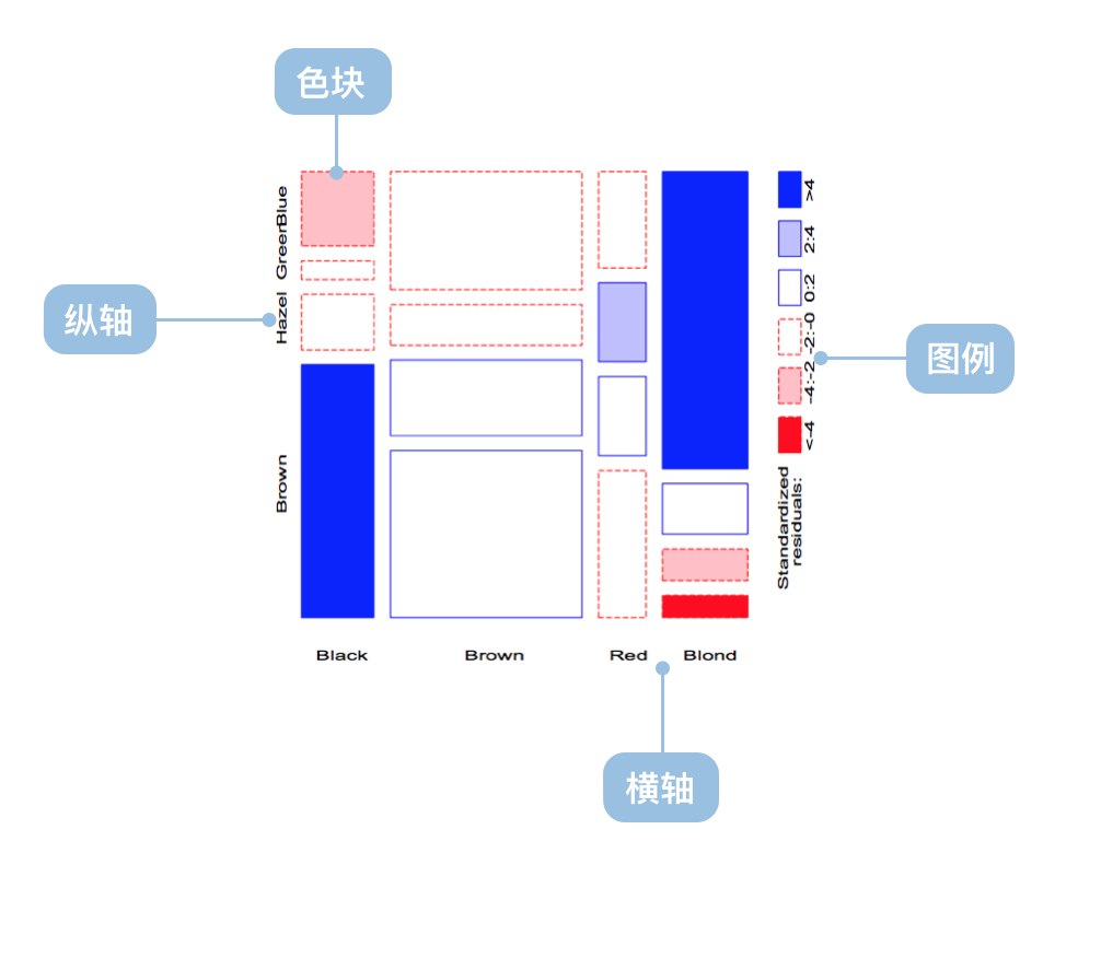
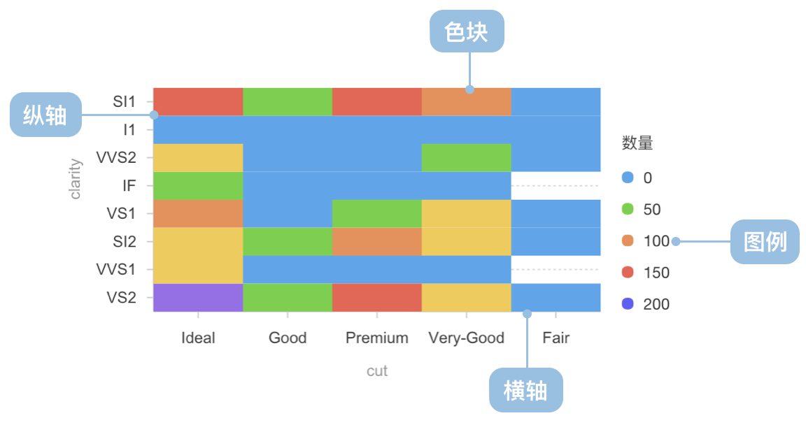
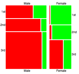
马赛克图
上一篇
弧长连接图
下一篇
打包图
Loading...
马赛克图(Mosaic Plot,又名 Marimekko Chart)是一种用于显示分类数据之间关系的图表。它通过矩形的面积和颜色来表示数据的比例和分类。
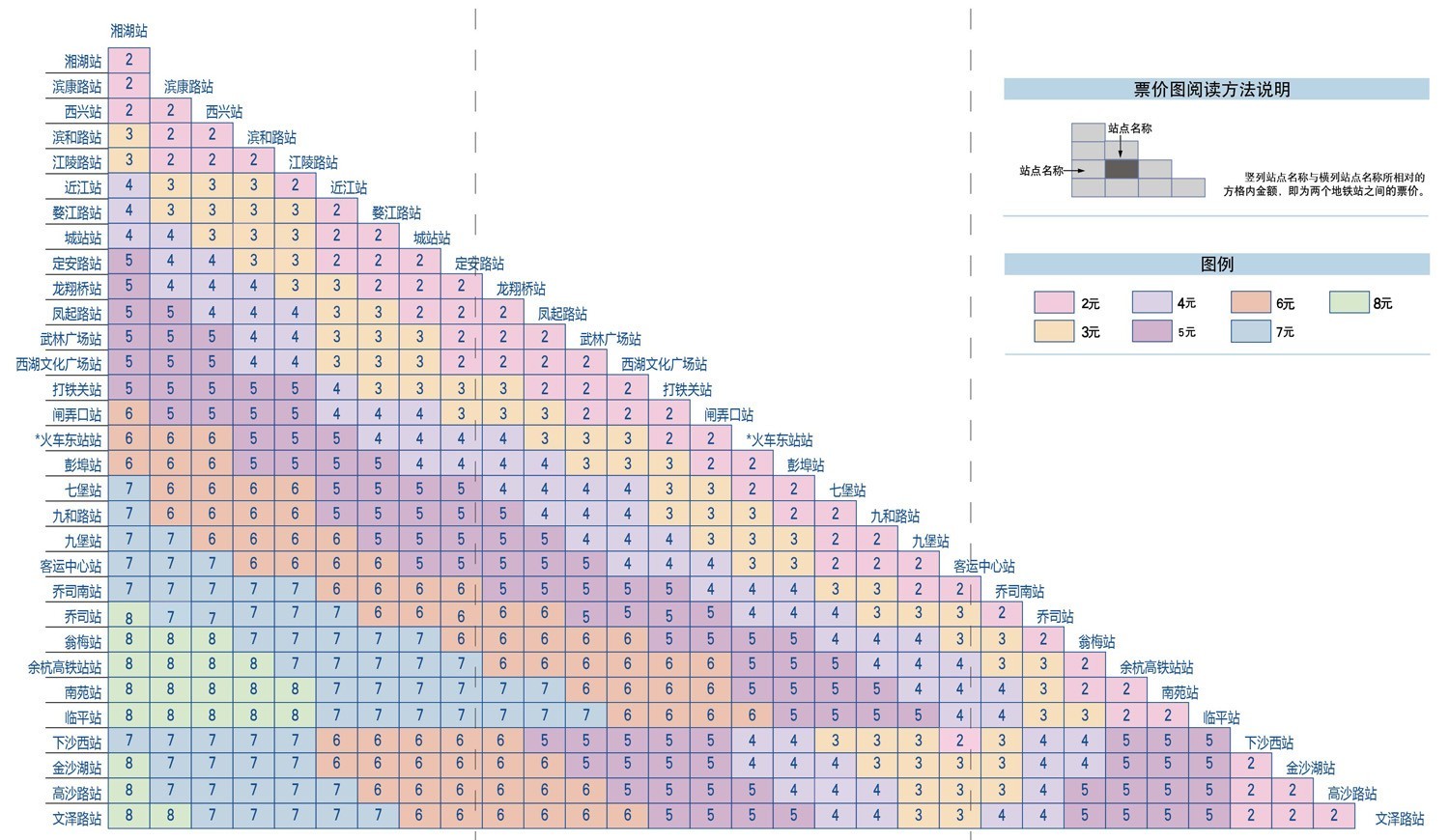
马赛克图分为均匀和非均匀两种类型,均匀马赛克图在生活中更为常见,例如地铁票价图;而非均匀马赛克图多用于统计学领域。
英文名:Mosaic Plot, Marimekko Chart
| 图表类型 | 非均匀坐标轴马赛克图 |
|---|---|
| 适合的数据 | 多维分类数据 |
| 功能 | 显示多维分类数据的分布 |
| 数据与图形的映射 | 分类数据字段映射到非均匀的坐标轴 面积和颜色表示数据的比例和分类 |
| 适合的数据条数 | 数据维度较多时效果更佳 |
| 图表类型 | 均匀坐标轴马赛克图 |
|---|---|
| 适合的数据 | 二维分类数据 |
| 功能 | 显示二维分类数据的分布 |
| 数据与图形的映射 | 分类数据字段映射到均匀的坐标轴 颜色表示数据的分类 |
| 适合的数据条数 | 数据维度较少时效果更佳 |
例子 1: 适合应用到多维分类数据分析
例子 2: 适合应用到二维分类数据分析
const chart = new G2.Chart({container: 'container',autoFit: true,height: 400,});chart.options({type: 'cell',data: [{ product: '手机', region: '华北', sales: 120, category: '高端' },{ product: '手机', region: '华东', sales: 180, category: '高端' },{ product: '手机', region: '华南', sales: 150, category: '高端' },{ product: '电脑', region: '华北', sales: 80, category: '中端' },{ product: '电脑', region: '华东', sales: 110, category: '中端' },{ product: '电脑', region: '华南', sales: 95, category: '中端' },{ product: '平板', region: '华北', sales: 60, category: '中端' },{ product: '平板', region: '华东', sales: 85, category: '中端' },{ product: '平板', region: '华南', sales: 70, category: '低端' },{ product: '耳机', region: '华北', sales: 40, category: '低端' },{ product: '耳机', region: '华东', sales: 55, category: '低端' },{ product: '耳机', region: '华南', sales: 45, category: '低端' },],encode: {x: 'product',y: 'region',color: 'category',size: 'sales',},scale: {color: {palette: 'category10',type: 'ordinal',},size: {type: 'linear',range: [0.3, 1],},},style: {stroke: '#fff',strokeWidth: 2,inset: 2,},legend: {color: {title: '产品类别',position: 'top',},size: {title: '销售额',position: 'right',},},axis: {x: {title: '产品类型',labelAutoRotate: false,},y: {title: '销售区域',},},tooltip: {title: (d) => `${d.product} - ${d.region}`,items: [{ field: 'sales', name: '销售额', valueFormatter: (v) => `${v}万` },{ field: 'category', name: '类别' },],},});chart.render();
例子 3: 市场细分分析(非均匀马赛克图)
这个例子展示了如何使用非均匀马赛克图来展示不同市场细分的分布情况,其中矩形的宽度表示市场规模,高度表示各细分市场的占比。
import { Chart } from '@antv/g2';const chart = new Chart({container: 'container',width: 900,height: 800,paddingLeft: 0,paddingRight: 0,});chart.options({type: 'interval',data: {type: 'fetch',value:'https://gw.alipayobjects.com/os/bmw-prod/3041da62-1bf4-4849-aac3-01a387544bf4.csv',},transform: [{ type: 'flexX', reducer: 'sum' }, // 灵活X轴宽度{ type: 'stackY' }, // Y轴堆叠{ type: 'normalizeY' }, // Y轴归一化],encode: {x: 'market',y: 'value',color: 'segment',},axis: {y: false,},scale: {x: { paddingOuter: 0, paddingInner: 0.01 },},tooltip: 'value',labels: [{text: 'segment',x: 5,y: 5,textAlign: 'start',textBaseline: 'top',fontSize: 10,fill: '#fff',},{text: 'value',x: 5,y: 5,textAlign: 'start',dy: 15,fontSize: 10,fill: '#fff',},],});chart.render();
例子 4: 电影评分分布分析(密度马赛克图)
这个例子展示了如何使用密度马赛克图来分析 IMDB 和烂番茄评分的关系分布,颜色深浅表示电影数量的多少。
import { Chart } from '@antv/g2';const chart = new Chart({container: 'container',autoFit: true,});chart.options({type: 'rect',data: {type: 'fetch',value: 'https://assets.antv.antgroup.com/g2/movies.json',},encode: {x: 'IMDB Rating',y: 'Rotten Tomatoes Rating',},transform: [{ type: 'bin', color: 'count', thresholdsX: 30, thresholdsY: 20 },],scale: {color: { palette: 'ylGnBu' },},tooltip: {title: { channel: 'color' },items: [(d, i, data, column) => ({name: 'IMDB评分',value: `${column.x.value[i]}, ${column.x1.value[i]}`,}),(d, i, data, column) => ({name: '烂番茄评分',value: `${column.y.value[i]}, ${column.y1.value[i]}`,}),],render: () => '1',},});chart.render();
例子 5: 运动员生理数据分析(分组密度马赛克图)
这个例子展示了如何使用马赛克图按性别分组展示运动员身高和体重的分布情况,不透明度表示数据点的密度。
import { Chart } from '@antv/g2';const chart = new Chart({container: 'container',autoFit: true,});chart.options({type: 'rect',data: {type: 'fetch',value: 'https://assets.antv.antgroup.com/g2/athletes.json',},encode: {x: 'weight',y: 'height',color: 'sex',},transform: [{ type: 'bin', opacity: 'count' }],legend: {opacity: false,},style: {inset: 0.5,},tooltip: {title: { channel: 'opacity' },items: [(d, i, data, column) => ({name: '体重',value: `${column.x.value[i]}, ${column.x1.value[i]}`,}),(d, i, data, column) => ({name: '身高',value: `${column.y.value[i]}, ${column.y1.value[i]}`,}),],},});chart.render();

