环图
上一篇
饼图
下一篇
热力图
Loading...
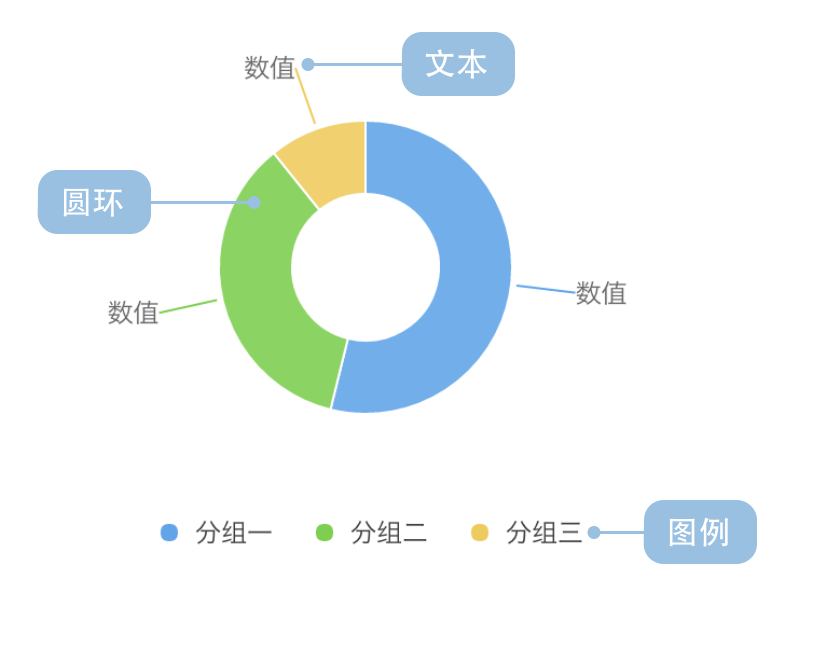
环图(又叫做甜甜圈图),其本质是饼图将中间区域挖空。环图采用了让我们更关注长度而不是面积的做法,这样我们就能相对简单的对比不同的环图。
虽然环图和饼图在数据表达上很相似,但环图还是有它独特的优点:
英文名:Donut Chart
| 图表类型 | 环图 |
|---|---|
| 适合的数据 | 列表:一个分类数据字段、一个连续数据字段 |
| 功能 | 对比分类数据的数值大小 |
| 数据与图形的映射 | 分类数据字段映射到环形的颜色 连续数据字段映射到环形的角度 |
| 适合的数据条数 | 不超过 9 条数据 |
例子 1: 展示分类的占比情况
这种用法与饼图类似,下图是一个游戏公司的销售情况:
| genre(游戏类型) | sold(销售量) |
|---|---|
| Sports | 27,500 |
| Strategy | 11,500 |
| Action | 6,000 |
| Shooter | 3,500 |
| Other | 1,500 |
import { Chart } from '@antv/g2';const chart = new Chart({container: 'container',theme: 'classic',});chart.options({type: 'interval',autoFit: true,transform: [{ type: 'stackY' }], // 添加堆叠转换data: [{ genre: 'Sports', sold: 27500 },{ genre: 'Strategy', sold: 11500 },{ genre: 'Action', sold: 6000 },{ genre: 'Shooter', sold: 3500 },{ genre: 'Other', sold: 1500 },],coordinate: { type: 'theta', innerRadius: 0.5 },encode: { y: 'sold', color: 'genre' },legend: {color: { position: 'bottom', layout: { justifyContent: 'center' } },},labels: [{text: 'genre',style: {fontWeight: 'bold',},},{text: (d, i, data) => {const total = data.reduce((acc, curr) => acc + curr.sold, 0);const percent = ((d.sold / total) * 100).toFixed(2);return `${percent}%`;},style: {fontSize: 10,dy: 12,},},],});chart.render();
说明:
genre 字段映射到颜色,用于区分不同的游戏类型sold 字段映射到角度,表示销售量占比的大小coordinate: { type: 'theta', innerRadius: 0.5 } 创建环图效果例子 2: 在中心区域显示额外信息
环图的空心区域可以用来显示总数、标题或其他重要信息:
import { Chart } from '@antv/g2';const chart = new Chart({container: 'container',theme: 'classic',});const data = [{ type: '移动端', value: 54.2 },{ type: '桌面端', value: 32.1 },{ type: '平板端', value: 13.7 },];const total = data.reduce((acc, curr) => acc + curr.value, 0);chart.options({type: 'interval',autoFit: true,transform: [{ type: 'stackY' }], // 添加堆叠转换data,coordinate: { type: 'theta', innerRadius: 0.6 },encode: { y: 'value', color: 'type' },style: { stroke: '#fff', lineWidth: 2 },legend: {color: { position: 'bottom', layout: { justifyContent: 'center' } },},labels: [{text: (d) => `${d.value}%`,style: {fontWeight: 'bold',fontSize: 12,},},],});chart.render();
例子 1: 分类过多的场景
下图是各个省的人口的占比情况,因为这张图上包含的分类过多,很难清晰对比各个省份的人口数据占比情况,所以这种情况下,我们推荐使用柱状图。
import { Chart } from '@antv/g2';const chart = new Chart({container: 'container',theme: 'classic',});chart.options({type: 'interval',autoFit: true,transform: [{ type: 'stackY' }], // 添加堆叠转换data: [{ province: '北京市', population: 19612368 },{ province: '天津市', population: 12938693 },{ province: '河北省', population: 71854210 },{ province: '山西省', population: 27500000 },{ province: '内蒙古自治区', population: 24706291 },{ province: '辽宁省', population: 43746323 },{ province: '吉林省', population: 27452815 },{ province: '黑龙江省', population: 38313991 },{ province: '上海市', population: 23019196 },{ province: '江苏省', population: 78660941 },{ province: '浙江省', population: 54426891 },{ province: '安徽省', population: 59500468 },{ province: '福建省', population: 36894217 },{ province: '江西省', population: 44567797 },{ province: '山东省', population: 95792719 },{ province: '河南省', population: 94029939 },{ province: '湖北省', population: 57237727 },{ province: '湖南省', population: 65700762 },{ province: '广东省', population: 104320459 },{ province: '广西壮族自治区', population: 46023761 },{ province: '海南省', population: 8671485 },{ province: '重庆市', population: 28846170 },{ province: '四川省', population: 80417528 },{ province: '贵州省', population: 34748556 },{ province: '云南省', population: 45966766 },{ province: '西藏自治区', population: 3002165 },{ province: '陕西省', population: 37327379 },{ province: '甘肃省', population: 25575263 },{ province: '青海省', population: 5626723 },],coordinate: { type: 'theta', innerRadius: 0.4 },encode: { y: 'population', color: 'province' },legend: false, // 分类太多,关闭图例labels: false, // 分类太多,关闭标签});chart.render();
说明:上图中分类过多,颜色难以区分,标签重叠严重,不适合使用环图。
例子 2: 分类占比差别不明显的场景
下图中游戏公司的不同种类游戏的销售量相近,角度差异很小,不太适合使用环图,此时可以使用柱状图。
import { Chart } from '@antv/g2';const chart = new Chart({container: 'container',theme: 'classic',});chart.options({type: 'interval',autoFit: true,transform: [{ type: 'stackY' }], // 添加堆叠转换data: [{ genre: 'Sports', sold: 15000 },{ genre: 'Strategy', sold: 14900 },{ genre: 'Action', sold: 15050 },{ genre: 'Shooter', sold: 13000 },{ genre: 'Other', sold: 13900 },],coordinate: { type: 'theta', innerRadius: 0.5 },encode: { y: 'sold', color: 'genre' },legend: {color: { position: 'bottom', layout: { justifyContent: 'center' } },},labels: [{text: (d, i, data) => {const total = data.reduce((acc, curr) => acc + curr.sold, 0);const percent = ((d.sold / total) * 100).toFixed(2);return `${percent}%`;},style: {fontSize: 10,},},],});chart.render();
说明:上图中各个分类的占比都接近 20%,差异很小,难以通过角度清晰地对比数值大小。
使用 G2 的分面功能,可以将分组数据绘制成多个环图。下图展示了全球最大 1000 家银行所在地区在 2007 年和 2011 年的利润总额占比情况:
| 年份 | 地区 | 利润总额(亿美金) |
|---|---|---|
| 2007 | 亚太地区 | 1485.54 |
| 2007 | 非洲及中东 | 330.12 |
| 2007 | 拉丁美洲 | 196.5 |
| …… | …… | …… |
| 2011 | 亚太地区 | 4107.18 |
| 2011 | 非洲及中东 | 495.3 |
| 2011 | 拉丁美洲 | 495.3 |
| …… | …… | …… |
import { Chart } from '@antv/g2';const chart = new Chart({container: 'container',theme: 'classic',});chart.options({type: 'facetRect',autoFit: true,data: [{ year: '2007', area: '亚太地区', profit: 1485.54 },{ year: '2007', area: '西欧', profit: 3631.32 },{ year: '2007', area: '北美', profit: 2083.9 },{ year: '2007', area: '非洲及中东', profit: 330.12 },{ year: '2007', area: '中欧和东欧', profit: 141.48 },{ year: '2007', area: '拉丁美洲', profit: 196.5 },{ year: '2011', area: '亚太地区', profit: 4107.18 },{ year: '2011', area: '西欧', profit: 480.06 },{ year: '2011', area: '北美', profit: 1783.08 },{ year: '2011', area: '非洲及中东', profit: 495.3 },{ year: '2011', area: '中欧和东欧', profit: 259.08 },{ year: '2011', area: '拉丁美洲', profit: 495.3 },],encode: { x: 'year' },children: [{type: 'interval',transform: [{ type: 'stackY' }], // 添加堆叠转换coordinate: { type: 'theta', innerRadius: 0.5 },encode: { y: 'profit', color: 'area' },legend: {color: { position: 'bottom', layout: { justifyContent: 'center' } },},labels: [{text: (d, i, data) => {const total = data.reduce((acc, curr) => acc + curr.profit, 0);const percent = ((d.profit / total) * 100).toFixed(1);return `${percent}%`;},style: {fontSize: 10,},},],},],});chart.render();