
子弹图
上一篇
桑基图
下一篇
甘特图
Loading...
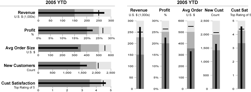
子弹图(Bullet Chart)是一种线性的图表类型,最初由数据可视化专家 Stephen Few 设计,旨在替代传统的仪表盘而提供更加紧凑和信息丰富的可视化形式。子弹图能够在有限的空间内同时展示实际值、目标值和表现区间,通过对比的方式清晰地显示指标的完成度和表现情况。
子弹图的设计理念是最大化数据墨水比(data-ink ratio),在最小的空间内展示最多的有用信息,特别适合用于仪表板和绩效监控场景。
英文名:Bullet Chart
其他名称:进度条图、目标比较图、弹丸图
| 图表类型 | 子弹图 |
|---|---|
| 适合的数据 | 一个分类数据字段、一个连续数据字段(实际值)、一个目标值、可选的表现区间 |
| 功能 | 展示实际值与目标值的对比,评估表现等级 |
| 数据与图形的映射 | 分类数据字段映射到纵轴位置 连续数据字段映射到条形长度 目标值映射到标记线 表现区间映射到背景色带 |
| 适合的数据条数 | 单个或多个指标,建议不超过 10 个 |
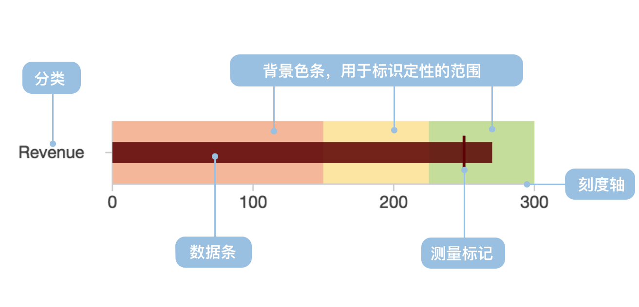
子弹图的主要组成部分包括:
import { Chart } from '@antv/g2';const chart = new Chart({container: 'container',theme: 'classic',});const data = [{title: '销售完成率',ranges: 100,measures: 80,target: 85,},];chart.options({type: 'view',coordinate: { transform: [{ type: 'transpose' }] },children: [{type: 'interval',data,encode: { x: 'title', y: 'ranges', color: '#f0efff' },style: { maxWidth: 30 },axis: {y: {grid: true,gridLineWidth: 2,title: '完成率 (%)',},x: {title: false,},},},{type: 'interval',data,encode: { x: 'title', y: 'measures', color: '#5B8FF9' },style: { maxWidth: 20 },label: {text: 'measures',position: 'right',textAlign: 'left',dx: 5,formatter: (d) => `${d}%`,},},{type: 'point',data,encode: {x: 'title',y: 'target',shape: 'line',color: '#3D76DD',size: 8,},tooltip: {title: false,items: [{ channel: 'y', name: '目标值', valueFormatter: (d) => `${d}%` },],},},],});chart.render();
场景 1:业绩指标监控
子弹图是展示业绩指标完成情况的理想工具,能够清晰地对比实际表现与目标要求。
import { Chart } from '@antv/g2';const chart = new Chart({container: 'container',theme: 'classic',});const colors = {ranges: ['#ffebee', '#fff3e0', '#e8f5e8'],measures: '#1890ff',target: '#ff4d4f',};// 转换数据结构const transformedData = [{ title: '项目进度', value: 40, level: '差' },{ title: '项目进度', value: 30, level: '良' },{ title: '项目进度', value: 30, level: '优' },];chart.options({type: 'view',coordinate: { transform: [{ type: 'transpose' }] },children: [{type: 'interval',data: transformedData,encode: { x: 'title', y: 'value', color: 'level' },transform: [{ type: 'stackY' }],scale: {color: {domain: ['差', '良', '优'],range: colors.ranges,},},style: { maxWidth: 30 },},{type: 'interval',data: {value: [{ title: '项目进度', value: 60, type: '实际进度' },{ title: '项目进度', value: 80, type: '目标进度' },],transform: [{ type: 'filter', callback: (d) => d.type === '实际进度' }],},encode: { x: 'title', y: 'value', color: colors.measures },style: { maxWidth: 16 },},{type: 'point',data: {value: [{ title: '项目进度', value: 60, type: '实际进度' },{ title: '项目进度', value: 80, type: '目标进度' },],transform: [{ type: 'filter', callback: (d) => d.type === '目标进度' }],},encode: {x: 'title',y: 'value',shape: 'line',color: colors.target,size: 8,},axis: { y: { grid: true, title: '进度 (%)' }, x: { title: false } },},],});chart.render();
场景 2:预算执行跟踪
子弹图能够有效地显示预算的执行情况,包括实际支出、预算目标和预警区间。
场景 3:资源利用率监控
通过子弹图可以直观地了解各类资源的使用情况,识别过度使用或利用不足的资源。
import { Chart } from '@antv/g2';const chart = new Chart({container: 'container',theme: 'classic',});const resourceData = [{resource: 'CPU使用率',ranges: 100,measures: 65,target: 80,},{resource: '内存使用率',ranges: 100,measures: 45,target: 70,},{resource: '磁盘使用率',ranges: 100,measures: 88,target: 85,},{resource: '网络带宽',ranges: 100,measures: 72,target: 75,},];chart.options({type: 'view',coordinate: { transform: [{ type: 'transpose' }] },children: [{type: 'interval',data: resourceData,encode: { x: 'resource', y: 'ranges', color: '#f5f5f5' },style: { maxWidth: 30 },},{type: 'interval',data: resourceData,encode: {x: 'resource',y: 'measures',color: (d) => (d.measures > d.target ? '#ff7875' : '#52c41a'),},style: { maxWidth: 20 },label: {text: 'measures',position: 'right',textAlign: 'left',dx: 5,formatter: (d) => `${d}%`,},},{type: 'point',data: resourceData,encode: {x: 'resource',y: 'target',shape: 'line',color: '#1890ff',size: 6,},axis: {y: {grid: true,title: '使用率 (%)',},x: {title: '系统资源',},},},],});chart.render();
场景 1:时间趋势分析
子弹图主要展示某个时点的状态对比,不适合展示随时间变化的趋势,此时应使用折线图。
场景 2:部分与整体关系
如果需要展示各部分占整体的比例关系,饼图或环形图更为合适。
场景 3:数据量过大
当需要展示大量指标时,子弹图会导致视觉混乱,建议使用分组展示或其他图表类型。
通过分组显示多个相关指标的表现情况,便于横向对比。
import { Chart } from '@antv/g2';const chart = new Chart({container: 'container',theme: 'classic',});const multiData = [{department: '销售部',indicator: '销售额',ranges: 100,measures: 85,target: 90,},{department: '销售部',indicator: '客户数',ranges: 100,measures: 92,target: 85,},{department: '市场部',indicator: '品牌知名度',ranges: 100,measures: 78,target: 80,},{department: '市场部',indicator: '营销投入ROI',ranges: 100,measures: 88,target: 85,},];chart.options({type: 'view',coordinate: { transform: [{ type: 'transpose' }] },children: [{type: 'interval',data: multiData,encode: { x: 'indicator', y: 'ranges', color: '#f0f0f0' },style: { maxWidth: 30 },},{type: 'interval',data: multiData,encode: { x: 'indicator', y: 'measures', color: 'department' },style: { maxWidth: 20 },label: {text: 'measures',position: 'right',textAlign: 'left',dx: 5,},},{type: 'point',data: multiData,encode: {x: 'indicator',y: 'target',shape: 'line',color: '#666',size: 6,},axis: {y: {grid: true,title: '完成度',},x: {title: '关键指标',},},},],});chart.render();
通过不同颜色深浅的背景区间,提供更细致的表现评估标准。
import { Chart } from '@antv/g2';const chart = new Chart({container: 'container',theme: 'classic',});const colors = {ranges: ['#ffebee', '#fff3e0', '#e8f5e8'],measures: '#1890ff',target: '#ff4d4f',};// 转换数据结构const transformedData = [{ title: '项目进度', value: 40, level: '差' },{ title: '项目进度', value: 30, level: '良' },{ title: '项目进度', value: 30, level: '优' },];chart.options({type: 'view',coordinate: { transform: [{ type: 'transpose' }] },children: [{type: 'interval',data: transformedData,encode: { x: 'title', y: 'value', color: 'level' },transform: [{ type: 'stackY' }],scale: {color: {domain: ['差', '良', '优'],range: colors.ranges,},},style: { maxWidth: 30 },},{type: 'interval',data: {value: [{ title: '项目进度', value: 60, type: '实际进度' },{ title: '项目进度', value: 80, type: '目标进度' },],transform: [{ type: 'filter', callback: (d) => d.type === '实际进度' }],},encode: { x: 'title', y: 'value', color: colors.measures },style: { maxWidth: 16 },},{type: 'point',data: {value: [{ title: '项目进度', value: 60, type: '实际进度' },{ title: '项目进度', value: 80, type: '目标进度' },],transform: [{ type: 'filter', callback: (d) => d.type === '目标进度' }],},encode: {x: 'title',y: 'value',shape: 'line',color: colors.target,size: 8,},axis: { y: { grid: true, title: '进度 (%)' }, x: { title: false } },},],});chart.render();
在空间受限或需要特殊布局时,可以使用垂直方向的子弹图。
import { Chart } from '@antv/g2';const chart = new Chart({container: 'container',theme: 'classic',});const verticalData = [{metric: 'Q1销售',ranges: 100,measures: 80,target: 85,},{metric: 'Q2销售',ranges: 100,measures: 92,target: 88,},{metric: 'Q3销售',ranges: 100,measures: 76,target: 90,},];chart.options({type: 'view',children: [{type: 'interval',data: verticalData,encode: { x: 'metric', y: 'ranges', color: '#f0f0f0' },style: { maxWidth: 30 },},{type: 'interval',data: verticalData,encode: { x: 'metric', y: 'measures', color: '#52c41a' },style: { maxWidth: 20 },label: {text: 'measures',position: 'top',textAlign: 'center',dy: -5,},},{type: 'point',data: verticalData,encode: {x: 'metric',y: 'target',shape: 'line',color: '#ff4d4f',size: 6,},axis: {y: {grid: true,title: '销售额 (万元)',},x: {title: '季度',},},},],});chart.render();


